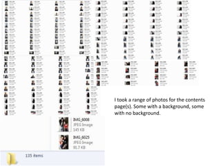
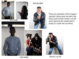
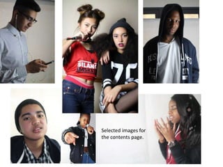
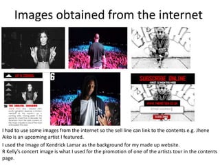
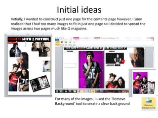
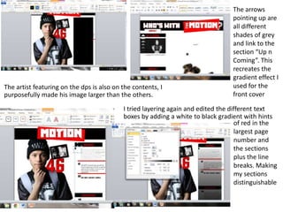
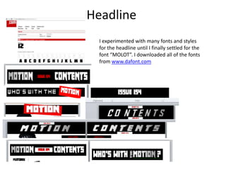
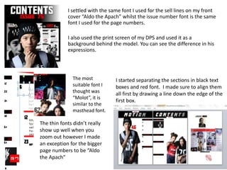
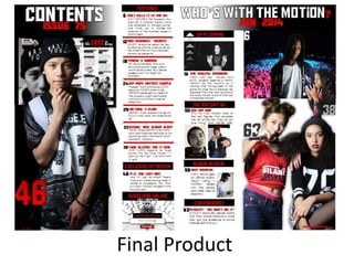
I took a range of photos for the contents
page(s). Some with a background, some
with no background.
These are examples of the images I
rejected. Some were too dark, too
blurry, part of their hand is cut off
and in general the model wasn’t
ready so I could not use these.
TOO DARK Hand is cut off
TOO BLURRY
Not ready
Selected images for
the contents page.
Images obtained from the internet
I had to use some images from the internet so the sell line can link to the contents e.g. Jhene
Aiko is an upcoming artist I featured.
I used the image of Kendrick Lamar as the background for my made up website.
R Kelly’s concert image is what I used for the promotion of one of the artists tour in the contents
page.
Initial ideas
Initially, I wanted to construct just one page for the contents page however, I soon
realised that I had too many images to fit in just one page so I decided to spread the
images across two pages much like Q magazine.
For many of the images, I used the ‘Remove
Background’ tool to create a clear back ground
The artist featuring on the dps is also on the contents, I
purposefully made his image larger than the others.
The arrows
pointing up are
all different
shades of grey
and link to the
section “Up n
Coming”. This
recreates the
gradient effect I
used for the
front cover
I tried layering again and edited the different text
boxes by adding a white to black gradient with hints
of red in the
largest page
number and
the sections
plus the line
breaks. Making
my sections
distinguishable
Headline
I experimented with many fonts and styles
for the headline until I finally settled for the
font “MOLOT”. I downloaded all of the fonts
from www.dafont.com
I started separating the sections in black text
boxes and red font. I made sure to align them
all first by drawing a line down the edge of the
first box.
I settled with the same font I used for the sell lines on my front
cover “Aldo the Apach” whilst the issue number font is the same
font I used for the page numbers.
I also used the print screen of my DPS and used it as a
background behind the model. You can see the difference in his
expressions.
The most
suitable font I
thought was
“Molot”, it is
similar to the
masthead font.
The thin fonts didn’t really
show up well when you
zoom out however I made
an exception for the bigger
page numbers to be “Aldo
the Apach”
Final Product

Contents page construction

  • 2.
    I took arange of photos for the contents page(s). Some with a background, some with no background.
  • 3.
    These are examplesof the images I rejected. Some were too dark, too blurry, part of their hand is cut off and in general the model wasn’t ready so I could not use these. TOO DARK Hand is cut off TOO BLURRY Not ready
  • 4.
  • 5.
    Images obtained fromthe internet I had to use some images from the internet so the sell line can link to the contents e.g. Jhene Aiko is an upcoming artist I featured. I used the image of Kendrick Lamar as the background for my made up website. R Kelly’s concert image is what I used for the promotion of one of the artists tour in the contents page.
  • 6.
    Initial ideas Initially, Iwanted to construct just one page for the contents page however, I soon realised that I had too many images to fit in just one page so I decided to spread the images across two pages much like Q magazine. For many of the images, I used the ‘Remove Background’ tool to create a clear back ground
  • 7.
    The artist featuringon the dps is also on the contents, I purposefully made his image larger than the others. The arrows pointing up are all different shades of grey and link to the section “Up n Coming”. This recreates the gradient effect I used for the front cover I tried layering again and edited the different text boxes by adding a white to black gradient with hints of red in the largest page number and the sections plus the line breaks. Making my sections distinguishable
  • 8.
    Headline I experimented withmany fonts and styles for the headline until I finally settled for the font “MOLOT”. I downloaded all of the fonts from www.dafont.com
  • 9.
    I started separatingthe sections in black text boxes and red font. I made sure to align them all first by drawing a line down the edge of the first box. I settled with the same font I used for the sell lines on my front cover “Aldo the Apach” whilst the issue number font is the same font I used for the page numbers. I also used the print screen of my DPS and used it as a background behind the model. You can see the difference in his expressions. The most suitable font I thought was “Molot”, it is similar to the masthead font. The thin fonts didn’t really show up well when you zoom out however I made an exception for the bigger page numbers to be “Aldo the Apach”
  • 10.