
Recommended
More Related Content
What's hot
What's hot (20)
Viewers also liked
Viewers also liked (20)
Similar to Double page spread
Similar to Double page spread (20)
Recently uploaded
Recently uploaded (20)
Double page spread
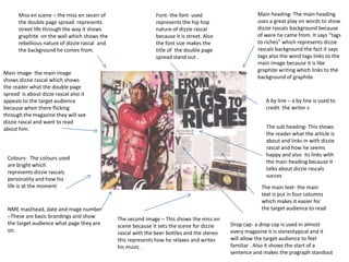
- 1. Miss en scene – the miss en secen of the double page spread represents street life through the way it shows graphite on the wall which shows the rebellious nature of dizzie rascal and the background he comes from. Main image- the main image shows dizzie rascal which shows the reader what the double page spread is about dizze rascal also it appeals to the target audience because when there flicking through the magazine they will see dizzie rascal and want to read about him. Font- the font used represents the hip hop nature of dizzie rascal because it is street. Also the font size makes the title of the double page spread stand out . Colours- The colours used are bright which represents dizzie rascals personality and how his life is at the moment. The second image – This shows the miss en scene because it sets the scene for dizzie rascal with the beer bottles and the stereo this represents how he relaxes and writes his music . Main heading- The main heading uses a great play on words to show dizzie rascals background because of were he came from. It says “tags to riches” which represents dizzie rascals background the fact it says tags also the word tags links to the main image because it is like graphite writing which links to the background of graphite The main text- the main text is put in four columns which makes it easier for the target audience to readNME masthead, date and mage number –These are basic brandings and show the target audience what page they are on. The sub heading- This shows the reader what the article is about and links in with dizzie rascal and how he seems happy and also its links with the main heading because it talks about dizzie rascals succes Drop cap- a drop cap is used in almost every magazine it is stereotypical and it will allow the target audience to feel familiar . Also it shows the start of a sentence and makes the pragraph standout A by line – a by line is used to credit the writer s