1. Salford City College
Eccles Centre
AS Media Studies
Foundation Portfolio
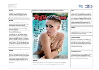
Masthead
‘Rollingstones’ in the original colour and font,
behind the model. Using the classical font and
colour that is synonymous with the brand, and
genre. The masthead is also in the key area (top of
the page)
Main image
The main image is of Miley Cyrus, it feature her
wearing nothing but gold jewellery emerging from a
swimming pool. The rock and roll, slightly
provocative image is very common for the rolling
stones and it also breaks away from the regular
front cover conventions.
Model credit& Main Cover Line
The model credit and Main cover line are both
featured together (could have been used to help
keep the [page looking clean and simplistic). The
cover line is ‘Good golly miss Miley’ it is in a large
font that is beside the model. The cover line attracts
the reader as it is suggestive as does not saying
what she has done. Also I could be suggested that it
is a reference to her southern roots and there for be
slightlytongue in cheek reference to the model.
Coverline
The cover lines are all kept to the left hand side and
de4crese in size as they move downwards. There
are 6 cover lines that are all varied in topics, ranging
from music related news that would appeal to the
rolling stones fan base ‘ the last days of nirvana’ to
topical news that could be used to again grab the
reader’sattention with the use of keys words like
‘war’ and hot’.
Colour
There are a lot of contrasting colours in this as there
are lots of pinks and blue and then blacks and reds.
The use of these contrasting colours makes the page
vibrant and interesting even though there are not a
lot of cover lines. This balances works well. Also the
black eye makeup on the model is very striking again
the pale skin and soft background. Also the use of the
washed out blue background helps separate the
model from her background and has cleverly been
used.
Typefaces
The types faces used are all serif fonts which create a
harmonious planed look that works well as this fonts is
usually associated with formal features yet the main image is
very provocative and this contras works well.
Photography Lighting
The image is very well lit and is nearly slightly over
exposed. This brightness creates lots of contrast of
white highlights and black shadows. I could take a
guess that not only natural lighting (due to it being
outdoors) was used, lighting systems where used as
it very professional looking.
Design Principles Used?
There does not seem to be any strong use of a design
principle as there is very minimal written content.
The layout has been used to help frame the model as
this was the main feature of this front cover.
House Style
The house style is simplicity fonts with contrasting colours. The icon title sat behind the
model and the mix of warm and cold colours to help balance out the overall look.
Comment on how the design of the magazine cover attracts the target audience: