2. Layout
Text is organised into tight columns with black
dotted lines being shown to separate the
individual columns and entries. This makes a
nicely organised and very tidy design with very
clear separation between the individual columns
and entries. Most albums get small and succinct
explanations for their inclusions, but others get
expanded pieces with a stock image of the singer
and, in this case, a short Q&A on the singer’s
reaction to being featured.
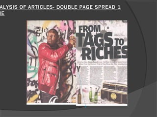
3. Main image
The main image is of the singer spraying
graffiti on the wall, he is doing so as looking
over his shoulder as if to say he is looking
out for people who could catch him doing it,
overall presenting him as a bad character,
but this is what the readers like so they will
want to read on. He is also on the front
cover so the contents page relates back to
the front cover.
4. Main heading
Main heading rhymes and relates to
what is happening in the image as the
person in the image is tagging the wall,
also known as spray painting. The text is
slanted relating to dizziness, tag is a
word associated with being on the
streets witch also relates to the rapping
style of music Dizzee produces.
5. Backround
Second image used is an old stereo and
bottles of beer making up a typical
gangster scene. Background is graffiti
relating to the heading and Dizzee’s
gangster rap image.
6. Written article
The article itself is basically about how Dizzee
has turned his life around. He has gone from
the graphite tagging youth to a famous rap
artists. The style of the article is a laid back
tone of article which is easy for anyone to
read. It is written in 4 short columns each of
approx75-100 words The main
heading/headline is quite dramatic as it is
large and in your face. It also emphasises the
topic of the article and makes it even more
impressive.