Difference Between Search & Browse Methods in Odoo 17
Analysis of front cover, content and double page spread
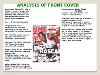
1. Connotation: The graffiti links to
the party scene of student where
Dizzee Rascals music is heavily
featured. The party scene also
links to the genre of music that
Dizzee Rascal represents.
Genre: British Music Magazine.
Image: Dizzee Rascal is
recognisable for a younger
generation or the NME title is
recognisable for an older audience.
Rule of 3: Not standard layout
split into 4 horizontal strips
instead of 3 vertical strips.
Masthead: On the left-hand side,
this follows the standard
conventions of magazines.
Layout: Messy and not conventional
which makes the front cover look
unstructured.
Tilted text doesn’t conform to
traditional standards which links
into the connotations of the front
cover.
Colour Scheme: Red, White and
Black. These colours are typically
masculine and are also bold, strong
colours.
Target Audience: Gender (Male)
Age (20s)
Students relate more to this cover
because it looks rebellious.
Cover lines: Main cover line is informal, it
matches the colour scheme.
Wide genre of music covered by the
magazine. Pull out quote from the article
to grab the audiences attention.
Model: NME has a largely male audience
and the model appeals to the audience.
He is dressed casually which is relatable
to the target audience, Also the
positioning with the model reaching out
makes it seem like the model is trying to
connect with the audience.
2. Fonts: Seirf (Body Text) which is
a more modern text that gets
used in a lot a magazines.
Sans Seirf (Heading) which
is bold and chunky, making the
text stand out.
Borders: White border looks like
an old fashioned photo which has
been stuck on to the page.
Background: It is a fly case
which links to the magazine being
a touring special.
Colour Scheme: Same scheme as
the front cover; Black, Red and
White this is the brand identity
of NME.
Rule of 3: Split into horizontal
strips like the front cover.
Main image: It’s a medium close
up, so you can see the tour bus
but also the expression on the
models face.
Date: So you can see it’s the
most recent edition.
Certain page numbers makes you want to
buy it to get all the information.
Colloquial Language to help it relate to
the target audience and by the magazine
using the pronoun “We” it makes the
reader feel more involved with what the
editors letter is saying.
3. Image: Same model as the front cover to show he is the article for the magazine.
Colour Scheme: Same as the front cover and contents page to follow the brand of NME.
Language: Informal to suit the target audience of this artist, which is teenagers.
Page Numbers: N/A
Design: Messy to links to the genre of music.
Overall Impression: Follows the same theme as the other pages so they link together.
Imagery: Carries on behind the text.
Use of Space: Model takes up one half of the spread, small interview text fitted around the other images.
Use of Images: Carries on the party vibe from the front cover.
Layout: 3 horizontal strips for the text page.
Column width and Positioning: Short and wide to fit around the other images.
Branding: Colour scheme helps identify with
NME.
Drop Cap: Same font as the masthead to
link it together.