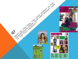
3. MASTHEAD
The aim of this is to give the reader an idea of the magazine's target audience
and content within one or two words.
The word ‘Confess’ has connotations both with gossip, and reconciliation. This
is an appropriate name for the magazine as the school it is distributed at is a
Catholic one.
I chose to call my music magazine ‘Rock Chick’ because it directly addresses
the target audience, through the word ‘rock’ which tells us the genre, and with
the word ‘chick’ and the pink coloured background which tells us that it is aimed
at girls. The font is of a rebellious nature, and therefor also shows us that the
magazine intends to interest older teenagers and young adults.
I did not want the masthead for my preliminary piece to be in front of the main
image, and because of this it is not as easy to read. To combat this on my final
cover, I put the masthead in front of the main image, and changed the layout of
the words from one line to two.
4. COVER IMAGE
Both the cover images are conventional, due to the fact they are close up
photographs of faces. Holly’s eyes, as well as Gabby’s, are both looking directly
at the camera, which would engage with people as they pass by the magazine
stand.
The themes of the magazines are different, and this is shown through the facial
expressions of the subjects. Holly appears calm and happy, whereas Gabby is
angry. Both these emotions are representative of the characters – Holly is head
girl and therefore must be as warm and welcoming to her peers as possible;
Gabby rejects society and rebels against the conventions.
5. COVER LINES / TEXT OVERALL
The cover lines of both magazines reflect the styles and themes accordingly.
This is through the sans serif fonts used, colour schemes and arrangement of
the words.
My preliminary magazine’s cover lines, although well laid out and clear, are
more wordy than my final piece. This is because the point of cover lines is to
get the message across in a quick and easy to read manner, so that potential
customers can get in idea of what the magazine will include, which will
ultimately impact whether or not they want to buy it
Rock Chick also abbreviates band names, which gives fans a sense of
exclusivity and personal connection to the artists. My final piece also uses
more of the stroke tool, which outlines the lettering in order to make them stand
out against the page and against other magazines on the stand. To emphasize
this further, I have also highlighted the words, and used the shadow effect. The
shadowing additionally provides the impression that the words are coming off
the page.
7. TITLE / TEXT OVERALL
The title ‘contents’ on the contents pages both appear towards the top of the
page, following convention. The title for my rock magazine, however, is much
better because of the font and colour of the text, which impacts its easiness to
read. The green and grey neither contrast or agree with each other, although
they do not sit well together and makes the word more difficult to read.
This is not helped by the lettering being lower case, which I have corrected in
my final piece. Capitalisation also fits in with the rock genre which screams
rebellion, like capitalised letters in dialogue suggest shouting and louder voices.
My final piece also uses more of the stroke tool, which outlines the lettering in
order to make them stand out against the page. I have also used a star shape
to illustrate this, along with the choice of colours – yellow and black.
I have also included quotes in my rock magazine I draw the reader into
wanting to read the article.
8. LISTINGS
I have used different layout methods to show the reader the contents of the
magazines. The initial contents page does not follow convention as it is not an
ordered list, and I have changed this in my final piece as I feel it worked better
with the images I had.
The fonts and number of articles in each magazine reflect the purposes of them
– the school publication will be shorter. This meant that I had more room on the
page to set out the listings, and so the font is bigger. The font used for the page
numbers in the rock magazine is typical
of the rock genre and relates back to the
masthead.
9. IMAGES
To gain a more realistic feel to the images on my final piece I have taken some
using a professional backdrop and some lighting, which very commonly
appears within magazines.
My final piece contents also includes more images, which makes the page look
less ordered, and therefore fits in with the theme of punk rock as it goes against
the normal conventions.
Following convention further in my rock magazine, I decided to include a image
of the editor and a letter from her. I had not thought to do this in my preliminary,
and the effect of this is so that the reader feels like the magazine was written
and is addressed to themselves. This is because the letter is
written in an informal way, as
if Emily is a friend of the
reader.