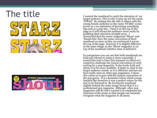
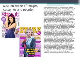
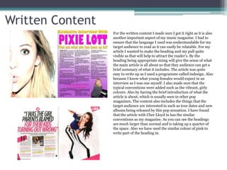
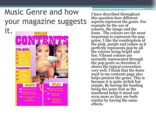
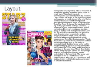
1. In what ways does your media
product use, develop or
challenge forms and conventions
of real media products?
By Nikki Dewitt
2. The title I wanted the masthead to catch the attention of my
target audience. This is why I came up wit the name
‘STRAZ’. By making this the title it relates with the
young female audience as the name ‘STARZ’ comes
across as a an aspiration of becoming something
big such as a pop star. I had it on the top of the
page as it will attract the audience more easily by
grabbing their attention straight away. I
researched that the music magazines ‘Shout’ and
‘Smash hits’ have the same convention of their
masthead as mine as they are portrayed it across
the top of the page. However it is slightly different
as the main image on the ‘Shout’ magazine is on
top of the masthead whether mine is behind it.
In comparison you can see that both mastheads are
bold and vibrant to make it more noticeable. I
wanted the text to have this stamped on effect as I
wanted to challenge the typical convention of curly
writing for a pop magazine. It also looks bold and
allows it to be more readable. It helps to stick in the
target audience minds as it is different and has not
been really seen on other pop magazines. I chose
this colour as it goes with the typical convention of
the pop genre. It is a feminine colour which young
females like therefore it was a perfect colour for the
text to be featured in. By having the masthead
slightly behind the main image shows that it is a
professional pop magazine. Although other pop
magazines still do this I wanted it to emphasise the
clearness of the name so that people can instantly
recognise what the magazine is all about.
3. Mise-en-scene of images, The images are a big part of a music magazine as it the
costumes and people. main things on a front cover that attracts the audience. It
is vital to make it look right as it should grab the reader’s
attention. I chose my friend to act as the famous pop
artist Pixie Lott. I chose Pixie Lott to be featured as the
main image because I had to decided on what my
audience would be interested in. Therefore Pixie Lott is a
well known singer who has many female fans in order to
relate with my audience. She also is a representative for
my music magazine as she fits in well with the pop genre
as she is portrayed positively with the clean , sophisticated
look. The costume I got her to wear was a grey
blazer, striped top, scarf and jeans. I thought by having
the blazer on would make her look more sophisticated as
my target audience are at the age of trying to grow up and
dress more smartly. The scarf is like a fashion statement
as many young females like the new fashion accessories. I
limited the amount of jewellery as I wanted to clothing to
stand out more. The pose challenge the typical
conventions of the pop genre as it is quite a girly and
cheesy pose. This is a common pose that many pop
magazine use as there front cover. I think that I have kept
the convention similar to what the magazine typically
represent however I made sure that I challenged other
conventions to make the front cover look unique. I like
how the background colours are vibrant yet it makes the
main image stand out. This is because I have two tones the
white and purple. These colours I have used helps to
represent the genre as they are girly and vibrant colours.
The background also helps to show the sub-headings and
images to come up more clearly. These colours are
stereotypical colours that young females like. I am quite
happy with the natural lighting I have used to help the
main features on her face stand out. This is so that it
makes it look more real and professional. The lighting on
my model’s face also emphasized as it is quite common in
many magazines such as We love pop and Smash hits.
Overall the conventions are similar to other pop
magazines as the mis en scene works well on both cover.
4. Written Content
For the written content I made sure I got it right as it is also
another important aspect of my music magazine. I had to
ensure that the language I used was understandable for my
target audience to read as it can easily be relatable. For my
article I wanted to make the heading and my pull quite
visible as that will help to attract the reader’s. By the
heading being appropriate sizing will give the sense of what
the main article is all about so that they audience can get a
brief summary of what it includes. The article was quite
easy to write up as I used a programme called indesign. Also
because I know what young females would expect in an
interview as I was one myself. I also made sure that the
typical conventions were added such as the vibrant, girly
colours. Also by having the brief introduction of what the
article is about, which is usually seen in other pop
magazines. The content also includes the things that the
target audience are interested in such as tour dates and new
albums being released by this pop sensation. I have found
that the article with Cher Lloyd in has the similar
conventions as my magazine. As you can see the headings
are much larger than normal and is taking up a quarter of
the space. Also we have used the similar colour of pink to
write part of the heading in.
5. Music Genre and how I have described throughout
this question how different
your magazine suggests aspects represent the genre. For
example by the use of
it. colours, the image and the
fonts. The colours are the most
important to represent the pop
genre. I like the combination of
the pink, purple and yellow as it
perfectly represents pop by all
the colours being bright and
fun. Vibrant colours are
normally represented through
the pop genre so therefore it
shows the typical convention
very well. I think that the fonts
used in my contents page also
helps present the genre. This is
because it is quite stylish but
simple. By having the heading
being the same font as the
masthead helps it stand out
even more as they are both
similar by having the same
effects.
6. Layout The layout is also important. This is because if it
is not done properly it can look either bland or
overly busy. Therefore it can look
unprofessional and will not attract the audience.
I have related my layout to the typical pop genre
and magazine as pop is known to be over the top
and busy but at the same time organised.
Another example of this layout is the magazine
Top of the Pops. By having the masthead at the
top of the page made it look like a normal
magazine as most magazines have this typical
convention. However I overlapped my main
image to make it look more professional. I also
did this as I did not want to take the attention
away from the other cover stories and my
images in my front cover. There are some
similarity between the layouts of my music
magazine and Top of the Pops magazine. This is
due to have the cover stories on the side and the
main image placed bang in the centre. I
personally think that this layout works well to
recognise the pop genre as it looks presentable
and professional. I like how it looks busy but is
organised at the same time. This is done by the
articles being arranged around the main image
however having lots of the cover stories
projected gives the busy look. The layout was
important to me as I had to make sure
everything was portrayed in a creative way and
making it more visible to the audience in order
to catch their attention.