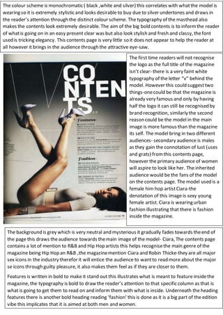
1. The colour scheme is monochromatic ( black ,white and silver) this correlates with whatthe model is
wearing so it is extremely stylistic and looks desirable to buy due to silver undertones and draws in
the reader’s attention through the distinct colour scheme. The typography of the masthead also
makes the contents look extremely desirable. The aim of the big bold contents is to informthe reader
of whatis going on in an easy present clear was but also look stylish and fresh and classy, thefont
used is tricking elegancy. This contents page is very little so it does not appear to help the reader at
all however it brings in the audience through the attractive eye-saw.
The first time readers will not recognise
the logo as the full title of the magazine
isn’t clear- there is a very faint white
typography of the letter “v” behind the
model. However this could suggesttwo
things-onecould be that the magazine is
already very famous and only by having
half the logo it can still be recognised by
brand recognition, similarly the second
reason could be the model in the main
image is more famous than the magazine
its self. The model bring in two different
audiences- secondary audience is males
as they gain the connotation of lust (uses
and grats) fromthis contents page,
however the primary audience of women
will aspire to look like her. The inherited
audience would be the fans of the model
on the contents page. The model used is a
female him hop artistCiara-the
denotation of this image is sexy young
female artist. Ciara is wearing urban
fashion illustrating that there is fashion
inside the magazine.
The background is grey which is very neutral and mysterious it gradually fades towards theend of
the page this draws theaudience towards themain image of the model- Ciara, The contents page
contains a lot of mention to R&B and Hip Hop artists this helps recognisethe main genre of the
magazine being Hip Hop an R&B ,the magazinemention Ciara and Robin Thicke-they are all major
sex icons in the industry therefor it will entice the audience to wantto read more about the major
se icons through guilty pleasure, it also makes them feel as if they are closer to them.
Features is written in bold to make it stand out this illustrates what is meant to feature insidethe
magazine, the typography is bold to draw the reader’s attention to that specific column as that is
what is going to get them to read on and inform them with what is inside. Underneath the heading
features there is another bold heading reading ‘fashion’ this is done as it is a big part of the edition
vibe this implicates that it is aimed at both men and women.