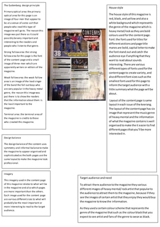
1. House style
The house style of thismagazine is
red,black, and yellow andalsoa
white background whichrepresents
the genre of the magazine whichis
heavymetal/rockasthey are bold
coloursusedforthe contentpage.
Font:the fontusedfortitles for
differentsectionsandpage title
manesare bold,capital lettertomake
the fontstand out andcatch the
audience eye if anythingthatthey
wantto read aboutsounds
interesting.There are various
differenttypesof fontsusedforthe
contentpage to create variety,and
alsodifferentfontsizessuchasthe
smallestfontusedforthispage to
informthe targetaudience witha
little summarywhatthe page will be
about.
Layout of the contentpage issame
layoutineach issue of the keerang.
The layoutof the contentpage has six
image that representthe musicgenre
of heavymental andthe information
of whatthe magazine containsiswell
organisedtomake the it easiertofind
differentpagesthatyou’ll be more
interestedin.
Imagery
This imagery used in the content page
of this magazine relates to what will be
in the magazine and also which pages
are more importantthan the others.
Each image used for the content page
are various differentsizes to what will
probably be the most important or
more interesting to read to the target
audience.
Design balance
The design balanceof the content uses
symmetry and informal balanceto make
the magazine to appear organised and
sophisticated as the both pages use the
same layoutto make the magazine look
professional.
Target audience andneed
To attract there audience tothe magazine theyvarious
differentimagesof heavymental/rockartistthat popularto
the audience toattract themto the magazine,because if they
see the imagesof certainartistthat theyenjoytheywouldbuy
the magazine toknow the information.
As theyuseda certaincolourscheme thatrepresentsthe
genre of the magazine thatsuch as the colourblackthat you
expecttosee artistand fansof the genre to wearas black.
The Guttenberg design principle
Primary optical area:the primary
optical area for this page is an
image of four men that appear to
be at a venue of some sortthat
people who read this type of
magazine will go to. The reason this
image was put there as itcould
possibly bevery importantand
interesting to the readers and
people who listen to that genre.
Strong fallowarea:the strong
fallowarea for this page is the font
of the content page and a small
image of three men which are
apparently writers or editors of the
magazine.
Weak fallowarea:the weak fallow
area is an image of the lead singer
of the band the fall outboys who
are very popular in the heavy metal
genre, the reason this imagewas
put there is to show the readers
that the information about them is
the leastimportant to the
magazine.
Terminal area: the terminal area of
the magazine is credits to those
who created this magazine.
2. The Guttenberg design principle
Strong fallowarea:the strongfallowarea is
focused on the what features in the magazine
the target audiencewill enjoy to read for
example Heidi who is a popular housemusic
dj and is also thefront cover this issues
magazine which will attractthe target
audiences as they will possibly befans of the
artistand festival previews where the target
audienceknow information aboutthe latest
festivals thatwould be great to go to, and too
listen to their favouriteartistperforming live.
Weak fallowarea:in the weak fallowarea the
focus here is on a free cd full of songs created
by upcoming djs that aresuccessful in the
house music genre the reason why the this
information was put there suggests to the
audiencethat’s it’s the leastimportant
information in the magazineand they want
their target audienceto buy the magazine for
the main content of the magazine which is
the festival season information notthe free
cd that comes with the magazine.
Primary optical area:the primary optical area
in this magazine is an imageof a music
festival and also information of different
events where there target audiencewill enjoy
going to such as Ibiza holiday is wheremost
house music festivals arebased atdue to the
weather and music.The reason the image
was put there as the issueof this magazine
was releasein May 2014 when the house
music festival startto appear and that when
many fans will liketo know where there
festival will beand fun would itbe to
experiences it.
Terminal area: the terminal area is focused
on the directory which the information is
based on house parties,clubs,questions,and
tellingpeople about their experience at these
different events. The reason why this is the
terminal area as many of the target audience
likegoing to these certain events as they only
play housemusic genre and that will attract
the their audienceto the magazine and buy
it, to find out where the best events are and
if they worth going to them or not.
Design balance
The design of the content page is
likesymmetry as each page has an
image each of events based around
the house genre and also have
both have information on each
page that will attractthe audience
to buy the magazine.
House style
Font: the font on these two pages of
the contents page are all bold and
quite artistic fontto represent the
house music genre, as this genre is
known for being very creativewhen
it comes to music.
Colour:the colour used for the
content page is a simpleblack and
white colour scheme but is very
effective as the black background
makes the white font that’s is
constantly used throughout the page
stand pout to the target audience.
And the black back ground helps out
the images used on this page to
make the images be the main focus
to attractthe audience not
everything around it.
Layout: the layoutof the content
page is symmetrical as both pages
use images and have the same
amount of information of what the
magazine contains.The layoutof the
magazine is well organized so it
easier to look what the magazines
contains and to focus more on the
images as the issueof the magazine
is when the music festival startto
rise.
Target audience andneed
The target audience forthis
magazine isforthose how are
interestedinhouse musicandalso
musicfestivalsasthe magazine
issue isall aboutupcomingmusic
eventsthatfansof the house
musicgenre will enjoygoingto.
Imagery
The images used are all based
around house music genre, as the
images seen in content pages areat
a music festival,a recordingstudio,
and image of two artists and two DJs
that appear to be in a club that
represent the whole house music
genre and where you expect to see
the music to be played at, and the
audiencewhile enjoy goingtoo.