Opportunities, challenges, and power of media and information
Front cover essay finished.
1. Media: Front Cover Analysis
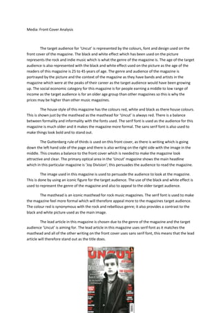
The target audience for ‘Uncut’ is represented by the colours, font and design used on the
front cover of the magazine. The black and white effect which has been used on the picture
represents the rock and indie music which is what the genre of the magazine is. The age of the target
audience is also represented with the black and white effect used on the picture as the age of the
readers of this magazine is 25 to 45 years of age. The genre and audience of the magazine is
portrayed by the picture and the context of the magazine as they have bands and artists in the
magazine which were at the peaks of their career as the target audience would have been growing
up. The social economic category for this magazine is for people earning a middle to low range of
income as the target audience is for an older age group than other magazines so this is why the
prices may be higher than other music magazines.
The house style of this magazine has the colours red, white and black as there house colours.
This is shown just by the masthead as the masthead for ‘Uncut’ is always red. There is a balance
between formality and informality with the fonts used. The serif font is used as the audience for this
magazine is much older and it makes the magazine more formal. The sans serif font is also used to
make things look bold and to stand out.
The Guttenberg rule of thirds is used on this front cover, as there is writing which is going
down the left hand side of the page and there is also writing on the right side with the image in the
middle. This creates a balance to the front cover which is needed to make the magazine look
attractive and clear. The primary optical area in the ‘Uncut’ magazine shows the main headline
which in this particular magazine is ‘Joy Division’; this persuades the audience to read the magazine.
The image used in this magazine is used to persuade the audience to look at the magazine.
This is done by using an iconic figure for the target audience. The use of the black and white effect is
used to represent the genre of the magazine and also to appeal to the older target audience.
The masthead is an iconic masthead for rock music magazines. The serif font is used to make
the magazine feel more formal which will therefore appeal more to the magazines target audience.
The colour red is synonymous with the rock and rebellious genre; it also provides a contrast to the
black and white picture used as the main image.
The lead article in this magazine is chosen due to the genre of the magazine and the target
audience ‘Uncut’ is aiming for. The lead article in this magazine uses serif font as it matches the
masthead and all of the other writing on the front cover uses sans serif font, this means that the lead
article will therefore stand out as the title does.
2. The target audience for ‘Vibe’ is shown in the same ways as ‘Uncut’, using the design and
colours to represent the genre of this magazine. The target audience for this magazine is around the
ages of 16 to 25 this is represented by a simple layout design used and also due to the context which
you can see on the picture for example the main image. The genre of this magazine is for pop and
rap. The social economic category of this magazine is for people who earn a middle to low range of
income and also students, this may be why this magazine is a monthly magazine.
The house style of this magazine has the house colours black, white and yellow. These are
clear, vibrant colours which connotes the music that the magazine is trying to portray. The font used
for ‘Vibe’ magazine is usually san serif this is due to the fact that the audience is relatively young and
if the magazine had serif font it would seem too formal for the target audience. The simple layout of
the magazine will attract the target audience to the magazine as they are of a younger age which
means that a simple layout with be more attractive for them.
The Guttenberg design principle is used on the front cover of this magazine. There is text
going down both sides of the page with a picture in the middle. This creates a balance to the front
cover which makes it more attractive as it is makes it easier to read and it doesn’t clog up with front
cover with too much writing which means there will be a lot of blank space which makes the picture
stand out. In the main optical area of the cover there is an ‘exclusive’, this means that the audience
of the magazine will see this first. This may persuade them to buy it.
The main image used is of a world famous artist, Drake. This picture would attract Vibes
target audience as Drake is one of the most popular artists at the moment. The image used has
informal balance as he is leant to one side. The text on the t-shirt is white in block capitals; it looks
like the masthead which gives connotations of ‘Vibe’ being ‘unstoppable’.
The masthead used is sans serif font which keeps to the magazines house style. This font is
used to keep the magazine informal and to attract there target audience. The colour of the
masthead has connotations of being clean and powerful.
There are two main articles in this magazine, one about Chris Brown and one about the
artist in the image, Drake. These two articles would entice the target audience as these two artists
are very popular at the moment. The lead articles keep to the house style of the magazine and keep
the font sans serif which means that it is a lot less formal.
3. The two magazines are very different as they aim for different target audiences. ‘Uncut’
aims for an audience of 25 to 45 whereas ‘Vibe’ aims for a lot younger audience of 16 o 25. This is
shown by the fonts used and also with the picture and the colours used. Although there audience
are very different the layout of the magazines are similar as they all have writing on both sides of the
front cover with a main image of a person don the middle. This means that both magazines have
balance.