
Recommended
More Related Content
What's hot
What's hot (19)
Similar to Analysis of dps 2
Similar to Analysis of dps 2 (20)
More from a2media14f
More from a2media14f (20)
Recently uploaded
Recently uploaded (20)
Analysis of dps 2
- 1. A N I S A I L Y A S ANALYSIS OF EXISTING DOUBLE PAGE SPREAD ARTICLES FOR TV SHOWS – RADIO TIMES
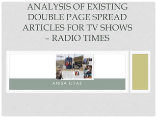
- 2. DOUBLE PAGE SPREAD ANALYSIS Header - The heading is placed at the top left corner of the magazine. This has been made as part of the background as I has been placed on top of it however it’s on a plan background therefore makes the text stand out. The heading is short and snappy and is very clear to the readers what’s going to be included in the double page spread. There are a reasonable amount of pictures across the double page spread, this is so that the reader can engage with the text. Also, so that they can visualize what is happening and allowing them to understand. Pictures tend to appeal more to the eye of the verge reader. There is usually an issue date at the bottom of the spread with the name of the magazine. Main image with some of the cast filming on location gives us an insight onto what the series of the show will contain. The fact that this double page spread is very image manipulated maybe shows that the target audience do not prefer to read large amounts of text. The tardis is also part of the picture because a doctor who viewer will immediately recognize this iconic image and therefore connote it to Doctor Who, despite the article not having a ‘Doctor Who’ title. Copy - This is an easy eligible text as it’s in Black font with a white background. Also, the language it is written in is not hard to interpret therefore suitable for everyone. Caption - Underneath the heading the caption reads ‘Thinking inside the box’ this is ironic as one of the images as the doctor who box, therefore relating to it. Rule of thirds Radio Times have followed the convention of a documentary magazine to allow the attraction of the audiences gaze to fall on to these hotspots of the magazine especially when the double page spread is dominantly image lead. Page number – is usually one of the main key conventions which helps the readers find out what page number it is. Text wrap – This is used on the double page spread to allow the image to be in front rather than the text first , this allows the audience to focus on the image, but also so it’s easier to see. The way the ‘secondary image’ is wrapped around the text suggests that radio Times want us to see the image on the left as well as reading. Drop cap – A drop cap has been used in the colour black at the beginning of this article to emphasize the importance of this paragraph. Colours – The colour scheme on this page is very simple. The dominant colours being Black and White.