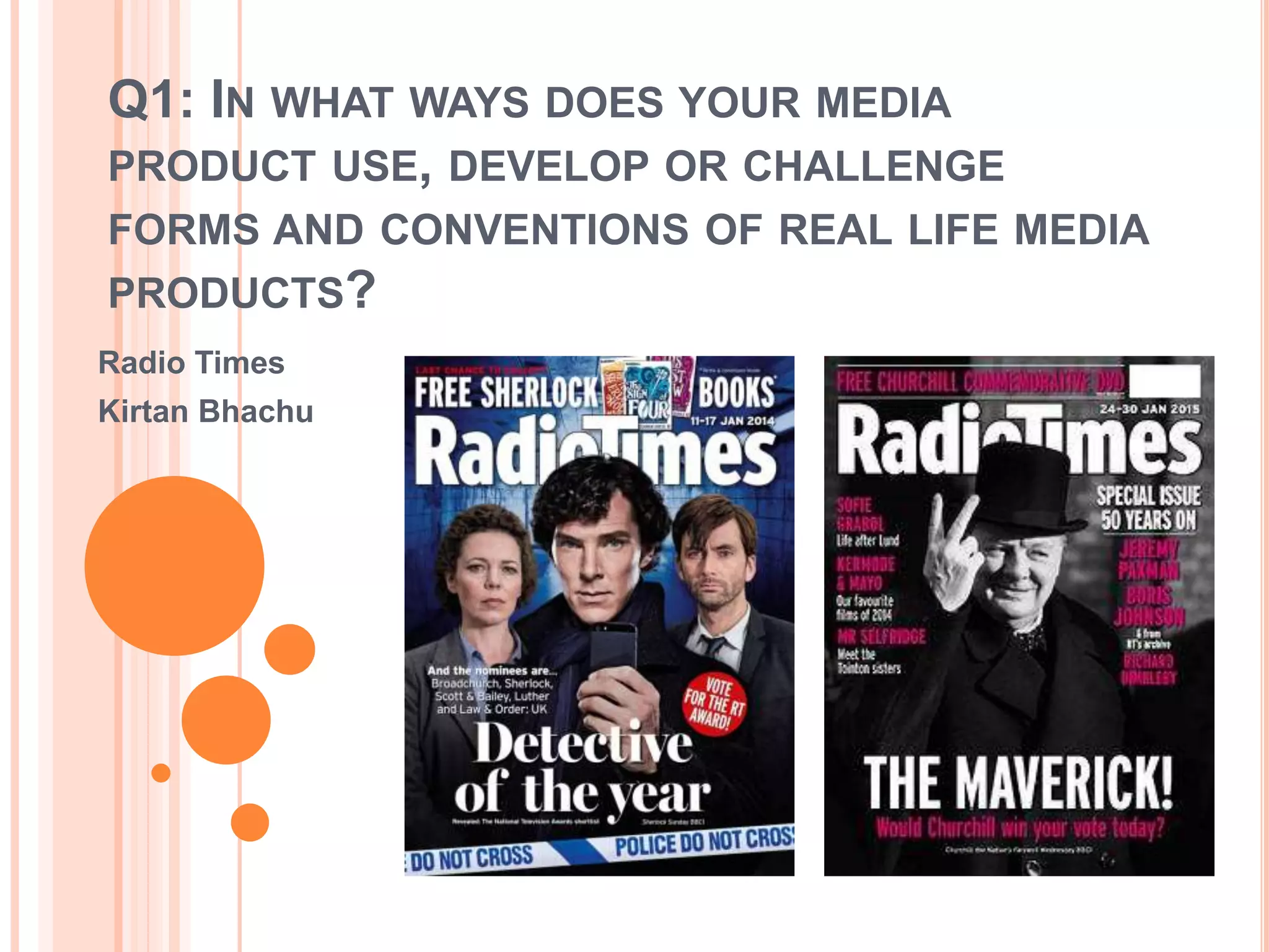
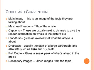
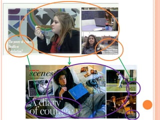
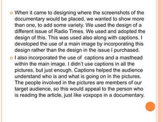
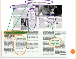
Q1: IN WHAT WAYS DOES YOUR MEDIA
PRODUCT USE, DEVELOP OR CHALLENGE
FORMS AND CONVENTIONS OF REAL LIFE MEDIA
PRODUCTS?
Radio Times
Kirtan Bhachu
Constructed own Magazine TV Listing – Double
Page Spread
Similar Product of Radio Times
(Original Copy)
Similar Product of Radio Times
(different copy)
CODES AND CONVENTIONS
 Main image – this is an image of the topic they are
talking about
 Masthead/header – Title of the article
 Captions – These are usually next to pictures to give the
reader information on who’s in the picture etc
 Standfirst – gives an overview of what the article is
about
 Dropcaps – usually the start of a large paragraph, and
also lists such as Q&A and 1,2,3 etc.
 Pull Quote – Gives a sneak peek of what’s ahead in the
article
 Secondary Images – Other images from the topic
 When it came to designing where the screenshots of the
documentary would be placed, we wanted to show more
than one, to add some variety. We used the design of a
different issue of Radio Times. We used and adopted the
design of this. This was used also along with captions. I
developed the use of a main image by incorporating this
design rather than the design in the issue I purchased.
 I also incorporated the use of captions and a masthead
within the main image. I didn’t use captions in all the
pictures, but just enough. Captions helped the audience
understand who is and what is going on in the pictures.
The people involved in the pictures are members of our
target audience, so this would appeal to the person who
is reading the article, just like voxpops in a documentary.
v
v
 When it came to the designing of the article itself, we did use
Dropcaps as it was a Q&A session with the makers of the
documentary. We didn’t really develop this convention, we just
used it as indicators of what was a question and what was an
answer. This was also used in the similar product I purchased.
 When it came to a Standfirst, we used the similar style of
Standfirst that was used in both the purchased issue and the
other issue. We used a Standfirst because this gives a good
overview of the article so that the audience can understand.
 When it came to placing when and where the documentary would
be broadcast, we placed it just underneath the Standfirst. We
used this convention but developed it by placing it where we did.
We decided to place it where it was easiest for the audience to
see it, instead on the top left hand corner.
 Just like in or similar product, we placed a pull quote to bring the
audience into the article. A pull quote is a convention we used but
didn’t develop as we placed it in a similar position to the
purchased similar product.
 Because our main magazine was Radio Times, we
added in a similar feature column on the Right hand
side. These included a Masthead/Header, Images,
and a mini article. We developed and challenged
this use of a mini feature article by including a Pull
quote. We also focused on one topic, which was
Jamie Oliver. This meant that there were no
subsections as shown through a similar product.
We also included one image, not a few as shown
through the similar product.

Q1 Magazinne Kirtan

  • 1.
    Q1: IN WHATWAYS DOES YOUR MEDIA PRODUCT USE, DEVELOP OR CHALLENGE FORMS AND CONVENTIONS OF REAL LIFE MEDIA PRODUCTS? Radio Times Kirtan Bhachu
  • 2.
    Constructed own MagazineTV Listing – Double Page Spread
  • 3.
    Similar Product ofRadio Times (Original Copy)
  • 4.
    Similar Product ofRadio Times (different copy)
  • 5.
    CODES AND CONVENTIONS Main image – this is an image of the topic they are talking about  Masthead/header – Title of the article  Captions – These are usually next to pictures to give the reader information on who’s in the picture etc  Standfirst – gives an overview of what the article is about  Dropcaps – usually the start of a large paragraph, and also lists such as Q&A and 1,2,3 etc.  Pull Quote – Gives a sneak peek of what’s ahead in the article  Secondary Images – Other images from the topic
  • 7.
     When itcame to designing where the screenshots of the documentary would be placed, we wanted to show more than one, to add some variety. We used the design of a different issue of Radio Times. We used and adopted the design of this. This was used also along with captions. I developed the use of a main image by incorporating this design rather than the design in the issue I purchased.  I also incorporated the use of captions and a masthead within the main image. I didn’t use captions in all the pictures, but just enough. Captions helped the audience understand who is and what is going on in the pictures. The people involved in the pictures are members of our target audience, so this would appeal to the person who is reading the article, just like voxpops in a documentary.
  • 8.
  • 9.
     When itcame to the designing of the article itself, we did use Dropcaps as it was a Q&A session with the makers of the documentary. We didn’t really develop this convention, we just used it as indicators of what was a question and what was an answer. This was also used in the similar product I purchased.  When it came to a Standfirst, we used the similar style of Standfirst that was used in both the purchased issue and the other issue. We used a Standfirst because this gives a good overview of the article so that the audience can understand.  When it came to placing when and where the documentary would be broadcast, we placed it just underneath the Standfirst. We used this convention but developed it by placing it where we did. We decided to place it where it was easiest for the audience to see it, instead on the top left hand corner.  Just like in or similar product, we placed a pull quote to bring the audience into the article. A pull quote is a convention we used but didn’t develop as we placed it in a similar position to the purchased similar product.
  • 11.
     Because ourmain magazine was Radio Times, we added in a similar feature column on the Right hand side. These included a Masthead/Header, Images, and a mini article. We developed and challenged this use of a mini feature article by including a Pull quote. We also focused on one topic, which was Jamie Oliver. This meant that there were no subsections as shown through a similar product. We also included one image, not a few as shown through the similar product.