
Recommended
More Related Content
What's hot
What's hot (20)
Viewers also liked
Viewers also liked (20)
Similar to TV Guide Article Layout Breakdown
Similar to TV Guide Article Layout Breakdown (20)
Recently uploaded
Recently uploaded (20)
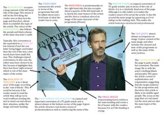
TV Guide Article Layout Breakdown
- 1. The MAIN HEADING occupies a large amount of the left hand side of the page. This means it will be the first thing the reader sees as they turn the page and therefore, allows them to establish the topic of the article. The colour of the MAIN HEADING also follows the purple and black scheme of the main character’s outfit. The STAND FIRST summarises the article in terms of the programme that will be talked about and a brief taste of what the reader has to come. The MAIN IMAGE is predominantly on the right hand side but also occupies about a quarter of the left hand side. It is clearly the main feature of the article and the shot is a medium shot of an image of the main character of the programme (House). The WRITER’S NAME is a typical convention of TV guide articles and, in terms of the rule of thirds; it is in a relatively dead area of the page. Although it is still visible so it makes the readers aware of ho wrote the article. It also fits around the main image by appearing as if it is sitting on the walking stick. This makes the article look more structured and professional. The SIDE QUOTE almost always accompanies an image. It gives context of the main image and often includes the channel and time of the programme as well as the name of the actor/actress. Typically, this convention is the equivalent to a DROP CAP but instead of just the one letter being bigger and bolder than the rest of the text, a few words have been made this way. This challenges typical conventions. In this case, the editor may have chosen to do this because it highlights that there has been ‘eight seasons’ which is one of the main topics of the article. The MAIN BODY OF TEXT/COPY is in a ‘dead area’ of the page, according to the ‘rule of thirds’. This could be because if the reader wants to read the article they will go on to read it without needing the text to stand out and attract their attention, unlike the image and main heading. The PAGE NUMBER AND PUBLISHER is a typical and important convention of a TV guide article and is almost always in the bottom corner of the page. It gives the article structure and shows a sense of professionalism as well as reinforcing the name of the magazine. The COLOUR SCHEME of the page is quite simple but consistent. The main image fits in with the actor’s clothing (black and purple). This gives the article a sense of sophistication and organization, suggesting that the target audience for the programme and, therefore, this article is likely to be middle-aged people. The areas on the page that are red stand out the most and are also the main topics of the article. The SMALL IMAGES (representing tears) reinforce the main heading and create a bit of humor with the readers because it is as if the heading is crying.