Analysis of media dps
•Download as PPTX, PDF•
0 likes•231 views

Analysis of published double page spreads.

Recommended
More Related Content
What's hot
What's hot (20)
Similar to Analysis of media dps
Similar to Analysis of media dps (20)
Recently uploaded
Recently uploaded (20)
Analysis of media dps
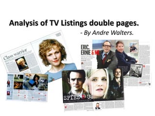
- 1. Analysis of TV Listings double pages. - By Andre Walters.
- 2. Title: A fundamental convention to any piece of media, whether it be newspaper, magazine, website, blog, app. This feature is used throughout TV listings, whether it be in another language or not. The big font catches the readers eye and the title gives an overview of the article usually within a couple of words. The words usually either very simple, or put together to cleverly but both still relating to the article. Drop Cap: Recognised widely as a popular convention regarding most articles not just TV listings, however it is found across a range of TV listings as a popular feature of an Article. The Drop Cap clearly shows the start of an article/paragraph. Caption: Follows the simple house style used for this Double page spread (Black and White, with bold fonts). The caption often tells a small amount but additional information about the image. For example, this caption reveals how Maxine was drunk when she audition for a film in the past. Date, broadcast time and channel: These conventions used across a range of TV listing Double page spreads. For Radio Times especially, it is often found at the beginning of the article. The placement of this convention tends to be the same across a range of double page articles. The information informs the reader about the broadcast time, the date it will be broadcasted on and the broadcast channel. By-line: A simple but popular feature, often the smallest text found across the double page. This convention simply credits the photographer, or often who the article was written by. Page number: This convention makes for easier reading for the reader, often out of the way of any copy and found in the bottom left/right corner OR the top left/right corner of the pages. Pull Quote: Often a quote “pulled” from the article, or it may be something the actor has spoken about in an interview etc relating to the written article. This smart convention breaks up the often used column structure and brings the reader attention to it. Placed below an image, the reader is more likely to look at the image then the pull quote. The font often being bigger than the articles font itself. Stand First: a popular convention used amongst TV listings as a way to encourage the reader to read on. Being the second largest font after the masthead, it can summarise the article or pose an interesting questions answered within the article. Again, a method to engage the reader. Layout: The layout of three columns is often used when the article only takes up one Main Image: side. The three column style For this Double Page Spread the image takes makes for easy reading, up the whole page on right, often the main often looking very image relates to the article. On this occasion professional and neat. The it relates directly to the female actor involved article often is wrote using in this programme. From the size of the chatty language, the style of image, the audiences attention is instantly this article seems to be quite grabbed, you may find yourself constantly informal and conversational glancing at the image when reading the alot of speech marks being article itself or reading this paragraph right used throughout. now.
- 3. Title: The title here uses a custom font, different to the double page spread on the page prior to this. The placement of the title is also different, this may be influenced by the house style of this double page. The main image taking up 75% of both pages. Nevertheless, the title almost sets the house style (White, red and black). Main Image: The main image here takes up 75% of the double page spread, condensing the copy to the lower third. The choice of image and placement also leads to a slight challenge of typical conventions, most other conventions all being placed in the lower third of the page. The main image features three characters from the new drama, all shown clearly. The size of the image will attract the reader to this page and hold their attention. Stand First: Again here, the stand first is in relation to the article, being the second biggest font on the page closely followed by the pull quote. The convention used to encourage the reader to continue reading the rest of the article, the stand first here giving an overview of the drama , boasting the cold war drama is new and recreates a period in history, telling readers what they can expect. Caption: The caption refers to the main image and often acknowledges actors in the image. For this double page, each actor is named and there character role told to the audience. Broadcast time, date and channel: A simple feature used to let the reader know when they can they view this programme, often placed before the beginning of the article as was shown in the double page prior to this. Drop Cap: As mentioned, a very widely used basic industry technique used to introduce the start of an article or paragraph. Reader have become used to this technique and can acknowledge that that is where they should begin reading the article from. The drop cap is capitalised and in a bold custom font, linking to the house style and title. Page Numbers: This convention makes for easier reading for the reader, often out of the way of any copy and found in the bottom left/right corner OR the top left/right corner of the pages. Layout: This layout uses short , but many columns. The short columns however may work in favour of Radio Times attracting readers as some of them may not want to always read over powering text heavy articles. Many publishers I think try to have a balance of image and text to ensure the reader does not feel the need to ignore/skip a double page at a glance. The house style is maintained throughout, and the short columns make for easy reading. Pull Quote: the pull quote is nicely positioned, placed centrally below the main image, but in between the short columns along the bottom. This pull quote acts a break in the article, again to the eye reducing the amount of reading a reader may feel they have to do. The pull quote is taken from something Alan Judd said in relation to the topic SPIES R US is based on, being the Cold War. The use of the smaller image is smartly used, the readers can see who is saying the quote as he is not part of the main image.
- 4. Conclusion!! To summarise, The double pages shown are a couple analysed by myself, with other group members also analysing other double pages. I feel this has successfully developed my knowledge further of double pages, many features being similar to what we learnt in AS Media. However, it was important to not assume the styles were exactly the same as magazine double page spreads. The group will now discuss the appropriate style we will go for to suit our Documentary based on Violent Crime. We look forward to putting our double page together, possibly challenging a few conventions to suit our target audience being younger than my assumption of a TV Listings like Radio Times target audience. I did try to found out the Target audience for Radio Times, but information was scarce, but I believe my assumption may be correct, as I feel readers of TV Listings would be of a much older age.