
Recommended
More Related Content
What's hot
What's hot (20)
Viewers also liked
Viewers also liked (17)
Similar to Magazine Front Cover Analysis 2
Similar to Magazine Front Cover Analysis 2 (20)
More from StephanieAlabi
More from StephanieAlabi (19)
Recently uploaded
Recently uploaded (20)
Magazine Front Cover Analysis 2
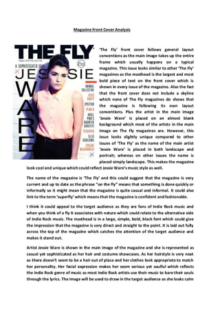
- 1. Magazine Front Cover Analysis ‘The Fly’ front cover follows general layout conventions as the main image takes up the entire frame which usually happens on a typical magazine. This issue looks similar to other ‘The Fly’ magazines as the masthead is the largest and most bold piece of text on the front cover which is shown in every issue of the magazine. Also the fact that the front cover does not include a skyline which none of The Fly magazines do shows that the magazine is following its own layout conventions. Plus the artist in the main image ‘Jessie Ware’ is placed on an almost blank background which most of the artists in the main image on The Fly magazines are. However, this issue looks slightly unique compared to other issues of ‘The Fly’ as the name of the main artist ‘Jessie Ware’ is placed in both landscape and portrait; whereas on other issues the name is placed simply landscape. This makes the magazine look cool and unique which could reflect Jessie Ware’s music style as well. The name of the magazine is ‘The Fly’ and this could suggest that the magazine is very current and up to date as the phrase “on the fly” means that something is done quickly or informally so it might mean that the magazine is quite casual and informal. It could also link to the term ‘superfly’ which means that the magazine is confident and fashionable. I think it could appeal to the target audience as they are fans of Indie Rock music and when you think of a fly it associates with nature which could relate to the alternative side of Indie Rock music. The masthead is in a large, simple, bold, black font which could give the impression that the magazine is very direct and straight to the point. It is laid out fully across the top of the magazine which catches the attention of the target audience and makes it stand out. Artist Jessie Ware is shown in the main image of the magazine and she is represented as casual yet sophisticated as her hair and costume showcases. As her hairstyle is very neat as there doesn’t seem to be a hair out of place and her clothes look appropriate to match her personality. Her facial expression makes her seem serious yet soulful which reflects the Indie Rock genre of music as most Indie Rock artists use their music to bare their souls through the lyrics. The image will be used to draw in the target audience as she looks calm
- 2. and approachable so people would feel comfortable buying the magazine. Her costume is quite smart yet casual which could show us that she isn’t as carefree as other Indie Rock artists and can be quite contained with her music and lyrics. Her body is fairly open but also half-hidden so that she doesn’t lose her cool persona but can still draw in the audience. There are not many sell-lines used in this issue of The Fly because maybe they wanted to focus on the Indie Rock music and the different artists that are going to be featured in it. However the sell-line ‘a sophisticated soul’ is used to describe the main artist Jessie Ware and this entices the audience to buy the magazine as if they are fans of her music they will want to find out more about her and how her personality is sophisticated. Also this draws in the audience as by describing her as a ‘soul’ they could be referencing her style of music because she may sing from the heart. The sell-line is also simple and could reflect the simple nature of the front coverbut also sounds catchy because of the use of alliteration. The other sell-lines on the magazine are just various names of other Indie Rock artists that feature in the magazine e.g. Ellie Goulding, Eugene McGuiness and Bloc Party. This draws in the audience as they would recognise the names of the artists and want to find out how they feature in the magazine as they are not given any extra information on the front cover. The sell-lines are presented on the far right side of the magazine and are placed in a column without anything else cluttering them. This shows that the magazine puts celebrating music their main priority. They all have the same sized thin, sans-serif font but they range from the colour blue to rose alternatively. This could mean that the sell-lines in blue catch the attention of the target audience more than the ones in rose as they are darker and easier to read. The main sell-line of Jessie Ware’s name dominates the entire left-hand-third and this shows that the magazine is putting a heavy influence on her in the magazine as the audience’s eye is instantly drawn to the left-hand-third. In this issue of ‘The Fly’ magazine, the main artist Jessie Ware takes up all of the front cover with the sell-lines placed around her and the masthead takes up the entire top of the front cover instead of their being a skyline. This layout is continued on all ‘The Fly’ magazines as the artist in the main image is placed on a blank background so that they are the main focus of the front cover; this maintains the brand identity of the magazine. The magazine ‘The Fly’ is free and they promote this by putting it underneath the masthead in a black circle prominently whereas on other magazines that charge a price, it is normally hidden at the bottom of the front coverin a small font. The colour scheme of the front cover is mainly black, blue and rose. They are effective as they are bold and to the point and it gives the magazine an edgy but soft look which reflects the Indie Rock genre as it can be hard yet soulful. The sans serif font is simple yet it stands out because of its size which can attract the readership to the magazine. I think
- 3. this front cover is effective as it is straight to the point about the fact that it is an Indie Rock magazine as it showcases Jessie Ware and the names of the other artists. Also I think the front cover draws in the audience well by teasing information that makes the readership want to buy the magazine so they can read the information that is inside. I think it will be successful in drawing in its target audience as it presents the genre well and the readership will recognise this and want to purchase the magazine.