
Recommended
More Related Content
What's hot
What's hot (20)
Viewers also liked
Viewers also liked (15)
Similar to Front Cover Analysis
Similar to Front Cover Analysis (20)
More from Shauna-Mullen
More from Shauna-Mullen (20)
Recently uploaded
Recently uploaded (20)
Front Cover Analysis
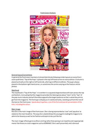
- 1. Front Cover Analysis General layout/conventions In general the front cover maintains its brand identity by following similar layouts on every front cover published. ‘Top of the Pops’ is placed in the top left hand corner on every edition. A column is placed vertically on the right or left hand side, altering on different editions. The pug is always placed in the bottom right hand corner, or sometimes the centre varying on the feature article photos. Masthead The masthead is “Top of the Pops”. It is written in a squared shape text box with stars across the top and bottom, insinuating that the magazine provides the latest gossip about “stars” at the “top” of the pop music industry and will therefore appeal to the target audience as that is what they aim to get from the magazine. The font type is Display as it is bold and bulky, standing out from the rest of the text on the front cover. Speak about typeface, size of the font and overall presentation of the title, including the colour. Main Image Rita Ora is the main image of the front cover. She is being represented as ‘cool ’ and ‘pop diva’ as stated on the main headline. The way she is styled allows the young girls reading the magazine to admire her beauty as well as her fashion and aspire to be just like her. The main image reflects genre as Rita is smiling rather than posing in an impolite and inappropriate manor like those on a rock magazine such as KERRANG! She is well presented, and is dressed
- 2. appropriately so parents of the girls purchasing the magazine will have no issue in their daughters wanting to purchase clothing items such as the ones Rita is wearing in this specific photo. Readership could be influenced by the idea that if someone had never purchased ‘We Love Pop’ before and one of their favourite female artists is Rita Ora and they see her on the front , this would provoke and encourage them to buy it. Additionally, it will also draw in existing fans. The mise-en-scene of the magazine is typical of a pop magazine. The background is white which is a popular choice on most pop magazine, and can be seen as a convention. The main sell line is often written over the main image or close beside it. This gives a clear indication of the idea that they belong together, so it is easier for the younger generation to establish. Other feature article photographs are used in order to lure the target audience in even more as they are made aware that more of their favourite artists have some part within the magazine. Not only celebrities are used to invite the audience in but so are the latest fashion tips, appeal to another side of the audience. Fun puffs and colours are also used to reflect the age group of the audience. Iconography of this particular cover of ‘We Love Pop’ could include the idea that all those present on the cover are all smiling. This reflects the pop genre in the sense that they are all smiling and happy creating a good and positive example for their fans as they are all role models and should therefore give of a good impression. As pop is mainly attracted by young girls, the fact that the main image is of a ‘diva’ with in the industry, it creates idolism as they would want to be just like her. Additionally by having male artists such as Harry Styles, JLS, members of The Wanted and Lawson on the front it is more likely to have an appeal than if a female artist was on the front, despite young girls idolising female artists, they tend to ‘fan girl’ more over male artists. Additionally, it is a convention that men tend dominate the front cover of magazines. Sell-lines The sell line in relation to the main sell line is “How cool is Rita Ora? The pop diva’s incredible rise to the top... in her slippers!” the used of the word cool relates to the audience as it is terminology they are familiar with, so it’s like they are conversing with a friend rather than reading a magazine. Other sell lines include “boy confessions”, “boy secrets” and “boys exp osed” featuring Harry Styles, Taylor Swift and Lawson. There is an “also inside” list, this entices the reader as they would want to know what the magazine has to say about more of their favourite artists and the only way to do this would be by purchasing the magazine. The mode of address used in the sell -lines makes the target audience more distinguished. Words such as “cool” are used which reflect the audience perfectly, as they are young girls/early teens their language in context to a magazine is informal and ‘slang words’ (buzz words) are used as a form of communication. This is further highlighted by the fact some words are shortened, such as the word celebrity. The word ‘celeb’ is used instead. The sell-lines are placed vertically on the left hand side of the magazine in the left hand third. The name of the artists is written in white with a pink background with a sneak peak of the article about them written in red – as the sell line. With the artists name written in black. All the colours used are conventionally used on a pop magazine and the style in which it is done also reflects one of a pop magazine. Other sell lines are placed at the bottom of the page – these are, which look to be, smaller articles such as “I’d lick someone toe!” Lastly, another sell line is written in a puff, a small shape with
- 3. text inside. In this case it is – “Your instant makeover. Fashion fixes in a flash”. The layout of the sell-lines clearly indicates which are perhaps more important – those in the left hand third. Layout The layout is near enough the same on every edition of ‘Top of the Pops’, with few changes the positioning of the sell-lines. This helps to maintain the brand identity of the magazine. The masthead is always placed on a slight slant in a squared text box in the top left hand corner. With the main image just to the right of it, taking up the majority of the front cover, with sell lines placed around it. The main sell line is always placed on the main image or right beside it to link the two together. The choice of layout is clear, and it does not look overly crowded. It is easy to establish what is what and the content of the magazine. The setup of this particular front cover is interesting in the use of colours and the general set up itself. It is clear to the reader what is inside of the magazine. The feature photos are of a good size so they are easy to see but do not take up to much space, as is the text. Colours The colours used all reflect the genre of the magazine – they are all vibrant colours which match the upbeat music produced in the pop industry. The same colours are used throughout the magazine as well as throughout different editions, maintaining the magazines brand identity.