
Recommended
More Related Content
What's hot
What's hot (20)
Viewers also liked
Viewers also liked (18)
Similar to Close-Up Portrait Reveals Artist's Journey
Similar to Close-Up Portrait Reveals Artist's Journey (20)
Close-Up Portrait Reveals Artist's Journey
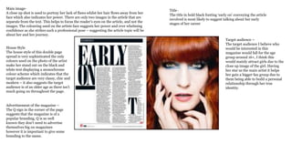
- 1. Main image- A close up shot is used to portray her lack of flaws whilst her hair flows away from her face which also indicates her power. There are only two images in the article that are separate from the text. This helps to focus the reader's eyes on the article, and not the images. The colouring used on the artists face suggests her power and over whelming confidence as she strikes such a professional pose – suggesting the article topic will be about her and her journey. House Style The house style of this double page spread is very sophisticated the only colours used on the photo of the artist make her stand out on the black and white text displaying a monochrome colour scheme which indicates that the target audience are very classy, chic and modern – it also suggests the target audience is of an older age as there isn’t much going on throughout the page. Advertisement of the magazine – The Q sign in the corner of the page suggests that the magazine is of a popular branding, Q is so well known they don’t need to advertise themselves big on magazines however it is important to give some branding to the name. Title - The title in bold black fonting ‘early on’ conveying the article involved is most likely to suggest talking about her early stages of her career Target audience – The target audience I believe who would be interested in this magazine would fall for the age group around 16+, I think this would mainly attract girls due to the close up image of the girl. Having her star as the main artist it helps her gain a bigger fan group due to them being able to build a personal relationship through her true identity.
- 2. The main front shot of the artist conveys who to the reader who the articles about, the facial expression she displays suggests the article being about an experience she has gone through - the black and white effect on her highlights the professional mannerism of the magazine The small font writing comes across as if its too small to read however once zooming in its very easy to understand, it suggests a sophisticated feel to the magazine as only a few words are in a different sized witting/font. The colours used are minimal throughout this double page spread as they choose to stick to a more sophisticated edge by using a black and white image with black witting however the bold sharp red L is used which creates a classy professional look rather than the colours being too much. Due to the page break of black and white the red L is the only thing in which ties the magazine together. The layout throughout is very plain as half of the whole double page spread is dedicated to the artist used displaying they want her to have the biggest role throughout the article. The beginning of a new paragraph starting with the large capital 'S' and 'I' suggests an importance of that particular paragraph within the article, it draws attention to audience to read that set section. The beginning of a new paragraph starting with the large capital 'S' and 'I' suggests an importance of that particular paragraph within the article, it draws attention to audience to read that set section.
- 3. Purpose Overall, the article does not demand prior knowledge as the in depth article has background information at the beginning of its paragraphs; the only information that is expected from the audience is that they are aware/they know who Adele is. The article informs the reader of the time that the article is set in, which is just after an award show in 2011, and informs the reader of whom Adele is, in case they didn't know who she was and if they was to know who she was then her fans can get involved. Main image – The main image of Adele over powers the page, the surprising elegant look that she pulls suggests how much of a powerful woman she is in the music industry. The side look suggests her indicating a thoughtful look – there are no other images used on the article suggesting that they want her to be the star involved. Title The title of the double page spread is very striking and big to attract attention from the audience this will attract the audience into reading the magazine as it stands out and uses the main artists name which will gain her more publicity. The use of alliteration is used to make the title stand out whilst sticking to the colour scheme of black which stands out against the light hues of grey and white this gives a professional feel to the magazine whilst ensuring it doesn't look kiddy.. The logo of „WOMEN WHO ROCK 2012‟ enforces the audience want to read the article and placing it by the title makes it more eye- catching as it’s a big well known brand. House Style The house style of this double page spread is very sophisticated, the colour scheme of black and white which indicates that the target audience are very classy and modern. The purple back drop indicates the target audience is most likely to be enjoyed by girls as it signifies a girly colour. Audience I think that this magazine is aimed at women aged 17 and over. This front cover in particular is aimed at those who like heavy rock music and are particularly influenced by music and fashion as they use an artist like Adele herself who conveys all these aspects. This is portrayed by the demographics that this magazine fits within.