SlideShare a Scribd company logo
1 of 5
Contents Page Analysis
This specific contents page from ‘Top of the Pops’ follows conventions. Contents pages are a
combination of both text and images, around 50% each, and this convention is followed. A few of the
images have a small caption relating to the article or the number of the page it is placed on. The
images and colours used are all a reflection of the target audience as well as the style of the magazine.
The fonts used help to keep brand identity as the same fonts are used on front covers and throughout
the rest of the magazine. The editors letter from ‘Zoe’ adds an extra, personal touch, making her seem
like a friend to the audience!
The first thing the audience are presented with is the title: “Inside your mag...”, it is written in a bold,
bulky font. “Inside your” is written in white in normal lower cap letters apart from the first letter. The
colour white represents wholeness and completion, this highlights that the magazine completes the
audience. Also, the used of direct address gives the audience a feel of ownership in the sense that it is
their magazine. Whereas “mag” is written in black, in a different font and in capital letters. The colour
black represents the unknown and the hidden, this could relate to the idea that the audience do not, as
of yet, know the content of the magazine and that this is what they are about to find out. Also, the
word “mag” is used an as abbreviation from the word magazine, this ties in with the mode of address
whereby many words are abbreviated such as “goss” from “gossip, this overall allows the audience to
see as someone they can speak to as a friend, speaking in a ‘language’ of abbreviate and slang that
they are used to.
The title of the contents page is placed in the top right hand corner, which is the first thing that the
audience are going to see. It is placed in a speech mark, or a text bubble, highlighting that the contents
page has information that the audience are going to be interested in.
There is more text across the page such as the categories: "On the cover", “All about you”, “Wins and
offers”, “Celebs and Gossip” and “We love shopping” are also written in a similar font. They are also
written in a white font, with a purple background. The colour purple is a colour of imagination. It
helps to stimulate the imagination and helps to inspire and allow us to get in touch with deeper
thoughts. This relates the the content of the magazine, as it aims to help the audience engage with
celebrities on an deeper level and inspires them to be just like their favourite artists by reader articles
on experiences they have been through.
All other text/content is written in a different fonts: that are a lot smaller, in black, either in bold
(which is the main feature of the article) with the rest in standard text such as, “Kimberley Walsh
steps into the spotlight” and “Battled of the boybands Union J and District 3 fight it out.”
The main image on the contents page is of a front cover of a “Top of the Pops” magazine, containing
George Shelly and other artists such as Rita Ora and Justin Bieber. George Shelly is next to another
male artist who are both back to back wearing the colours purple and grey. Purple is a colour often
used to represent the future, what these two boys are doing - they are representing the future of the
pop industry. Both boys are smiling towards the camera and looking directly at it (direct address).
They also both have their hair swept over their face and rather long, making them look younger and
“cute” this helps to tie in with the sell line that complies with the image “battle of the fittest”. This
however, could have a double meaning, it could refer to being physically fit or the slang term fit as in
good looking.
Rita Ora looks to be wearing a red/orange jacket. She also looks to be sitting down. She is giving the
audience direct address as she is looking directly at the camera from a low angle, smiling up. Her hair
is dip-dyed, it is a very light brown at the top, fading into a bright blonde, it is short and is cut just
above her shoulder and is styled in loose curls. Her make up is very subtle, other than her red lipstick
to match the colour of her jacket!
Also on the contents page, in the bottom left hand corner there is an image of Niall Horan. This image
is a medium close-up. He is wearing a light blue t-shirt with two navy buttons in the centre at the top
of his shirt, located where buttons would be on a regular, smart shirt. His body position looks like he
is in a school photograph, with his body facing right with his face towards the left. He is smiling
directly at the camera, with his cute smile showing of his braces. His hair looks to be a combination of
being ‘spiked’ up but with a quiff, so it looks more natural and big rather than gelled. He also has
blonde highlights that are growing out. The image itself is placed on a dark blue background rather
than a white background. The colour blue is a colour of trust, honesty and loyalty, this could reflect
Niall as a person as both the background and his costume is blue.
Just above the image of Niall, there is an image of Jay from The Wanted. It is a close up image of jay,
whereby we can only see from his shoulders and above. From what we can see his costume consists of
a white shirt with black details on it - on the inner section of the collar. Jay is smiling at the camera,
giving of direct address, however he is not smiling with a big cheesy grin showing his teeth of, but a
more subtle and shy smile. His hair is styled the same way as always, big and curly, his signature
hairstyle that makes him stand out from the rest of the boys in the band. The colour white can
represent the idea of wholeness, which could reflect the idea that Jay completes the band and the
colour black represents being hidden, as he is not as loud as the other boys so it creates a form of
mystery in the sense that he is quite quiet.
Above this and below the editor's letter, there are three images, which include three artist with both
Zoe and Liz, the editors of the magazine. This shows that those working at Top of the Pops get up
close and personal with the celebrities. This will therefore make the audience adore the magazine
even more knowing that both Zoe and Liz get up close and personal with the artists. It also puts a lot
more trust between the audience and the magazine, making the audience believe that all the content of
the magazine is true and reliable.
These artists reflect the genre of the magazine as they are all pop artists. The small image of the front
cover is annotated, those reading this will be pleased with this as they will be eager to get to the
content presented on the front. Other images on the contents page include Niall Horan from One
Direction, Jay from the Wanted and the boys from Union J. In all these images, the artists are a
smiling - or in Union J’s case - messing about - which reflects the personality of the audience - fun
and happy! Words such as “fittest” is presented, which is a term that the target audience will be
familiar with, creating a mode of address that the audience will understand. These images will be used
to draw the audience in as they are all there favourite artists, so they will want to read about every
single one of them. By having loads of pictures, the audience can see straight away who features in
the magazine rather than reading through it to find out. Most of the images are placed vertically down
the right hand side, so that they audience can look down through all of them, rather than them being
scattered all over the page. This is good for the audience as the contents page is very visual. This
reflects their age group, as it is more fun and intriguing for them, rather than having the page just
covered in words. Despite it having lots of images, it gives of information with these images and helps
to give the audience a further insight as to what’s inside.
The magazine content is written in a small text box’s across the bottom of the page. There are five
sections as well as an editor's letter. The editors letter is in the top right hand corner, away from the
content of the magazine - perhaps implying that it is not as important as the content of the magazine,
which is what the audience will be more eager to find out. In the middle section of the content page,
towards the left is a section called “On the Cover” whereby there is a screenshot of the front cover of
the magazine, labeled with page numbers, this is helpful to the audience as they are going to buy the
magazine based on the content of the front cover, so they will be able to find the page numbers easily
with this idea, instead of them having to go through all the headlines/titles trying to find the article
they want to read of the front cover. Just underneath, there is a section called “All About You” which
is a section that revolves around the audience, including articles such as “Oops! Your shameful
stories” and “Quiz - Discover your dating super-powers”. This gives an insight as to things that the
audience are interested in - such as reading embarrassing stories about one another. It also represents
that the audience are comfortable enough with the magazine to share embarrassing stories with them,
further indicating that the magazine is like a friend to the audience! Underneath this is “We Love
Shopping” with a heart rather than the word love/heart which has thirteen pages full of ‘high street
fashion and beauty’. This reflects the age of the audience, they are not writting phrases out in full, but
are using a code instead. Also, it reflects that fashion must be important to the reader if 13 pages are
dedicated to it. Next to this in the centre of the page towards the bottom is “Wins & Offers”which has
five different prizes for the audience to win, they include a ‘lip and beauty set’, ‘1D headphones’,
‘Union J’s hot hoodie’ and many more. This highlights gifts and prizes that the magazine typically
offers its audience, this shows some of the audiences likes and what prizes they look forward to
winning! Lastly is “Celeb & Gossip” which is the main content of the magazine focusing on all that
is going on in the Celebrity world, which is generally the reason why the audience brought the
magazine and therefore highlights the audiences overall interest, this is placed last as those reading it
would say.. “best till last”.
The mode of address of the contents page is mainly abbreviations making them into shortened words,
which is something the target audience would do in their normal speech, when not reading the
magazine. An example of this is the word “goss” which is abbreviated from “gossip”. Also wording
used often have been modernised and the audience are able to interpret it with the modern version in
comparison to someone older. An example of this is the word “fittest” the audience will take this
word in the context it means someone is good looking, however, someone older will take it as being
physically fit. Also, words such as “aww!” are used, which the audience will use a lot whilst reading
the magazine, “awwing” about how cute there “fave” artists are. The mode of address is perfect for
the audience as it is at the right level of intellect as it will be an easy read for them and won’t be
challenging.
The editors letter takes up a small section of the page - but it still very noticeable and will be one of
the first things the audience will read. The mode of address uses words that the audience will be
familiar with such as “lushest”, “fitties” and “aww!”. By using terminology like this the audience can
relate to the magazine like a friend. It is used to interact with the reader, as well as to inform them on
what the issue contains, drawing the reader in. Specific parts of the editors letter that will draw the
reader in is “we’ve packed all the lushest lads into this issue!” making the reader think of all their
favourite male celebrities, who could potentially be inside the issue! Also, the last line of the editors
letter draws the reader in even more as their is an underlying mystery behind it, making the reader
want to turn to the page straight away. The last line says: “If that lot doesn’t make your heart skip a
beat, turn to page 30, to find fave celebs revealing the true meaning of love… aww!”. The letter
begins in a handwritten purple text saying “Hey Girls!” which firstly, states the target market for the
magazine, it also gives a bold introduction to the letter itself, attracting the girls to read it as it
suggests there is something important Emily has to say. It is signed of in the same purple text with the
word “Emily” followed by an “X” (kiss). The fact it is written in handwriting implies that Emily
actually signed it herself. This makes the letter feel like it was personally written to the audience,
making them feel special. It also refers back to the idea that the magazine is not just a magazine, but
also a friend.
There is a boy alert symbol also, just below the “inside your mag”. It is in a black puff, with “we love
boys” with the love being replaced by a love heart shape. The text below is written in white saying
“We’ve highlighted everywhere you can find out about fit lads with this symbol”. With a small blue
text box, with “BOY ALERT!” written inside it. The colour blue is a colour of responsibility, and this
blue symbol is responsible to alert the audience when their is a boy alert within the magazine.
The contents page is very similar in layout across many editions/issues of ‘Top of the Pops’, this
maintains brand identity as well as the benefits of those reading it as they are used to the set up and
can gather the information they need quickly within having to search for it. The choice of layout is
very clear, the editors letter on the right, with the rest of the content spread widely across the page,
with pictures scattered around everywhere.
The colours used are purple, blue, yellow and pink. These colours represent the upbeat and bubbly
girls who will be reading the magazine as the colours themselves are bright and vibrant. The colours
are also used to maintain brand identity as they are used in almost every edition, varying slightly. The
colour purple dominants the page and is a colour of imagination, perhaps presenting that the contents
page is imaginative, as our the pages that it links to.

More Related Content

What's hot

Music magazine analysis
Music magazine analysisMusic magazine analysis
Music magazine analysisellentozer
 
AQA GCSE Media Studies - Coursework assignment 1 - Magazine covers
AQA GCSE Media Studies - Coursework assignment 1 - Magazine coversAQA GCSE Media Studies - Coursework assignment 1 - Magazine covers
AQA GCSE Media Studies - Coursework assignment 1 - Magazine coversMike Gunn
 
Analyzing magazines
Analyzing magazinesAnalyzing magazines
Analyzing magazinesMegan Allen
 
Nme analysis
Nme analysisNme analysis
Nme analysismagda rak
 
Double Page Spread Analysis 1
Double Page Spread Analysis 1Double Page Spread Analysis 1
Double Page Spread Analysis 1KirstyMaeHarragan
 
Media page designs
Media page designsMedia page designs
Media page designs10BeatBe
 
Music magazine analysis
Music magazine analysis Music magazine analysis
Music magazine analysis ellentozer
 
GCSE Magazine Research and Planning
GCSE Magazine Research and PlanningGCSE Magazine Research and Planning
GCSE Magazine Research and PlanningNeill Ford
 
Signs and Signifiers
Signs and SignifiersSigns and Signifiers
Signs and Signifiersanniemyatt
 
Textual Analysis of "Real Texts"
Textual Analysis of "Real Texts"Textual Analysis of "Real Texts"
Textual Analysis of "Real Texts"10BeatBe
 
5) evaluation: how did you attract your target audience
5) evaluation: how did you attract your target audience5) evaluation: how did you attract your target audience
5) evaluation: how did you attract your target audienceJessica Davies
 
Front Cover Analysis
Front Cover AnalysisFront Cover Analysis
Front Cover AnalysisShauna-Mullen
 
Music magazine analysis
Music magazine analysis Music magazine analysis
Music magazine analysis ellentozer1
 
Analyzing mag. covers
Analyzing mag. coversAnalyzing mag. covers
Analyzing mag. coverseliseapall
 
Presentation1.pptx signs and signifiers
Presentation1.pptx signs and signifiersPresentation1.pptx signs and signifiers
Presentation1.pptx signs and signifiersanniemyatt
 
Detailed analysis of front cover
Detailed analysis of front coverDetailed analysis of front cover
Detailed analysis of front coverdjames127
 
Magazine Research - AS Media Studies
Magazine Research - AS Media StudiesMagazine Research - AS Media Studies
Magazine Research - AS Media StudiesStephStafford01
 
Research course work
Research course workResearch course work
Research course workmaleneriise
 

What's hot (20)

Music magazine analysis
Music magazine analysisMusic magazine analysis
Music magazine analysis
 
AQA GCSE Media Studies - Coursework assignment 1 - Magazine covers
AQA GCSE Media Studies - Coursework assignment 1 - Magazine coversAQA GCSE Media Studies - Coursework assignment 1 - Magazine covers
AQA GCSE Media Studies - Coursework assignment 1 - Magazine covers
 
Analyzing magazines
Analyzing magazinesAnalyzing magazines
Analyzing magazines
 
Nme analysis
Nme analysisNme analysis
Nme analysis
 
Double Page Spread Analysis 1
Double Page Spread Analysis 1Double Page Spread Analysis 1
Double Page Spread Analysis 1
 
Radial Analysis
Radial AnalysisRadial Analysis
Radial Analysis
 
Media page designs
Media page designsMedia page designs
Media page designs
 
Music magazine analysis
Music magazine analysis Music magazine analysis
Music magazine analysis
 
GCSE Magazine Research and Planning
GCSE Magazine Research and PlanningGCSE Magazine Research and Planning
GCSE Magazine Research and Planning
 
Signs and Signifiers
Signs and SignifiersSigns and Signifiers
Signs and Signifiers
 
Textual Analysis of "Real Texts"
Textual Analysis of "Real Texts"Textual Analysis of "Real Texts"
Textual Analysis of "Real Texts"
 
5) evaluation: how did you attract your target audience
5) evaluation: how did you attract your target audience5) evaluation: how did you attract your target audience
5) evaluation: how did you attract your target audience
 
Front Cover Analysis
Front Cover AnalysisFront Cover Analysis
Front Cover Analysis
 
Music magazine analysis
Music magazine analysis Music magazine analysis
Music magazine analysis
 
Analyzing mag. covers
Analyzing mag. coversAnalyzing mag. covers
Analyzing mag. covers
 
Presentation1.pptx signs and signifiers
Presentation1.pptx signs and signifiersPresentation1.pptx signs and signifiers
Presentation1.pptx signs and signifiers
 
Textual analysis
Textual analysisTextual analysis
Textual analysis
 
Detailed analysis of front cover
Detailed analysis of front coverDetailed analysis of front cover
Detailed analysis of front cover
 
Magazine Research - AS Media Studies
Magazine Research - AS Media StudiesMagazine Research - AS Media Studies
Magazine Research - AS Media Studies
 
Research course work
Research course workResearch course work
Research course work
 

Viewers also liked

Viewers also liked (16)

Evaluation: Question One
Evaluation: Question One Evaluation: Question One
Evaluation: Question One
 
Evaluation: Question Seven
Evaluation: Question Seven Evaluation: Question Seven
Evaluation: Question Seven
 
Front Cover Overview
Front Cover OverviewFront Cover Overview
Front Cover Overview
 
My Images
My ImagesMy Images
My Images
 
Practice shots
Practice shotsPractice shots
Practice shots
 
We Love Pop Case Study
We Love Pop Case Study We Love Pop Case Study
We Love Pop Case Study
 
Double Page Spread Analysis
Double Page Spread AnalysisDouble Page Spread Analysis
Double Page Spread Analysis
 
Costume Analysis
Costume Analysis Costume Analysis
Costume Analysis
 
Prop analysis
Prop analysisProp analysis
Prop analysis
 
Locations
Locations Locations
Locations
 
Early idea's
Early idea'sEarly idea's
Early idea's
 
Question 2
Question 2Question 2
Question 2
 
Front Cover Analysis
Front Cover AnalysisFront Cover Analysis
Front Cover Analysis
 
Mock ups
Mock ups Mock ups
Mock ups
 
Slasher conventions
Slasher conventions Slasher conventions
Slasher conventions
 
Questionnaire Analysis
Questionnaire AnalysisQuestionnaire Analysis
Questionnaire Analysis
 

Similar to Contents Page Analysis

Contents Page Analysis
Contents Page AnalysisContents Page Analysis
Contents Page AnalysisShauna-Mullen
 
Task Four - Target Audience Appeal
Task Four - Target Audience AppealTask Four - Target Audience Appeal
Task Four - Target Audience Appeallouisangus
 
Detailed analysis of music magazine
Detailed analysis of music magazineDetailed analysis of music magazine
Detailed analysis of music magazineginagoodall
 
Front Cover Analysis
Front Cover Analysis Front Cover Analysis
Front Cover Analysis Shauna-Mullen
 
Contents page analysis.
Contents page analysis.Contents page analysis.
Contents page analysis.Levita123
 
Double pages spread analysis one
Double pages spread analysis oneDouble pages spread analysis one
Double pages spread analysis oneKirstyMaeHarragan
 
Magazine resarch powerp 2
Magazine resarch powerp 2Magazine resarch powerp 2
Magazine resarch powerp 2Jessica Smith
 
Top of the pops analysis
Top of the pops analysisTop of the pops analysis
Top of the pops analysisscoley
 
Magazine Analysis
Magazine AnalysisMagazine Analysis
Magazine Analysisitsdoublem
 
Annotations of double page spreads
Annotations of double page spreadsAnnotations of double page spreads
Annotations of double page spreadslucyvh
 
Annotations of double page spreads
Annotations of double page spreadsAnnotations of double page spreads
Annotations of double page spreadslucyvh
 
Magazine resarch powerp 2 final
Magazine resarch powerp 2 finalMagazine resarch powerp 2 final
Magazine resarch powerp 2 finalJessica Smith
 
Analysis of cover page
Analysis of cover pageAnalysis of cover page
Analysis of cover pageKlarasa098
 
Magazine anotation
Magazine anotationMagazine anotation
Magazine anotationsarahwalley
 
Contents page analysis
Contents page analysisContents page analysis
Contents page analysislilytaylor99
 
Front cover analysis
Front cover analysisFront cover analysis
Front cover analysisbhatty97
 

Similar to Contents Page Analysis (20)

Contents Page Analysis
Contents Page AnalysisContents Page Analysis
Contents Page Analysis
 
Task Four - Target Audience Appeal
Task Four - Target Audience AppealTask Four - Target Audience Appeal
Task Four - Target Audience Appeal
 
Class deconstructions 1
Class deconstructions 1Class deconstructions 1
Class deconstructions 1
 
Detailed analysis of music magazine
Detailed analysis of music magazineDetailed analysis of music magazine
Detailed analysis of music magazine
 
Front Cover Analysis
Front Cover Analysis Front Cover Analysis
Front Cover Analysis
 
Contents page analysis.
Contents page analysis.Contents page analysis.
Contents page analysis.
 
Double pages spread analysis one
Double pages spread analysis oneDouble pages spread analysis one
Double pages spread analysis one
 
Magazine resarch powerp 2
Magazine resarch powerp 2Magazine resarch powerp 2
Magazine resarch powerp 2
 
Top of the pops analysis
Top of the pops analysisTop of the pops analysis
Top of the pops analysis
 
Contents Page Analysis One
Contents Page Analysis OneContents Page Analysis One
Contents Page Analysis One
 
Magazine Analysis
Magazine AnalysisMagazine Analysis
Magazine Analysis
 
Annotations of double page spreads
Annotations of double page spreadsAnnotations of double page spreads
Annotations of double page spreads
 
Annotations of double page spreads
Annotations of double page spreadsAnnotations of double page spreads
Annotations of double page spreads
 
Magazine resarch powerp 2 final
Magazine resarch powerp 2 finalMagazine resarch powerp 2 final
Magazine resarch powerp 2 final
 
Analysis of cover page
Analysis of cover pageAnalysis of cover page
Analysis of cover page
 
Magazine anotation
Magazine anotationMagazine anotation
Magazine anotation
 
Magazine Analyses
Magazine AnalysesMagazine Analyses
Magazine Analyses
 
Magazine resarch
Magazine resarch Magazine resarch
Magazine resarch
 
Contents page analysis
Contents page analysisContents page analysis
Contents page analysis
 
Front cover analysis
Front cover analysisFront cover analysis
Front cover analysis
 

More from Shauna-Mullen

More from Shauna-Mullen (20)

3
3 3
3
 
Question 1
Question 1Question 1
Question 1
 
Storyboard
StoryboardStoryboard
Storyboard
 
Introduction to characters
Introduction to charactersIntroduction to characters
Introduction to characters
 
ideas for Non diegetic sound
ideas for Non diegetic soundideas for Non diegetic sound
ideas for Non diegetic sound
 
Lighting ideas
Lighting ideasLighting ideas
Lighting ideas
 
Inspirational director
Inspirational director Inspirational director
Inspirational director
 
Trailer analysis 2
Trailer analysis 2Trailer analysis 2
Trailer analysis 2
 
Magazine analysis 1
Magazine analysis 1Magazine analysis 1
Magazine analysis 1
 
Trailer overview
Trailer overviewTrailer overview
Trailer overview
 
Front cover overview
Front cover overviewFront cover overview
Front cover overview
 
Poster overview
Poster overview Poster overview
Poster overview
 
Further ideas for narrative
Further ideas for narrativeFurther ideas for narrative
Further ideas for narrative
 
Case Study
Case Study Case Study
Case Study
 
Camera idea's and analysis
Camera idea's and analysisCamera idea's and analysis
Camera idea's and analysis
 
Call Sheets
Call SheetsCall Sheets
Call Sheets
 
sub genre explanation
sub genre explanation sub genre explanation
sub genre explanation
 
sub genre explanation
sub genre explanation sub genre explanation
sub genre explanation
 
Trailer analysis friday the 13th
Trailer analysis friday the 13thTrailer analysis friday the 13th
Trailer analysis friday the 13th
 
Poster analysis a nightmare on elm street
Poster analysis a nightmare on elm streetPoster analysis a nightmare on elm street
Poster analysis a nightmare on elm street
 

Recently uploaded

Basic Intentional Injuries Health Education
Basic Intentional Injuries Health EducationBasic Intentional Injuries Health Education
Basic Intentional Injuries Health EducationNeilDeclaro1
 
ICT Role in 21st Century Education & its Challenges.pptx
ICT Role in 21st Century Education & its Challenges.pptxICT Role in 21st Century Education & its Challenges.pptx
ICT Role in 21st Century Education & its Challenges.pptxAreebaZafar22
 
latest AZ-104 Exam Questions and Answers
latest AZ-104 Exam Questions and Answerslatest AZ-104 Exam Questions and Answers
latest AZ-104 Exam Questions and Answersdalebeck957
 
Graduate Outcomes Presentation Slides - English
Graduate Outcomes Presentation Slides - EnglishGraduate Outcomes Presentation Slides - English
Graduate Outcomes Presentation Slides - Englishneillewis46
 
Sociology 101 Demonstration of Learning Exhibit
Sociology 101 Demonstration of Learning ExhibitSociology 101 Demonstration of Learning Exhibit
Sociology 101 Demonstration of Learning Exhibitjbellavia9
 
UGC NET Paper 1 Mathematical Reasoning & Aptitude.pdf
UGC NET Paper 1 Mathematical Reasoning & Aptitude.pdfUGC NET Paper 1 Mathematical Reasoning & Aptitude.pdf
UGC NET Paper 1 Mathematical Reasoning & Aptitude.pdfNirmal Dwivedi
 
21st_Century_Skills_Framework_Final_Presentation_2.pptx
21st_Century_Skills_Framework_Final_Presentation_2.pptx21st_Century_Skills_Framework_Final_Presentation_2.pptx
21st_Century_Skills_Framework_Final_Presentation_2.pptxJoelynRubio1
 
How to Manage Global Discount in Odoo 17 POS
How to Manage Global Discount in Odoo 17 POSHow to Manage Global Discount in Odoo 17 POS
How to Manage Global Discount in Odoo 17 POSCeline George
 
REMIFENTANIL: An Ultra short acting opioid.pptx
REMIFENTANIL: An Ultra short acting opioid.pptxREMIFENTANIL: An Ultra short acting opioid.pptx
REMIFENTANIL: An Ultra short acting opioid.pptxDr. Ravikiran H M Gowda
 
ICT role in 21st century education and it's challenges.
ICT role in 21st century education and it's challenges.ICT role in 21st century education and it's challenges.
ICT role in 21st century education and it's challenges.MaryamAhmad92
 
Unit 3 Emotional Intelligence and Spiritual Intelligence.pdf
Unit 3 Emotional Intelligence and Spiritual Intelligence.pdfUnit 3 Emotional Intelligence and Spiritual Intelligence.pdf
Unit 3 Emotional Intelligence and Spiritual Intelligence.pdfDr Vijay Vishwakarma
 
80 ĐỀ THI THỬ TUYỂN SINH TIẾNG ANH VÀO 10 SỞ GD – ĐT THÀNH PHỐ HỒ CHÍ MINH NĂ...
80 ĐỀ THI THỬ TUYỂN SINH TIẾNG ANH VÀO 10 SỞ GD – ĐT THÀNH PHỐ HỒ CHÍ MINH NĂ...80 ĐỀ THI THỬ TUYỂN SINH TIẾNG ANH VÀO 10 SỞ GD – ĐT THÀNH PHỐ HỒ CHÍ MINH NĂ...
80 ĐỀ THI THỬ TUYỂN SINH TIẾNG ANH VÀO 10 SỞ GD – ĐT THÀNH PHỐ HỒ CHÍ MINH NĂ...Nguyen Thanh Tu Collection
 
Fostering Friendships - Enhancing Social Bonds in the Classroom
Fostering Friendships - Enhancing Social Bonds  in the ClassroomFostering Friendships - Enhancing Social Bonds  in the Classroom
Fostering Friendships - Enhancing Social Bonds in the ClassroomPooky Knightsmith
 
On_Translating_a_Tamil_Poem_by_A_K_Ramanujan.pptx
On_Translating_a_Tamil_Poem_by_A_K_Ramanujan.pptxOn_Translating_a_Tamil_Poem_by_A_K_Ramanujan.pptx
On_Translating_a_Tamil_Poem_by_A_K_Ramanujan.pptxPooja Bhuva
 
Philosophy of china and it's charactistics
Philosophy of china and it's charactisticsPhilosophy of china and it's charactistics
Philosophy of china and it's charactisticshameyhk98
 
Tatlong Kwento ni Lola basyang-1.pdf arts
Tatlong Kwento ni Lola basyang-1.pdf artsTatlong Kwento ni Lola basyang-1.pdf arts
Tatlong Kwento ni Lola basyang-1.pdf artsNbelano25
 
SOC 101 Demonstration of Learning Presentation
SOC 101 Demonstration of Learning PresentationSOC 101 Demonstration of Learning Presentation
SOC 101 Demonstration of Learning Presentationcamerronhm
 
Food safety_Challenges food safety laboratories_.pdf
Food safety_Challenges food safety laboratories_.pdfFood safety_Challenges food safety laboratories_.pdf
Food safety_Challenges food safety laboratories_.pdfSherif Taha
 
Basic Civil Engineering first year Notes- Chapter 4 Building.pptx
Basic Civil Engineering first year Notes- Chapter 4 Building.pptxBasic Civil Engineering first year Notes- Chapter 4 Building.pptx
Basic Civil Engineering first year Notes- Chapter 4 Building.pptxDenish Jangid
 
COMMUNICATING NEGATIVE NEWS - APPROACHES .pptx
COMMUNICATING NEGATIVE NEWS - APPROACHES .pptxCOMMUNICATING NEGATIVE NEWS - APPROACHES .pptx
COMMUNICATING NEGATIVE NEWS - APPROACHES .pptxannathomasp01
 

Recently uploaded (20)

Basic Intentional Injuries Health Education
Basic Intentional Injuries Health EducationBasic Intentional Injuries Health Education
Basic Intentional Injuries Health Education
 
ICT Role in 21st Century Education & its Challenges.pptx
ICT Role in 21st Century Education & its Challenges.pptxICT Role in 21st Century Education & its Challenges.pptx
ICT Role in 21st Century Education & its Challenges.pptx
 
latest AZ-104 Exam Questions and Answers
latest AZ-104 Exam Questions and Answerslatest AZ-104 Exam Questions and Answers
latest AZ-104 Exam Questions and Answers
 
Graduate Outcomes Presentation Slides - English
Graduate Outcomes Presentation Slides - EnglishGraduate Outcomes Presentation Slides - English
Graduate Outcomes Presentation Slides - English
 
Sociology 101 Demonstration of Learning Exhibit
Sociology 101 Demonstration of Learning ExhibitSociology 101 Demonstration of Learning Exhibit
Sociology 101 Demonstration of Learning Exhibit
 
UGC NET Paper 1 Mathematical Reasoning & Aptitude.pdf
UGC NET Paper 1 Mathematical Reasoning & Aptitude.pdfUGC NET Paper 1 Mathematical Reasoning & Aptitude.pdf
UGC NET Paper 1 Mathematical Reasoning & Aptitude.pdf
 
21st_Century_Skills_Framework_Final_Presentation_2.pptx
21st_Century_Skills_Framework_Final_Presentation_2.pptx21st_Century_Skills_Framework_Final_Presentation_2.pptx
21st_Century_Skills_Framework_Final_Presentation_2.pptx
 
How to Manage Global Discount in Odoo 17 POS
How to Manage Global Discount in Odoo 17 POSHow to Manage Global Discount in Odoo 17 POS
How to Manage Global Discount in Odoo 17 POS
 
REMIFENTANIL: An Ultra short acting opioid.pptx
REMIFENTANIL: An Ultra short acting opioid.pptxREMIFENTANIL: An Ultra short acting opioid.pptx
REMIFENTANIL: An Ultra short acting opioid.pptx
 
ICT role in 21st century education and it's challenges.
ICT role in 21st century education and it's challenges.ICT role in 21st century education and it's challenges.
ICT role in 21st century education and it's challenges.
 
Unit 3 Emotional Intelligence and Spiritual Intelligence.pdf
Unit 3 Emotional Intelligence and Spiritual Intelligence.pdfUnit 3 Emotional Intelligence and Spiritual Intelligence.pdf
Unit 3 Emotional Intelligence and Spiritual Intelligence.pdf
 
80 ĐỀ THI THỬ TUYỂN SINH TIẾNG ANH VÀO 10 SỞ GD – ĐT THÀNH PHỐ HỒ CHÍ MINH NĂ...
80 ĐỀ THI THỬ TUYỂN SINH TIẾNG ANH VÀO 10 SỞ GD – ĐT THÀNH PHỐ HỒ CHÍ MINH NĂ...80 ĐỀ THI THỬ TUYỂN SINH TIẾNG ANH VÀO 10 SỞ GD – ĐT THÀNH PHỐ HỒ CHÍ MINH NĂ...
80 ĐỀ THI THỬ TUYỂN SINH TIẾNG ANH VÀO 10 SỞ GD – ĐT THÀNH PHỐ HỒ CHÍ MINH NĂ...
 
Fostering Friendships - Enhancing Social Bonds in the Classroom
Fostering Friendships - Enhancing Social Bonds  in the ClassroomFostering Friendships - Enhancing Social Bonds  in the Classroom
Fostering Friendships - Enhancing Social Bonds in the Classroom
 
On_Translating_a_Tamil_Poem_by_A_K_Ramanujan.pptx
On_Translating_a_Tamil_Poem_by_A_K_Ramanujan.pptxOn_Translating_a_Tamil_Poem_by_A_K_Ramanujan.pptx
On_Translating_a_Tamil_Poem_by_A_K_Ramanujan.pptx
 
Philosophy of china and it's charactistics
Philosophy of china and it's charactisticsPhilosophy of china and it's charactistics
Philosophy of china and it's charactistics
 
Tatlong Kwento ni Lola basyang-1.pdf arts
Tatlong Kwento ni Lola basyang-1.pdf artsTatlong Kwento ni Lola basyang-1.pdf arts
Tatlong Kwento ni Lola basyang-1.pdf arts
 
SOC 101 Demonstration of Learning Presentation
SOC 101 Demonstration of Learning PresentationSOC 101 Demonstration of Learning Presentation
SOC 101 Demonstration of Learning Presentation
 
Food safety_Challenges food safety laboratories_.pdf
Food safety_Challenges food safety laboratories_.pdfFood safety_Challenges food safety laboratories_.pdf
Food safety_Challenges food safety laboratories_.pdf
 
Basic Civil Engineering first year Notes- Chapter 4 Building.pptx
Basic Civil Engineering first year Notes- Chapter 4 Building.pptxBasic Civil Engineering first year Notes- Chapter 4 Building.pptx
Basic Civil Engineering first year Notes- Chapter 4 Building.pptx
 
COMMUNICATING NEGATIVE NEWS - APPROACHES .pptx
COMMUNICATING NEGATIVE NEWS - APPROACHES .pptxCOMMUNICATING NEGATIVE NEWS - APPROACHES .pptx
COMMUNICATING NEGATIVE NEWS - APPROACHES .pptx
 

Contents Page Analysis

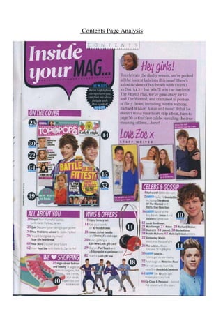
  • 2. This specific contents page from ‘Top of the Pops’ follows conventions. Contents pages are a combination of both text and images, around 50% each, and this convention is followed. A few of the images have a small caption relating to the article or the number of the page it is placed on. The images and colours used are all a reflection of the target audience as well as the style of the magazine. The fonts used help to keep brand identity as the same fonts are used on front covers and throughout the rest of the magazine. The editors letter from ‘Zoe’ adds an extra, personal touch, making her seem like a friend to the audience! The first thing the audience are presented with is the title: “Inside your mag...”, it is written in a bold, bulky font. “Inside your” is written in white in normal lower cap letters apart from the first letter. The colour white represents wholeness and completion, this highlights that the magazine completes the audience. Also, the used of direct address gives the audience a feel of ownership in the sense that it is their magazine. Whereas “mag” is written in black, in a different font and in capital letters. The colour black represents the unknown and the hidden, this could relate to the idea that the audience do not, as of yet, know the content of the magazine and that this is what they are about to find out. Also, the word “mag” is used an as abbreviation from the word magazine, this ties in with the mode of address whereby many words are abbreviated such as “goss” from “gossip, this overall allows the audience to see as someone they can speak to as a friend, speaking in a ‘language’ of abbreviate and slang that they are used to. The title of the contents page is placed in the top right hand corner, which is the first thing that the audience are going to see. It is placed in a speech mark, or a text bubble, highlighting that the contents page has information that the audience are going to be interested in. There is more text across the page such as the categories: "On the cover", “All about you”, “Wins and offers”, “Celebs and Gossip” and “We love shopping” are also written in a similar font. They are also written in a white font, with a purple background. The colour purple is a colour of imagination. It helps to stimulate the imagination and helps to inspire and allow us to get in touch with deeper thoughts. This relates the the content of the magazine, as it aims to help the audience engage with celebrities on an deeper level and inspires them to be just like their favourite artists by reader articles on experiences they have been through. All other text/content is written in a different fonts: that are a lot smaller, in black, either in bold (which is the main feature of the article) with the rest in standard text such as, “Kimberley Walsh steps into the spotlight” and “Battled of the boybands Union J and District 3 fight it out.” The main image on the contents page is of a front cover of a “Top of the Pops” magazine, containing George Shelly and other artists such as Rita Ora and Justin Bieber. George Shelly is next to another male artist who are both back to back wearing the colours purple and grey. Purple is a colour often used to represent the future, what these two boys are doing - they are representing the future of the pop industry. Both boys are smiling towards the camera and looking directly at it (direct address). They also both have their hair swept over their face and rather long, making them look younger and “cute” this helps to tie in with the sell line that complies with the image “battle of the fittest”. This however, could have a double meaning, it could refer to being physically fit or the slang term fit as in good looking. Rita Ora looks to be wearing a red/orange jacket. She also looks to be sitting down. She is giving the audience direct address as she is looking directly at the camera from a low angle, smiling up. Her hair is dip-dyed, it is a very light brown at the top, fading into a bright blonde, it is short and is cut just above her shoulder and is styled in loose curls. Her make up is very subtle, other than her red lipstick to match the colour of her jacket! Also on the contents page, in the bottom left hand corner there is an image of Niall Horan. This image is a medium close-up. He is wearing a light blue t-shirt with two navy buttons in the centre at the top
  • 3. of his shirt, located where buttons would be on a regular, smart shirt. His body position looks like he is in a school photograph, with his body facing right with his face towards the left. He is smiling directly at the camera, with his cute smile showing of his braces. His hair looks to be a combination of being ‘spiked’ up but with a quiff, so it looks more natural and big rather than gelled. He also has blonde highlights that are growing out. The image itself is placed on a dark blue background rather than a white background. The colour blue is a colour of trust, honesty and loyalty, this could reflect Niall as a person as both the background and his costume is blue. Just above the image of Niall, there is an image of Jay from The Wanted. It is a close up image of jay, whereby we can only see from his shoulders and above. From what we can see his costume consists of a white shirt with black details on it - on the inner section of the collar. Jay is smiling at the camera, giving of direct address, however he is not smiling with a big cheesy grin showing his teeth of, but a more subtle and shy smile. His hair is styled the same way as always, big and curly, his signature hairstyle that makes him stand out from the rest of the boys in the band. The colour white can represent the idea of wholeness, which could reflect the idea that Jay completes the band and the colour black represents being hidden, as he is not as loud as the other boys so it creates a form of mystery in the sense that he is quite quiet. Above this and below the editor's letter, there are three images, which include three artist with both Zoe and Liz, the editors of the magazine. This shows that those working at Top of the Pops get up close and personal with the celebrities. This will therefore make the audience adore the magazine even more knowing that both Zoe and Liz get up close and personal with the artists. It also puts a lot more trust between the audience and the magazine, making the audience believe that all the content of the magazine is true and reliable. These artists reflect the genre of the magazine as they are all pop artists. The small image of the front cover is annotated, those reading this will be pleased with this as they will be eager to get to the content presented on the front. Other images on the contents page include Niall Horan from One Direction, Jay from the Wanted and the boys from Union J. In all these images, the artists are a smiling - or in Union J’s case - messing about - which reflects the personality of the audience - fun and happy! Words such as “fittest” is presented, which is a term that the target audience will be familiar with, creating a mode of address that the audience will understand. These images will be used to draw the audience in as they are all there favourite artists, so they will want to read about every single one of them. By having loads of pictures, the audience can see straight away who features in the magazine rather than reading through it to find out. Most of the images are placed vertically down the right hand side, so that they audience can look down through all of them, rather than them being scattered all over the page. This is good for the audience as the contents page is very visual. This reflects their age group, as it is more fun and intriguing for them, rather than having the page just covered in words. Despite it having lots of images, it gives of information with these images and helps to give the audience a further insight as to what’s inside. The magazine content is written in a small text box’s across the bottom of the page. There are five sections as well as an editor's letter. The editors letter is in the top right hand corner, away from the content of the magazine - perhaps implying that it is not as important as the content of the magazine, which is what the audience will be more eager to find out. In the middle section of the content page, towards the left is a section called “On the Cover” whereby there is a screenshot of the front cover of the magazine, labeled with page numbers, this is helpful to the audience as they are going to buy the magazine based on the content of the front cover, so they will be able to find the page numbers easily with this idea, instead of them having to go through all the headlines/titles trying to find the article they want to read of the front cover. Just underneath, there is a section called “All About You” which is a section that revolves around the audience, including articles such as “Oops! Your shameful stories” and “Quiz - Discover your dating super-powers”. This gives an insight as to things that the
  • 4. audience are interested in - such as reading embarrassing stories about one another. It also represents that the audience are comfortable enough with the magazine to share embarrassing stories with them, further indicating that the magazine is like a friend to the audience! Underneath this is “We Love Shopping” with a heart rather than the word love/heart which has thirteen pages full of ‘high street fashion and beauty’. This reflects the age of the audience, they are not writting phrases out in full, but are using a code instead. Also, it reflects that fashion must be important to the reader if 13 pages are dedicated to it. Next to this in the centre of the page towards the bottom is “Wins & Offers”which has five different prizes for the audience to win, they include a ‘lip and beauty set’, ‘1D headphones’, ‘Union J’s hot hoodie’ and many more. This highlights gifts and prizes that the magazine typically offers its audience, this shows some of the audiences likes and what prizes they look forward to winning! Lastly is “Celeb & Gossip” which is the main content of the magazine focusing on all that is going on in the Celebrity world, which is generally the reason why the audience brought the magazine and therefore highlights the audiences overall interest, this is placed last as those reading it would say.. “best till last”. The mode of address of the contents page is mainly abbreviations making them into shortened words, which is something the target audience would do in their normal speech, when not reading the magazine. An example of this is the word “goss” which is abbreviated from “gossip”. Also wording used often have been modernised and the audience are able to interpret it with the modern version in comparison to someone older. An example of this is the word “fittest” the audience will take this word in the context it means someone is good looking, however, someone older will take it as being physically fit. Also, words such as “aww!” are used, which the audience will use a lot whilst reading the magazine, “awwing” about how cute there “fave” artists are. The mode of address is perfect for the audience as it is at the right level of intellect as it will be an easy read for them and won’t be challenging. The editors letter takes up a small section of the page - but it still very noticeable and will be one of the first things the audience will read. The mode of address uses words that the audience will be familiar with such as “lushest”, “fitties” and “aww!”. By using terminology like this the audience can relate to the magazine like a friend. It is used to interact with the reader, as well as to inform them on what the issue contains, drawing the reader in. Specific parts of the editors letter that will draw the reader in is “we’ve packed all the lushest lads into this issue!” making the reader think of all their favourite male celebrities, who could potentially be inside the issue! Also, the last line of the editors letter draws the reader in even more as their is an underlying mystery behind it, making the reader want to turn to the page straight away. The last line says: “If that lot doesn’t make your heart skip a beat, turn to page 30, to find fave celebs revealing the true meaning of love… aww!”. The letter begins in a handwritten purple text saying “Hey Girls!” which firstly, states the target market for the magazine, it also gives a bold introduction to the letter itself, attracting the girls to read it as it suggests there is something important Emily has to say. It is signed of in the same purple text with the word “Emily” followed by an “X” (kiss). The fact it is written in handwriting implies that Emily actually signed it herself. This makes the letter feel like it was personally written to the audience, making them feel special. It also refers back to the idea that the magazine is not just a magazine, but also a friend. There is a boy alert symbol also, just below the “inside your mag”. It is in a black puff, with “we love boys” with the love being replaced by a love heart shape. The text below is written in white saying “We’ve highlighted everywhere you can find out about fit lads with this symbol”. With a small blue text box, with “BOY ALERT!” written inside it. The colour blue is a colour of responsibility, and this blue symbol is responsible to alert the audience when their is a boy alert within the magazine. The contents page is very similar in layout across many editions/issues of ‘Top of the Pops’, this maintains brand identity as well as the benefits of those reading it as they are used to the set up and
  • 5. can gather the information they need quickly within having to search for it. The choice of layout is very clear, the editors letter on the right, with the rest of the content spread widely across the page, with pictures scattered around everywhere. The colours used are purple, blue, yellow and pink. These colours represent the upbeat and bubbly girls who will be reading the magazine as the colours themselves are bright and vibrant. The colours are also used to maintain brand identity as they are used in almost every edition, varying slightly. The colour purple dominants the page and is a colour of imagination, perhaps presenting that the contents page is imaginative, as our the pages that it links to.