
Recommended
More Related Content
What's hot
What's hot (17)
Viewers also liked
Similar to Contents Page Analysis One
Similar to Contents Page Analysis One (20)
More from KirstyMaeHarragan
More from KirstyMaeHarragan (20)
Recently uploaded
Recently uploaded (20)
Contents Page Analysis One
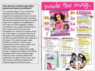
- 1. How does the contents page follow general and layout conventions? The contents page of Top of the Pops maintains the brand identity of the magazine by keeping the colour scheme, fonts artists and general layout and style the same throughout each issue and each page of the magazine It establishes its own style, but also manages to follow conventions. It is usually conventional to find a copy of the front cover with annotations on, and this is present at the top of the page; it is placed at the top of the page so the readership see this first, so they can easily find the main articles of the issue. The contents page is also divided into sections, which is also conventional, and for each article in the magazine, there is a brief line of information about it, along with a page number. Images that relate to the content are placed around the contents page, while the colour scheme reflects the readership, the genre of the music, and also shows a symbiosis between the contents page and the front cover.
- 2. The first thing that is seen when you open the magazine, is the title ‘Inside the mag…’ and this immediately tells the audience that this magazine is theirs to enjoy. The word ‘mag’ is informal slang, which sets an informal and friendly tone for the readership to enjoy. The words ‘Inside the mag…’ are placed inside a pink rectangle, which grabs attention because of the bright colour, establishes the colour scheme, and reflects the femininity of the readership. The writing is white, which stands out from the pink, and is in a very feminine font; white also represents the innocence of the reader. The annotated front cover is a good feature, and is usually seen in pop magazines; it will appeal to the young female reader who would be keen to find the main articles easily. It is placed in the middle left, and this is a prominent area for our eye’s to go first. This reinforces the idea that the content on the front is most important, and will interest the reader most. Each sell-line is annotated with the page number, so the readership is easily directed to it. It also shows that the magazine understands the readership, and it encourages and shares the information with them.
- 3. The contents themselves are placed in 6 sub-categories: ‘3D posters, ‘We boys’, ‘celebs and gossip’, ‘all about you’, ‘wins and offers’, and ‘we shopping’. These sub- categories are reader friendly, and relate directly to their interests. Unlike other music magazines, there is less interest on music, and more emphasis on boys and fashion, suggesting that the young reader wants something different from just a music magazine; rather than hearing about new songs, she would want to hear about what her favourite celebrities are wearing. Top of the Pops is generally a more fun magazine, which helps reflect the genre of pop. By saying ‘we love’ so often, it emphasizes the importance of these things in the minds of the magazine and its readers, and also shows the shared interest between them. The magazine’s passion for these things could urge the audience to love them more. Following conventions of content pages, a brief line of information is given with most features, e.g. Crazy in love – The stars get slushy, with the most important part in bold to grab the attention even more. On each one, just enough information is given to hook in the readership without giving away the whole article; this ensures that the reader will turn to the page to find out the rest. Helping to set the tone for the magazine and establishing the brand identity, mode of address is used informally and friendly to echo the language the audience use themselves; they feel like the magazine is on the same wavelength as them. such as ‘Your Oops!’. When presented with casual phrases like this, the readership will see the magazine as a friend.
- 4. The ‘we boys’ subheading says ‘we’ve highlighted everywhere you can get inside boys’ heads or simply find some cute pics to stare at. Yum!’ Abbreviations like ‘pics’ and ‘yum’ would interest the young audience, as they can relate to it, and see the magazine a friend it can come to. This also suggests that the magazine includes a lot about boys, because titles from each different subheading are highlighted. ‘We’ is used, showing that the magazine shares the reader’s interest in their love of boys. The highlighter effect suggests that the magazine have picked out the most important parts of the magazine for the readers, and the yellow stands out so attention is drawn to these sections. Images are used throughout the contents page, making it more visually attractive, so the audience will not look at the contents page and be immediately put off reading it. A picture of One Direction looking directly at the camera and smiling gives the magazine a friendly and welcoming feel, so the readership will be willing to open the next pages of the magazine. They appear to be holding dolls of themselves; showing there fame and giving the readers a short idea of the article. There is also an image of the clothes, shoes, and makeup that will be featured within the magazine, giving the readers a sneak peak, and making them want to open the magazine. The page numbers are next to the images, so readers can direct their attention to these pages.
- 5. Overall, this contents page is very easy to digest, and is visually attractive. The colours pink and yellow dominate the page, achieve the feminine look that is also fun and youthful. Pink also features' on the front, and throughout the magazine, so the brand identity is secured; the fonts are also the same. The contents page is easy to read, not to bright, and allows the readership to navigate their way around the magazine easily.
- 6. Overall, this contents page is very easy to digest, and is visually attractive. The colours pink and yellow dominate the page, achieve the feminine look that is also fun and youthful. Pink also features' on the front, and throughout the magazine, so the brand identity is secured; the fonts are also the same. The contents page is easy to read, not to bright, and allows the readership to navigate their way around the magazine easily.