SlideShare a Scribd company logo
1 of 5
Front Cover Analysis
General layout/conventions
In a general music magazine, conventionally the masthead is the biggest font on the page and is
usually at the very top, unless as skyline is presented above it. Pugs are used to present the edition and
the barcode, and more than likely the price of the magazine. Puffs are used to contain small pieces of
texts and are used to attract the reader to the text within them whether it be tops or posters. There is
usually a main sell lines written across the centre of the magazine, with a line of text underneath to
explain the headline. This also comes with many other sell lines around the main image to also attract
people to buy the magazine. The main image usually takes up the whole frame, and smaller images
known as feature article photos are also placed around the front cover to make it less word based and
dull.
The front cover maintains its brand identity by following similar layouts on every front cover
published. ‘We Heart Pop’ is placed in the top left hand corner on every edition. A column is placed
vertically on the right or left hand side, altering on different editions. The pug is always placed in the
bottom right hand corner, or sometimes the centre varying on the feature article photos.
Masthead
The masthead is We Love Pop, with a heart shape rather than the word. The use of the heart instead
reflects the young target audience, as they are more inclined to draw hearts to represent the word love.
The heart makes the front cover more visual as well so its not just word based. Also, it makes the
masthead more feminine, as does the colour pink for the heart - as pink is the most commonly
recognised feminine colour.
It is written in a speech bubble, this mimics a text message bubble, insinuating that the magazine
provides the latest gossip and will therefore appeal to the target audience as that is what they aim to
get from the magazine. Also, that the magazine can be perceived as being chatty and conversational
and therefore seen as a friend.
The font type is Display as it is bold and bulky, standing out from the rest of the text on the front
cover. It is written in black, to ensure it sounds out even more, as does the fact that it is written in
capital letters, rather than standard text size.
The name of the magazine is “We Love Pop”. This gives the audience a clear indication it is a
magazine regarding the pop genre and that is going to be celebrating the genre and all things to love
about it. It also ties in with the pop theme because it is a positive name for a magazine, and reflects
the pop genre is a positive and upbeat genre of the music and so are pop fans.
Main Image
Niall Horan and from One Direction and Nathan Sykes from the Wanted are the two people on the
main image of the front cover. This will appeal to the audience as they are from two popular bands
and therefore appeals to fans of both or either band, which could potentially widen the net. They are
being represented as ‘cuties’ as the main sell line is “battle of the boy band cuties”, which is ironic as
most young teenagers will have ‘crushes’ on them anyways and will cause discussion between the
audience. This supports Blumer and Katz uses and gratification theory as it creates social discussion
and the audience will enjoy the debating who they think is cuter with others, also reflecting the idea of
a battle.
The main image reflects genre as both Niall and Nathan are smiling rather than posing in an impolite
and inappropriate manner like those on a rock magazine such as KERRANG! They both look well
groomed, as if they look after themselves following the pretty boy look which is typical in pop boy
bands as they are both well groomed and well dressed rather than scruffy like those in the rock genre
who follow the shabby look. Their hair looks to be styled as with both boys they have a quiff look
going on. Also, they look to have had their eyebrows done - which is becoming more popular with
boys now-a-days as they tend to look after themselves a lot more, which could be something they
might undercoverly be promoting as before hand it was seen as an absurd thing to do and was for
females only. They also both look to be wearing makeup, to make their skin look better and to
compliment their complexion. Both boys are looking directly at the camera, giving direct address,
and smiling at the camera. They are both wearing blue, which is stereotypically a more masculine
colour, when pink is seen more as a feminine colour. The colour blue represents trust, honesty and
loyalty, which could reflect the boys personalities as they need all three factors to be in a successful
boy band. Also, Nathan has his thumb up and Niall is point at Nathan, these are poses quite frequently
used. However, these are acceptable and do not influence the reader badly in anyway shape or form.
Readership could be influenced by the idea that if someone had never purchased ‘We Love Pop’
before and their favourite band is One Direction and they see Niall on the front, this would provoke
and encourage them to buy it. Additionally, it will also draw in existing fans.
The mise-en-scene of the magazine is typical of a pop magazine. The background is white which is a
popular choice on most pop magazine, and can be seen as a convention. The main sell line is often
written over the main image or close beside it. This gives a clear indication of the idea that they
belong together, so it is easier for the younger generation to establish. Other feature article
photographs are used in order to lure the target audience in even more as they are made aware that
more of their favourite artists have some part within the magazine. Not only celebrities are used to
invite the audience in but so are the latest fashion tips, appeal to another side of the audience. Fun
puffs and colours are also used to reflect the age group of the audience.
Iconography of this particular cover of ‘We Love Pop’ could include the idea that all those present on
the cover are all smiling. This reflects the pop genre in the sense that they are all smiling and happy
creating a good and positive example for their fans as they are all role models and should therefore
give of a good impression.
As pop is mainly attracted by young girls, the fact that the main image consists of two of the most
popular members from boy bands in the industry adds more appeal to the magazine. By having Niall
and Nathan on the front it is more likely to have an appeal than if a female artist was on the front,
despite young girls idolising female artists, they tend to ‘fangirl’ moreover male artists. Additionally,
it is a convention that men tend dominate the front cover of magazines.
A few feature article photo’s are present on the front cover. The first one is Conor Maynard. There is
a photo of him accompanied by the sell-line “Uh-oh! Looks like I’m for the chop!” the picture is ideal
for the sell-line and they go together really well as in the photo Conor looks to be getting beheaded in
a wooden board. This also creates a fun and sarcastic element to the magazine as it is evidently a joke
- however, Conor’s facial expression might cause panic for his fans and make them want to buy the
magazine in order to see why he is “for the chop”.
The photo below this is on Jason Derulo, with the sell-line “My funniest interview ever”. In the photo
we see him wearing his signature outfit - a white vest and a snapback. In the photo he is smiling -
which reflects the content of the article, that is is his “funniest” interview.
Below this is a photo of Mollie from the Saturdays. She is smiling with her head tilted slightly to the
side with her hand pushing her hair up slightly. From what we can see she is wearing turquiose which
is a fun, colourful and upbeat colour that ties in with the pop genre and also goes nicely with her
blonde hair. Her makeup is done nice and naturally, making her a good role model for the young girls
reading the magazine.
There's a puff with Ariana Grande in it, a close up image. Of her with both her hair and makeup styled
nicely. By which we can only really pinpoint her wearing the colour red (for lipstick) as it is just a
closeup. But her hair is half up, half down like it always is, similar to how a parent would style their
childs hair. She is smiling and is looking directly at the camera, highlighting her confidence.
Lastly, at the bottom of the page there's a photo of Katy Perry and Nicole Scherzinger. Katy Perry has
her blonde hair styled up nicely, in a high ponytail. With her makeup looking nice a natural,
accompanying it with a lovely shade of pink lipstick, which complements both her hair and her dress.
Her dress has a lot of detail in it, keeping her wardrobe choices quirky as usual. Her stance involves
her with one hand on her hip and the other down by her side, leaning towards her left side. Then
behind her we can see Nicole who is also smiling, with her long dark hair styled down in and is wavy
in style - to an extent. She is wearing, of what we can see, a red dress.
Sell-lines
The sell line in relation to the main sell line is “battle of the boy band cuties”, the used of the word
battle enticed the audience to want to open the magazine in order to find out who wins the battle and
to see if there preferred choice won. This sell-line is kept light through the use of font and the smiling
faces and the boys body language - thumbs up and pointing.
Underneath a photo of Conor Maynard the sell-line is “Uh-oh! Looks like I’m for the chop”, this
creates a mystery as to what Conor is referring to and is enticing to the audience – who would want to
find out. Jason Derulo’s interview is described as his “funniest interview ever”, this would draw the
audience in because they would want to find out why it was so funny. The fact that Mollie gets
“jealous” of the other “girls” creates relatability and understanding between her and the audience, who
would then want to open it as they would be intrigued as to why she is jealous of them.
The mode of address used in the sell-lines makes the target audience more recognisable. Words such
as “cuties” are used which reflect the audience perfectly, as they are young girls/early teens their
language in context to a magazine is informal and ‘slang words’ (buzz words) are used as a form of
communication. This is further highlighted by the fact some words are shortened, such as the word
celebrity. The word ‘celeb’ is used instead. Across the front cover, words used are simplistic and are
not too complicated. This also reflects the age of those reading the magazine, as they are young, their
english will still be quite basic and would not understand a more sophisticated choice of wording.
Alliteration is used a lot which reflects the audience, phrases such as “style steals” and “pull-out
posters” are used in order to attract them to buy the magazine in order to receive these “treats”.
The sell-lines are placed vertically on the left hand side of the magazine in the left hand third. The
name of the artists is written in white with a pink background with a sneak peak of the article about
them written in black – as the sell line. Which is all placed on a yellow background. All the colours
used are conventionally used on a pop magazine and the style in which it is done also reflects one of a
pop magazine. Other sell lines are placed at the bottom of the page – these are, which look to be,
smaller articles such as “celeb fears” and “style steals”. Lastly, another sell line is written in a puff, a
small shape with text inside. In this case it is that an Ariana poster is available inside. The layout of
the sell-lines clearly indicates which are perhaps more important – those in the left hand third.
Layout
The layout is near enough the same on every edition of ‘We Love Pop’, with few changes the
positioning of the sell-lines. This helps to maintain the brand identity of the magazine.
The masthead is always placed on a slant in a speech bubble in the top left hand corner. With the main
image just to the right of it, taking up the majority of the front cover, with sell lines placed around it.
The main sell line is always placed on the main image or right beside it to link the two together.
The choice of layout is clear, and it does not look overly crowded. It is easy to establish what is what
and the content of the magazine.
The setup of this particular front cover is interesting in the use of colours and the general set up itself.
It is clear to the reader what is inside of the magazine. The feature photos are of a good size so they
are easy to see but do not take up to much space, as is the text.
Over, the layout of this particular issue of We Love Pop does look fairly busy. This is heightened by
the use of a collage effect in the bottom right hand corner. It looks like there is a lot to be enjoyed.
Fonts
The font used for the Masthead is a display font, as it is bold and bulky so it stands out and that the
audience can establish that this is the name of the magazine. The font itself is black, which I believe is
why the heart is a bright pink, to help establish that the magazine is a female magazine, also the age
of the audience. The heart helps to establish it is for a younger audience.
The same font is used for the main sell-line but the font size is smaller. It is still written in italics like
the main sell line. But rather than being written in black it is written in white/pink, on top of a pink
text box is Nathan’s name written in a white font and a white text box placed behind Niall’s name,
which is written in pink. Above their names, the same text is used in a sell-line relating to the main
sell-line, we can tell they are linked as they are physically connect by text boxes. The text box is
yellow and the text is written in black saying “battle of the boyband cuties”.
Another font is used, which looks like handwritten font, for the artists names on the sell-lines down
the left hand side. Making it look more personal - as if the artists have written their names themselves.
For the remainder of the sell-line a basic font is used to write the rest, it is a san serif font and
therefore will be a clear and easy font for the audience to read. This same font is used for the puff
with “ARIANA pull-out posters” written inside as well as “celeb fears” and “mid season special”.
Another font is also used to write “Revealed” underneath “celeb fears” and “style steals” is also
written in this font. This font is used to help the sell-line stand out so that will be the first word of the
sell-line that the audience see. It is also written in italics instead of normal, which makes it stand out
even more.
Colours
The colours used all reflect the genre of the magazine – they are all vibrant colours which match the
upbeat music produced in the pop industry. The same colours are used throughout the magazine as
well as throughout different editions, maintaining the magazines brand identity.
The main colour used is pink. The colour pink suggests that the target audience for this magazine is a
feminine one. Also, the colour pink reflects compassion and love, which are two feelings the audience
feel towards the magazine and in general that the magazine shows towards its audience as well as the
pop genre.
Another colour frequently used is the colour yellow. The colour yellow is recognised for being one of
the brighter colours and also represents acquired knowledge this colour relate to that the magazine
itself is full of knowledge regarding the celebrity world.
Other than pink and yellow the only other colours used are black and white. The background of the
magazine in general is white which is a convention on pop magazines. Also, it allows the magazine to
be as colourful as it likes without having to worry about the background and the content on the
magazine clashing. The colour black is used mainly for text, this is because it is bold and stands out
and is also easy for the audience to read.

More Related Content

What's hot

Music magazine analysis
Music magazine analysisMusic magazine analysis
Music magazine analysisBailey Shooter
 
Magazine Front Cover Analysis
Magazine Front Cover AnalysisMagazine Front Cover Analysis
Magazine Front Cover Analysisrebeccadahl98
 
Magazine analysis 3
Magazine analysis 3Magazine analysis 3
Magazine analysis 3Anikayasmiin
 
Textual analysis
Textual analysisTextual analysis
Textual analysismeganmoody
 
Product Research
Product ResearchProduct Research
Product Researchkatwatson96
 
Task Four - Target Audience Appeal
Task Four - Target Audience AppealTask Four - Target Audience Appeal
Task Four - Target Audience Appeallouisangus
 
Magazine analysis- Media Coursework
Magazine analysis- Media CourseworkMagazine analysis- Media Coursework
Magazine analysis- Media Courseworklozsheriston
 
Music magazine analysis covers
Music magazine analysis coversMusic magazine analysis covers
Music magazine analysis coversbethnoble
 
Research course work
Research course workResearch course work
Research course workmaleneriise
 
Analysing nme dizzee cover prep for blog ppt
Analysing  nme dizzee cover prep for blog pptAnalysing  nme dizzee cover prep for blog ppt
Analysing nme dizzee cover prep for blog pptelliefarr
 
Music Magazine Research
Music Magazine ResearchMusic Magazine Research
Music Magazine Researchasiyam
 
Analysis of cover page
Analysis of cover pageAnalysis of cover page
Analysis of cover pageKlarasa098
 
Magazine front cover analysis
Magazine front cover analysisMagazine front cover analysis
Magazine front cover analysisASMEDIADANIELLE
 
Magazine anotation
Magazine anotationMagazine anotation
Magazine anotationsarahwalley
 
Front Cover Analysis
Front Cover AnalysisFront Cover Analysis
Front Cover Analysisrebeccadahl98
 
Magazine analysis media
Magazine analysis media Magazine analysis media
Magazine analysis media leahdouglas98
 
Uk magazine market
Uk magazine marketUk magazine market
Uk magazine marketsara ali
 

What's hot (20)

Music magazine analysis
Music magazine analysisMusic magazine analysis
Music magazine analysis
 
Magazine Front Cover Analysis
Magazine Front Cover AnalysisMagazine Front Cover Analysis
Magazine Front Cover Analysis
 
Magazine analysis 3
Magazine analysis 3Magazine analysis 3
Magazine analysis 3
 
Textual analysis
Textual analysisTextual analysis
Textual analysis
 
Product Research
Product ResearchProduct Research
Product Research
 
The source magazine
The source magazineThe source magazine
The source magazine
 
Task Four - Target Audience Appeal
Task Four - Target Audience AppealTask Four - Target Audience Appeal
Task Four - Target Audience Appeal
 
Magazine analysis- Media Coursework
Magazine analysis- Media CourseworkMagazine analysis- Media Coursework
Magazine analysis- Media Coursework
 
Vibe
VibeVibe
Vibe
 
Music magazine analysis covers
Music magazine analysis coversMusic magazine analysis covers
Music magazine analysis covers
 
Research course work
Research course workResearch course work
Research course work
 
3. Research
3. Research3. Research
3. Research
 
Analysing nme dizzee cover prep for blog ppt
Analysing  nme dizzee cover prep for blog pptAnalysing  nme dizzee cover prep for blog ppt
Analysing nme dizzee cover prep for blog ppt
 
Music Magazine Research
Music Magazine ResearchMusic Magazine Research
Music Magazine Research
 
Analysis of cover page
Analysis of cover pageAnalysis of cover page
Analysis of cover page
 
Magazine front cover analysis
Magazine front cover analysisMagazine front cover analysis
Magazine front cover analysis
 
Magazine anotation
Magazine anotationMagazine anotation
Magazine anotation
 
Front Cover Analysis
Front Cover AnalysisFront Cover Analysis
Front Cover Analysis
 
Magazine analysis media
Magazine analysis media Magazine analysis media
Magazine analysis media
 
Uk magazine market
Uk magazine marketUk magazine market
Uk magazine market
 

Viewers also liked (13)

Jueves
JuevesJueves
Jueves
 
ashwani (1)
ashwani (1)ashwani (1)
ashwani (1)
 
Mantenimiento correctivo
Mantenimiento correctivo Mantenimiento correctivo
Mantenimiento correctivo
 
Resume-1
Resume-1Resume-1
Resume-1
 
cover letter
cover lettercover letter
cover letter
 
Practica 1
Practica 1Practica 1
Practica 1
 
Preliminary Task Reflection
Preliminary Task ReflectionPreliminary Task Reflection
Preliminary Task Reflection
 
Orthogonal Architecture
Orthogonal ArchitectureOrthogonal Architecture
Orthogonal Architecture
 
Historia de la informatica
Historia de la informaticaHistoria de la informatica
Historia de la informatica
 
Tipologia documental
Tipologia documentalTipologia documental
Tipologia documental
 
questionnaire analysis
questionnaire analysisquestionnaire analysis
questionnaire analysis
 
Daisy Bell Vosotros' CV
Daisy Bell Vosotros' CVDaisy Bell Vosotros' CV
Daisy Bell Vosotros' CV
 
MERCEDES CONSTANTINO RESUME
MERCEDES CONSTANTINO RESUMEMERCEDES CONSTANTINO RESUME
MERCEDES CONSTANTINO RESUME
 

Similar to Battle of the Boy Band Cuties

Front Cover Analysis
Front Cover AnalysisFront Cover Analysis
Front Cover AnalysisShauna-Mullen
 
Magazine analysis
Magazine analysisMagazine analysis
Magazine analysisJake Kemp
 
Magazine Cover Evaluations
Magazine Cover Evaluations Magazine Cover Evaluations
Magazine Cover Evaluations ChloeBakerMedia
 
Music magazines Analysis
Music magazines AnalysisMusic magazines Analysis
Music magazines AnalysisA99elpula
 
Front Cover Overview
Front Cover OverviewFront Cover Overview
Front Cover OverviewShauna-Mullen
 
Front cover overview we love pop edited
Front cover overview we love pop editedFront cover overview we love pop edited
Front cover overview we love pop editedrachaeldrake_
 
Front Cover Overview
Front Cover Overview Front Cover Overview
Front Cover Overview rachaeldrake_
 
Radial Analysis
Radial  AnalysisRadial  Analysis
Radial AnalysisMFJ
 
magazine cover analysis 1
magazine cover analysis 1magazine cover analysis 1
magazine cover analysis 1Jennifermegan93
 
magazine cover, analysis 1
magazine cover, analysis 1magazine cover, analysis 1
magazine cover, analysis 1Jennifermegan93
 
magazine cover analysis 1
magazine cover  analysis 1magazine cover  analysis 1
magazine cover analysis 1Jennifermegan93
 
Pop music magazine
Pop music magazinePop music magazine
Pop music magazineKlarasa098
 
Front Cover Annotations
Front Cover AnnotationsFront Cover Annotations
Front Cover AnnotationsStevenSibiya
 
Front Cover Analysis - 'We Love Pop'
Front Cover Analysis - 'We Love Pop'Front Cover Analysis - 'We Love Pop'
Front Cover Analysis - 'We Love Pop'Antonia-Montefusco
 
Front Cover Analysis 'We Love Pop'.
Front Cover Analysis 'We Love Pop'.Front Cover Analysis 'We Love Pop'.
Front Cover Analysis 'We Love Pop'.Antonia-Montefusco
 
Front cover analysis (2)
Front cover analysis (2)Front cover analysis (2)
Front cover analysis (2)jgamble14
 

Similar to Battle of the Boy Band Cuties (20)

Front Cover Analysis
Front Cover AnalysisFront Cover Analysis
Front Cover Analysis
 
Music magazine ananlyiss
Music magazine ananlyissMusic magazine ananlyiss
Music magazine ananlyiss
 
Magazine analysis
Magazine analysisMagazine analysis
Magazine analysis
 
Magazine Cover Evaluations
Magazine Cover Evaluations Magazine Cover Evaluations
Magazine Cover Evaluations
 
Music magazines Analysis
Music magazines AnalysisMusic magazines Analysis
Music magazines Analysis
 
Radial Analysis
Radial AnalysisRadial Analysis
Radial Analysis
 
Front Cover Overview
Front Cover OverviewFront Cover Overview
Front Cover Overview
 
Front cover overview we love pop edited
Front cover overview we love pop editedFront cover overview we love pop edited
Front cover overview we love pop edited
 
Front Cover Overview
Front Cover Overview Front Cover Overview
Front Cover Overview
 
Radial Analysis
Radial  AnalysisRadial  Analysis
Radial Analysis
 
magazine cover analysis 1
magazine cover analysis 1magazine cover analysis 1
magazine cover analysis 1
 
magazine cover, analysis 1
magazine cover, analysis 1magazine cover, analysis 1
magazine cover, analysis 1
 
magazine cover analysis 1
magazine cover  analysis 1magazine cover  analysis 1
magazine cover analysis 1
 
Pop music magazine
Pop music magazinePop music magazine
Pop music magazine
 
Front Cover Annotations
Front Cover AnnotationsFront Cover Annotations
Front Cover Annotations
 
Front Cover Analysis - 'We Love Pop'
Front Cover Analysis - 'We Love Pop'Front Cover Analysis - 'We Love Pop'
Front Cover Analysis - 'We Love Pop'
 
Front Cover Analysis 'We Love Pop'.
Front Cover Analysis 'We Love Pop'.Front Cover Analysis 'We Love Pop'.
Front Cover Analysis 'We Love Pop'.
 
Front Cover Analysis 2
Front Cover Analysis 2Front Cover Analysis 2
Front Cover Analysis 2
 
Front Cover Analysis
Front Cover AnalysisFront Cover Analysis
Front Cover Analysis
 
Front cover analysis (2)
Front cover analysis (2)Front cover analysis (2)
Front cover analysis (2)
 

More from Shauna-Mullen (20)

3
3 3
3
 
Question 2
Question 2Question 2
Question 2
 
Question 1
Question 1Question 1
Question 1
 
Storyboard
StoryboardStoryboard
Storyboard
 
Mock ups
Mock ups Mock ups
Mock ups
 
Introduction to characters
Introduction to charactersIntroduction to characters
Introduction to characters
 
ideas for Non diegetic sound
ideas for Non diegetic soundideas for Non diegetic sound
ideas for Non diegetic sound
 
Lighting ideas
Lighting ideasLighting ideas
Lighting ideas
 
Prop analysis
Prop analysisProp analysis
Prop analysis
 
Inspirational director
Inspirational director Inspirational director
Inspirational director
 
Trailer analysis 2
Trailer analysis 2Trailer analysis 2
Trailer analysis 2
 
Magazine analysis 1
Magazine analysis 1Magazine analysis 1
Magazine analysis 1
 
Trailer overview
Trailer overviewTrailer overview
Trailer overview
 
Front cover overview
Front cover overviewFront cover overview
Front cover overview
 
Poster overview
Poster overview Poster overview
Poster overview
 
Slasher conventions
Slasher conventions Slasher conventions
Slasher conventions
 
Further ideas for narrative
Further ideas for narrativeFurther ideas for narrative
Further ideas for narrative
 
Case Study
Case Study Case Study
Case Study
 
Camera idea's and analysis
Camera idea's and analysisCamera idea's and analysis
Camera idea's and analysis
 
Call Sheets
Call SheetsCall Sheets
Call Sheets
 

Recently uploaded

Gas measurement O2,Co2,& ph) 04/2024.pptx
Gas measurement O2,Co2,& ph) 04/2024.pptxGas measurement O2,Co2,& ph) 04/2024.pptx
Gas measurement O2,Co2,& ph) 04/2024.pptxDr.Ibrahim Hassaan
 
Introduction to AI in Higher Education_draft.pptx
Introduction to AI in Higher Education_draft.pptxIntroduction to AI in Higher Education_draft.pptx
Introduction to AI in Higher Education_draft.pptxpboyjonauth
 
Alper Gobel In Media Res Media Component
Alper Gobel In Media Res Media ComponentAlper Gobel In Media Res Media Component
Alper Gobel In Media Res Media ComponentInMediaRes1
 
Enzyme, Pharmaceutical Aids, Miscellaneous Last Part of Chapter no 5th.pdf
Enzyme, Pharmaceutical Aids, Miscellaneous Last Part of Chapter no 5th.pdfEnzyme, Pharmaceutical Aids, Miscellaneous Last Part of Chapter no 5th.pdf
Enzyme, Pharmaceutical Aids, Miscellaneous Last Part of Chapter no 5th.pdfSumit Tiwari
 
Final demo Grade 9 for demo Plan dessert.pptx
Final demo Grade 9 for demo Plan dessert.pptxFinal demo Grade 9 for demo Plan dessert.pptx
Final demo Grade 9 for demo Plan dessert.pptxAvyJaneVismanos
 
“Oh GOSH! Reflecting on Hackteria's Collaborative Practices in a Global Do-It...
“Oh GOSH! Reflecting on Hackteria's Collaborative Practices in a Global Do-It...“Oh GOSH! Reflecting on Hackteria's Collaborative Practices in a Global Do-It...
“Oh GOSH! Reflecting on Hackteria's Collaborative Practices in a Global Do-It...Marc Dusseiller Dusjagr
 
Difference Between Search & Browse Methods in Odoo 17
Difference Between Search & Browse Methods in Odoo 17Difference Between Search & Browse Methods in Odoo 17
Difference Between Search & Browse Methods in Odoo 17Celine George
 
CELL CYCLE Division Science 8 quarter IV.pptx
CELL CYCLE Division Science 8 quarter IV.pptxCELL CYCLE Division Science 8 quarter IV.pptx
CELL CYCLE Division Science 8 quarter IV.pptxJiesonDelaCerna
 
Procuring digital preservation CAN be quick and painless with our new dynamic...
Procuring digital preservation CAN be quick and painless with our new dynamic...Procuring digital preservation CAN be quick and painless with our new dynamic...
Procuring digital preservation CAN be quick and painless with our new dynamic...Jisc
 
Presiding Officer Training module 2024 lok sabha elections
Presiding Officer Training module 2024 lok sabha electionsPresiding Officer Training module 2024 lok sabha elections
Presiding Officer Training module 2024 lok sabha electionsanshu789521
 
MARGINALIZATION (Different learners in Marginalized Group
MARGINALIZATION (Different learners in Marginalized GroupMARGINALIZATION (Different learners in Marginalized Group
MARGINALIZATION (Different learners in Marginalized GroupJonathanParaisoCruz
 
Computed Fields and api Depends in the Odoo 17
Computed Fields and api Depends in the Odoo 17Computed Fields and api Depends in the Odoo 17
Computed Fields and api Depends in the Odoo 17Celine George
 
Framing an Appropriate Research Question 6b9b26d93da94caf993c038d9efcdedb.pdf
Framing an Appropriate Research Question 6b9b26d93da94caf993c038d9efcdedb.pdfFraming an Appropriate Research Question 6b9b26d93da94caf993c038d9efcdedb.pdf
Framing an Appropriate Research Question 6b9b26d93da94caf993c038d9efcdedb.pdfUjwalaBharambe
 
Pharmacognosy Flower 3. Compositae 2023.pdf
Pharmacognosy Flower 3. Compositae 2023.pdfPharmacognosy Flower 3. Compositae 2023.pdf
Pharmacognosy Flower 3. Compositae 2023.pdfMahmoud M. Sallam
 
Hierarchy of management that covers different levels of management
Hierarchy of management that covers different levels of managementHierarchy of management that covers different levels of management
Hierarchy of management that covers different levels of managementmkooblal
 
Organic Name Reactions for the students and aspirants of Chemistry12th.pptx
Organic Name Reactions  for the students and aspirants of Chemistry12th.pptxOrganic Name Reactions  for the students and aspirants of Chemistry12th.pptx
Organic Name Reactions for the students and aspirants of Chemistry12th.pptxVS Mahajan Coaching Centre
 
18-04-UA_REPORT_MEDIALITERAСY_INDEX-DM_23-1-final-eng.pdf
18-04-UA_REPORT_MEDIALITERAСY_INDEX-DM_23-1-final-eng.pdf18-04-UA_REPORT_MEDIALITERAСY_INDEX-DM_23-1-final-eng.pdf
18-04-UA_REPORT_MEDIALITERAСY_INDEX-DM_23-1-final-eng.pdfssuser54595a
 
AmericanHighSchoolsprezentacijaoskolama.
AmericanHighSchoolsprezentacijaoskolama.AmericanHighSchoolsprezentacijaoskolama.
AmericanHighSchoolsprezentacijaoskolama.arsicmarija21
 
What is Model Inheritance in Odoo 17 ERP
What is Model Inheritance in Odoo 17 ERPWhat is Model Inheritance in Odoo 17 ERP
What is Model Inheritance in Odoo 17 ERPCeline George
 

Recently uploaded (20)

Gas measurement O2,Co2,& ph) 04/2024.pptx
Gas measurement O2,Co2,& ph) 04/2024.pptxGas measurement O2,Co2,& ph) 04/2024.pptx
Gas measurement O2,Co2,& ph) 04/2024.pptx
 
Introduction to AI in Higher Education_draft.pptx
Introduction to AI in Higher Education_draft.pptxIntroduction to AI in Higher Education_draft.pptx
Introduction to AI in Higher Education_draft.pptx
 
Alper Gobel In Media Res Media Component
Alper Gobel In Media Res Media ComponentAlper Gobel In Media Res Media Component
Alper Gobel In Media Res Media Component
 
Enzyme, Pharmaceutical Aids, Miscellaneous Last Part of Chapter no 5th.pdf
Enzyme, Pharmaceutical Aids, Miscellaneous Last Part of Chapter no 5th.pdfEnzyme, Pharmaceutical Aids, Miscellaneous Last Part of Chapter no 5th.pdf
Enzyme, Pharmaceutical Aids, Miscellaneous Last Part of Chapter no 5th.pdf
 
Final demo Grade 9 for demo Plan dessert.pptx
Final demo Grade 9 for demo Plan dessert.pptxFinal demo Grade 9 for demo Plan dessert.pptx
Final demo Grade 9 for demo Plan dessert.pptx
 
“Oh GOSH! Reflecting on Hackteria's Collaborative Practices in a Global Do-It...
“Oh GOSH! Reflecting on Hackteria's Collaborative Practices in a Global Do-It...“Oh GOSH! Reflecting on Hackteria's Collaborative Practices in a Global Do-It...
“Oh GOSH! Reflecting on Hackteria's Collaborative Practices in a Global Do-It...
 
Difference Between Search & Browse Methods in Odoo 17
Difference Between Search & Browse Methods in Odoo 17Difference Between Search & Browse Methods in Odoo 17
Difference Between Search & Browse Methods in Odoo 17
 
CELL CYCLE Division Science 8 quarter IV.pptx
CELL CYCLE Division Science 8 quarter IV.pptxCELL CYCLE Division Science 8 quarter IV.pptx
CELL CYCLE Division Science 8 quarter IV.pptx
 
Procuring digital preservation CAN be quick and painless with our new dynamic...
Procuring digital preservation CAN be quick and painless with our new dynamic...Procuring digital preservation CAN be quick and painless with our new dynamic...
Procuring digital preservation CAN be quick and painless with our new dynamic...
 
Presiding Officer Training module 2024 lok sabha elections
Presiding Officer Training module 2024 lok sabha electionsPresiding Officer Training module 2024 lok sabha elections
Presiding Officer Training module 2024 lok sabha elections
 
MARGINALIZATION (Different learners in Marginalized Group
MARGINALIZATION (Different learners in Marginalized GroupMARGINALIZATION (Different learners in Marginalized Group
MARGINALIZATION (Different learners in Marginalized Group
 
Computed Fields and api Depends in the Odoo 17
Computed Fields and api Depends in the Odoo 17Computed Fields and api Depends in the Odoo 17
Computed Fields and api Depends in the Odoo 17
 
Model Call Girl in Bikash Puri Delhi reach out to us at 🔝9953056974🔝
Model Call Girl in Bikash Puri  Delhi reach out to us at 🔝9953056974🔝Model Call Girl in Bikash Puri  Delhi reach out to us at 🔝9953056974🔝
Model Call Girl in Bikash Puri Delhi reach out to us at 🔝9953056974🔝
 
Framing an Appropriate Research Question 6b9b26d93da94caf993c038d9efcdedb.pdf
Framing an Appropriate Research Question 6b9b26d93da94caf993c038d9efcdedb.pdfFraming an Appropriate Research Question 6b9b26d93da94caf993c038d9efcdedb.pdf
Framing an Appropriate Research Question 6b9b26d93da94caf993c038d9efcdedb.pdf
 
Pharmacognosy Flower 3. Compositae 2023.pdf
Pharmacognosy Flower 3. Compositae 2023.pdfPharmacognosy Flower 3. Compositae 2023.pdf
Pharmacognosy Flower 3. Compositae 2023.pdf
 
Hierarchy of management that covers different levels of management
Hierarchy of management that covers different levels of managementHierarchy of management that covers different levels of management
Hierarchy of management that covers different levels of management
 
Organic Name Reactions for the students and aspirants of Chemistry12th.pptx
Organic Name Reactions  for the students and aspirants of Chemistry12th.pptxOrganic Name Reactions  for the students and aspirants of Chemistry12th.pptx
Organic Name Reactions for the students and aspirants of Chemistry12th.pptx
 
18-04-UA_REPORT_MEDIALITERAСY_INDEX-DM_23-1-final-eng.pdf
18-04-UA_REPORT_MEDIALITERAСY_INDEX-DM_23-1-final-eng.pdf18-04-UA_REPORT_MEDIALITERAСY_INDEX-DM_23-1-final-eng.pdf
18-04-UA_REPORT_MEDIALITERAСY_INDEX-DM_23-1-final-eng.pdf
 
AmericanHighSchoolsprezentacijaoskolama.
AmericanHighSchoolsprezentacijaoskolama.AmericanHighSchoolsprezentacijaoskolama.
AmericanHighSchoolsprezentacijaoskolama.
 
What is Model Inheritance in Odoo 17 ERP
What is Model Inheritance in Odoo 17 ERPWhat is Model Inheritance in Odoo 17 ERP
What is Model Inheritance in Odoo 17 ERP
 

Battle of the Boy Band Cuties

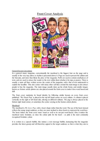
  • 1. Front Cover Analysis General layout/conventions In a general music magazine, conventionally the masthead is the biggest font on the page and is usually at the very top, unless as skyline is presented above it. Pugs are used to present the edition and the barcode, and more than likely the price of the magazine. Puffs are used to contain small pieces of texts and are used to attract the reader to the text within them whether it be tops or posters. There is usually a main sell lines written across the centre of the magazine, with a line of text underneath to explain the headline. This also comes with many other sell lines around the main image to also attract people to buy the magazine. The main image usually takes up the whole frame, and smaller images known as feature article photos are also placed around the front cover to make it less word based and dull. The front cover maintains its brand identity by following similar layouts on every front cover published. ‘We Heart Pop’ is placed in the top left hand corner on every edition. A column is placed vertically on the right or left hand side, altering on different editions. The pug is always placed in the bottom right hand corner, or sometimes the centre varying on the feature article photos. Masthead The masthead is We Love Pop, with a heart shape rather than the word. The use of the heart instead reflects the young target audience, as they are more inclined to draw hearts to represent the word love. The heart makes the front cover more visual as well so its not just word based. Also, it makes the masthead more feminine, as does the colour pink for the heart - as pink is the most commonly recognised feminine colour. It is written in a speech bubble, this mimics a text message bubble, insinuating that the magazine provides the latest gossip and will therefore appeal to the target audience as that is what they aim to
  • 2. get from the magazine. Also, that the magazine can be perceived as being chatty and conversational and therefore seen as a friend. The font type is Display as it is bold and bulky, standing out from the rest of the text on the front cover. It is written in black, to ensure it sounds out even more, as does the fact that it is written in capital letters, rather than standard text size. The name of the magazine is “We Love Pop”. This gives the audience a clear indication it is a magazine regarding the pop genre and that is going to be celebrating the genre and all things to love about it. It also ties in with the pop theme because it is a positive name for a magazine, and reflects the pop genre is a positive and upbeat genre of the music and so are pop fans. Main Image Niall Horan and from One Direction and Nathan Sykes from the Wanted are the two people on the main image of the front cover. This will appeal to the audience as they are from two popular bands and therefore appeals to fans of both or either band, which could potentially widen the net. They are being represented as ‘cuties’ as the main sell line is “battle of the boy band cuties”, which is ironic as most young teenagers will have ‘crushes’ on them anyways and will cause discussion between the audience. This supports Blumer and Katz uses and gratification theory as it creates social discussion and the audience will enjoy the debating who they think is cuter with others, also reflecting the idea of a battle. The main image reflects genre as both Niall and Nathan are smiling rather than posing in an impolite and inappropriate manner like those on a rock magazine such as KERRANG! They both look well groomed, as if they look after themselves following the pretty boy look which is typical in pop boy bands as they are both well groomed and well dressed rather than scruffy like those in the rock genre who follow the shabby look. Their hair looks to be styled as with both boys they have a quiff look going on. Also, they look to have had their eyebrows done - which is becoming more popular with boys now-a-days as they tend to look after themselves a lot more, which could be something they might undercoverly be promoting as before hand it was seen as an absurd thing to do and was for females only. They also both look to be wearing makeup, to make their skin look better and to compliment their complexion. Both boys are looking directly at the camera, giving direct address, and smiling at the camera. They are both wearing blue, which is stereotypically a more masculine colour, when pink is seen more as a feminine colour. The colour blue represents trust, honesty and loyalty, which could reflect the boys personalities as they need all three factors to be in a successful boy band. Also, Nathan has his thumb up and Niall is point at Nathan, these are poses quite frequently used. However, these are acceptable and do not influence the reader badly in anyway shape or form. Readership could be influenced by the idea that if someone had never purchased ‘We Love Pop’ before and their favourite band is One Direction and they see Niall on the front, this would provoke and encourage them to buy it. Additionally, it will also draw in existing fans. The mise-en-scene of the magazine is typical of a pop magazine. The background is white which is a popular choice on most pop magazine, and can be seen as a convention. The main sell line is often written over the main image or close beside it. This gives a clear indication of the idea that they belong together, so it is easier for the younger generation to establish. Other feature article photographs are used in order to lure the target audience in even more as they are made aware that more of their favourite artists have some part within the magazine. Not only celebrities are used to invite the audience in but so are the latest fashion tips, appeal to another side of the audience. Fun puffs and colours are also used to reflect the age group of the audience.
  • 3. Iconography of this particular cover of ‘We Love Pop’ could include the idea that all those present on the cover are all smiling. This reflects the pop genre in the sense that they are all smiling and happy creating a good and positive example for their fans as they are all role models and should therefore give of a good impression. As pop is mainly attracted by young girls, the fact that the main image consists of two of the most popular members from boy bands in the industry adds more appeal to the magazine. By having Niall and Nathan on the front it is more likely to have an appeal than if a female artist was on the front, despite young girls idolising female artists, they tend to ‘fangirl’ moreover male artists. Additionally, it is a convention that men tend dominate the front cover of magazines. A few feature article photo’s are present on the front cover. The first one is Conor Maynard. There is a photo of him accompanied by the sell-line “Uh-oh! Looks like I’m for the chop!” the picture is ideal for the sell-line and they go together really well as in the photo Conor looks to be getting beheaded in a wooden board. This also creates a fun and sarcastic element to the magazine as it is evidently a joke - however, Conor’s facial expression might cause panic for his fans and make them want to buy the magazine in order to see why he is “for the chop”. The photo below this is on Jason Derulo, with the sell-line “My funniest interview ever”. In the photo we see him wearing his signature outfit - a white vest and a snapback. In the photo he is smiling - which reflects the content of the article, that is is his “funniest” interview. Below this is a photo of Mollie from the Saturdays. She is smiling with her head tilted slightly to the side with her hand pushing her hair up slightly. From what we can see she is wearing turquiose which is a fun, colourful and upbeat colour that ties in with the pop genre and also goes nicely with her blonde hair. Her makeup is done nice and naturally, making her a good role model for the young girls reading the magazine. There's a puff with Ariana Grande in it, a close up image. Of her with both her hair and makeup styled nicely. By which we can only really pinpoint her wearing the colour red (for lipstick) as it is just a closeup. But her hair is half up, half down like it always is, similar to how a parent would style their childs hair. She is smiling and is looking directly at the camera, highlighting her confidence. Lastly, at the bottom of the page there's a photo of Katy Perry and Nicole Scherzinger. Katy Perry has her blonde hair styled up nicely, in a high ponytail. With her makeup looking nice a natural, accompanying it with a lovely shade of pink lipstick, which complements both her hair and her dress. Her dress has a lot of detail in it, keeping her wardrobe choices quirky as usual. Her stance involves her with one hand on her hip and the other down by her side, leaning towards her left side. Then behind her we can see Nicole who is also smiling, with her long dark hair styled down in and is wavy in style - to an extent. She is wearing, of what we can see, a red dress. Sell-lines The sell line in relation to the main sell line is “battle of the boy band cuties”, the used of the word battle enticed the audience to want to open the magazine in order to find out who wins the battle and to see if there preferred choice won. This sell-line is kept light through the use of font and the smiling faces and the boys body language - thumbs up and pointing. Underneath a photo of Conor Maynard the sell-line is “Uh-oh! Looks like I’m for the chop”, this creates a mystery as to what Conor is referring to and is enticing to the audience – who would want to find out. Jason Derulo’s interview is described as his “funniest interview ever”, this would draw the
  • 4. audience in because they would want to find out why it was so funny. The fact that Mollie gets “jealous” of the other “girls” creates relatability and understanding between her and the audience, who would then want to open it as they would be intrigued as to why she is jealous of them. The mode of address used in the sell-lines makes the target audience more recognisable. Words such as “cuties” are used which reflect the audience perfectly, as they are young girls/early teens their language in context to a magazine is informal and ‘slang words’ (buzz words) are used as a form of communication. This is further highlighted by the fact some words are shortened, such as the word celebrity. The word ‘celeb’ is used instead. Across the front cover, words used are simplistic and are not too complicated. This also reflects the age of those reading the magazine, as they are young, their english will still be quite basic and would not understand a more sophisticated choice of wording. Alliteration is used a lot which reflects the audience, phrases such as “style steals” and “pull-out posters” are used in order to attract them to buy the magazine in order to receive these “treats”. The sell-lines are placed vertically on the left hand side of the magazine in the left hand third. The name of the artists is written in white with a pink background with a sneak peak of the article about them written in black – as the sell line. Which is all placed on a yellow background. All the colours used are conventionally used on a pop magazine and the style in which it is done also reflects one of a pop magazine. Other sell lines are placed at the bottom of the page – these are, which look to be, smaller articles such as “celeb fears” and “style steals”. Lastly, another sell line is written in a puff, a small shape with text inside. In this case it is that an Ariana poster is available inside. The layout of the sell-lines clearly indicates which are perhaps more important – those in the left hand third. Layout The layout is near enough the same on every edition of ‘We Love Pop’, with few changes the positioning of the sell-lines. This helps to maintain the brand identity of the magazine. The masthead is always placed on a slant in a speech bubble in the top left hand corner. With the main image just to the right of it, taking up the majority of the front cover, with sell lines placed around it. The main sell line is always placed on the main image or right beside it to link the two together. The choice of layout is clear, and it does not look overly crowded. It is easy to establish what is what and the content of the magazine. The setup of this particular front cover is interesting in the use of colours and the general set up itself. It is clear to the reader what is inside of the magazine. The feature photos are of a good size so they are easy to see but do not take up to much space, as is the text. Over, the layout of this particular issue of We Love Pop does look fairly busy. This is heightened by the use of a collage effect in the bottom right hand corner. It looks like there is a lot to be enjoyed. Fonts The font used for the Masthead is a display font, as it is bold and bulky so it stands out and that the audience can establish that this is the name of the magazine. The font itself is black, which I believe is why the heart is a bright pink, to help establish that the magazine is a female magazine, also the age of the audience. The heart helps to establish it is for a younger audience. The same font is used for the main sell-line but the font size is smaller. It is still written in italics like the main sell line. But rather than being written in black it is written in white/pink, on top of a pink text box is Nathan’s name written in a white font and a white text box placed behind Niall’s name, which is written in pink. Above their names, the same text is used in a sell-line relating to the main sell-line, we can tell they are linked as they are physically connect by text boxes. The text box is yellow and the text is written in black saying “battle of the boyband cuties”.
  • 5. Another font is used, which looks like handwritten font, for the artists names on the sell-lines down the left hand side. Making it look more personal - as if the artists have written their names themselves. For the remainder of the sell-line a basic font is used to write the rest, it is a san serif font and therefore will be a clear and easy font for the audience to read. This same font is used for the puff with “ARIANA pull-out posters” written inside as well as “celeb fears” and “mid season special”. Another font is also used to write “Revealed” underneath “celeb fears” and “style steals” is also written in this font. This font is used to help the sell-line stand out so that will be the first word of the sell-line that the audience see. It is also written in italics instead of normal, which makes it stand out even more. Colours The colours used all reflect the genre of the magazine – they are all vibrant colours which match the upbeat music produced in the pop industry. The same colours are used throughout the magazine as well as throughout different editions, maintaining the magazines brand identity. The main colour used is pink. The colour pink suggests that the target audience for this magazine is a feminine one. Also, the colour pink reflects compassion and love, which are two feelings the audience feel towards the magazine and in general that the magazine shows towards its audience as well as the pop genre. Another colour frequently used is the colour yellow. The colour yellow is recognised for being one of the brighter colours and also represents acquired knowledge this colour relate to that the magazine itself is full of knowledge regarding the celebrity world. Other than pink and yellow the only other colours used are black and white. The background of the magazine in general is white which is a convention on pop magazines. Also, it allows the magazine to be as colourful as it likes without having to worry about the background and the content on the magazine clashing. The colour black is used mainly for text, this is because it is bold and stands out and is also easy for the audience to read.