2. Double Page Spread Analysis #1It is not clear as to where this double page spread comes from, but due to the layout and the font of the page numbers, it is clear that the double page spread is from We Love
Pop. However, this double page spread is spread across more than one page. There is three more pages, consisting of the rest of th e one direction boys. This is made evident
and clear to the audience from the arrow on the right page of the spread, in a white arrow with black text saying “Louis and Niall’s school secrets are over the page”. On these
other pages, the other boys also tell their story. This is significant, as the magazine is devoting a lot of space to One Direction , which indicates their success and the target
audiences interest in them.
General Layout
Both sides of the double page spread follow the convention that a quote is written in a larger font, as a ‘tease’ because the instantly draw in the audience and encourage them
to read the magazine, they spark and interest and engage the reader as they are giving a dramatic intake as to what the article is about. This overall entices the audience to
purchase the magazine. The use of images are used in order to interest the reader and highlight the fact that the article is in fact about that particular artist(s). In this case –
although it is a double page spread it is made up of only two members of One Direction; but like mentioned before it does con tinue on to further pages with the other 1D
boys. The use of Zayn being partly on the other side of the page allows the audience to understand that the articles are in fact interlinked. The use of puff’s with a pull quote
inside (which is a convention of double page spread) further entices the audience to read the double page spread as it gives the audience a further insight as to what the double
page spread contains.
The fact that the double page spread is similar in content reassures the audience that it is infact a double page spread, the re is a clear continuation between the two pages in
colour scheme, general theme, font and design.
Headline
On this particular double page spread there is no direct headline. I believe this is because the boys are split up on to three different double page spreads and the title is on
another page, as the opening page would contain the headline so it is evident that this is the middle page, as the arrows tells us there is another page about Louis and Niall,
suggesting that Liamis on the opening page.
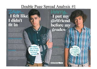
The headline on one half of the article is Zayn’s name is presented in a script font, similar to handwriting in a blue font, looking as if he wrote it himself. This is followed by
the quote “I felt like I didn’t fit in” in a bigger and bolder white font with black speech marks - taking on a title role despite there not being one, the font that the quote is
written in is sans serif. The content of the title suggests that the article is going to be about Zayn feeling like an outsid er at school and how he didn't "fit in" which is
encouraging to the reader as they could be going through something similar. This relates to Blumler and Katz theory.
On the other side of the double page spread, the article has Harry's name written in the same way as Zayn's, in a script font , looking as if he had written it himself - making it
more personal and direct to the reader. The only difference being that it is written in a greeny colour instead of blue like Zayn's. The colour green can represent Harry himself
3. Double Page Spread Analysis #1as green can represent being "restful" and "learning, growth and harmony". Harry's his name is followed by the quote "I put my girlfriend before my grades". Which is
written in a bigger and bolder white font with black speech marks, in a sans serif font. It suggests that Harry is speakin g about his regrets in not putting his education first and
how important education actually is. Which brings the point back to the colour of green as his mistakes have made him learn a nd grow as a person. The topic of Harry’s
section on the double page spread is interesting as he has chosen to speak about his love life, this will automatically draw the audience in as they want t o know about Harry’s
love life, especially if he is single, as they all have a dream that one day Harry will be their boyfriend. Also, it makes them warm to himmore because if he has been through
bad experiences in love it will make the audience feel sorry for him and will have the “aaaawwww!” factor.
Images
The first image presented is Zayn. His body composition consists of him standing up straight with one arm down next to his side with the other armgoing across his body
clutching onto his upper arm - just above the elbow. This portrays that he is shy and fragileness and represents the theme of the article - that he didn't fit in. Overall, this
shows Zayn's more sensitive side, which appeals more to the readers emotions, whereby they connect with Zayn on a deeper leve l. Costume wise, Zayn is wearing dark beige
chinos, a plain white t-shirt and a green, grey and white baseball jacket. This is typical of him, as him and the rest of the boys in One Direction often wear baseball jackets.
His hair is done in his 'signature hairstyle' - a quiff - popular with boys in this generation as well as those in the pop industry (iconography). The colour white represents
innocence and purity, this could reflect the way Zayn is feeling when speaking about this certain subject matter as it is personal and close to his heart. It is also about when he
was in school, suggesting he was young making him seem even more innocent. The image of Zayn is placed on the right hand side of the article about him. The image itself is
large. This will instantly draw the audience in as the image stand out more than the text does. It will be the first thing th ey see - and if they are huge One Direction fans, or
just like Zayn in particular, they will be drawn in by the image and will be more convinced to read the article. Placed on to p of the image is a white circle starburst. Inside the
starburst is the pull quote “It takes me a long time to get to know people” in black speech marks, in blue text, the same colour his name is written in, in t he same font the title
is written in. The quote itself links back to the title of the article. This will make the audience want to connect with Zayn on a deeper level, and try to sympathise with all he
went through at school, it will draw them into reading the double page spread, to see if they can find out why it takes him a long time to get to know people.
The second image is of Harry. His body composition consists of him standing up straight with one hand in his pocket and the other down by his side. This portrays himin
quite a cool and relaxed manner - which reflects the article itself as it is about him putting his girlfriend before school - and therefore wasn’t taking it seriously, which
therefore could reflect his composure. Costume wise - Harry is wearing a blue, black, grey and yellow, checkered shirt, rolled up on the sleeves - from long sleeve to the
elbow. Harry often wears checkered shirts and is therefore a typical costume choice for him! The colour blue represents loyalty. Which could refle ct the mistake he made
when he was back in school, instead of being dedicated and loyal to school and his exams, instead he was loy al to his girlfriend and that made him fail his exams and he
therefore had to pay the consequences for his actions. His hair is as curly as ever - making him stand out from the other boys, giving him his individuality. The image of
Harry is placed on the right side of the article about him. The image itself is large. This will instantly draw the audience in as the image stands o ut more than the text does. It
will be the first thing - other than the photograph of Zayn. However, seeing both of them both on the page, will attract the audience more as it is not just one member of the
band. Placed on top of the image is a white circle shaped starburst, inside the starburst is the text… “I was worried I would n’t be able to cope” in black speech marks, in a
4. Double Page Spread Analysis #1green text, the same colour his name is written in, in the same font the title is written in. This quote itself interlinks with the title and gives the audience about more insight as
to what Harry is feeling so they can understand and himon a deeper level in order to empathise with him.
Body Copy
The body copy consists of two different sections on the double page spread - one relating to Zayn and the other relating to Harry. Both of the articles are in relation to the
boys when the was at school. This is clever of the magazine as those reading it are also still in school, so they can relate to it.
On both articles, the articles are in paragraphs, separated by different sub-headings, breaking the article up. Aswell as separating the text up so it does not look as full on,
making it more digestible for the audience. If it was one complete block of text, it could be off putting for the reader as it would look long and perhaps boring to read. On
Zayn’s part of the double page spread he has two subheadings. The first one is “feeling comfortable” this suggest that this section is going to be about how Zayn came to
terms with fitting in and beginning to feel comfortable. The second sub-heading is called “personality” which perhaps suggests how he began to embrace and show other
people his personality, despite it taking a long time to get to know people and he therefore become more comfortable with oth ers. On Harry’s side of the double page spread,
he only had one sub-heading which is called “stressful”, this could be in relation to the stress he undertook when his exams were coming up trying to balance his school work
with his social life. The audience can relate to all of these idea’s as they are still in school themselves - without realising it, this double page spread could be used as a tip for
the audience, as well as them getting to know the boys better.
Both Harry and Zayn are being presented in a way which would hopefully deter young children from doing the same. Both boys are role models for the younger generation,
so if they are speaking about their regrets and issues when they was in school, hopefully others can relate to it and get through it without looking back and wishing they
handled the situation better - which is what the boys are reminiscing on.
Colours
The colours grey, white, blue and green dominate the double page spread. It is not the same in every double page spread that ‘We Love Pop’ produce. Making each one stand
out. However, the colours green and blue are popular throughout the magazine. Although, if it was a double page spread on the girls fromLittle Mix, colours such as pink and
yellow would be more likely to feature. The colours themselves represent the artists. Grey is a colour of detachment, which is why it might be a common feature on this
double page spread as it could relate to how the boys feel detached fromreality due to the stories they are talking about. The colour green is a colour of harmony and growth,
this could relfect how Harry has grown fromthe situation he was in and is now a better person because of it. The colour blue is a colour of trust and responsibility. This could
link to how Zayn had to put trust in people in order for him to get to know them better.
It could be said that the colours are being used in order to maintain brand identity as the colours used in this particular double page spread do feature widely across ‘We Love
Pop’ magazine. Just like the colours black, white and red feature in ‘KERRANG!’ and ‘NME’.