1. Masthead: The masthead is very
formal to tie in to the rest of the
magazine. The font is simple yet is
elegant which compliments the
front cover, resulting in it having a
professional outcome. In addition
to this the formal approach of the
front cover appeals to the
audience meaning the masthead is
fulfilling its aim. The masthead
encourages parents to be
interested into the school by
giving off a good impression.
Audience: The target audience is
towards both parents and students,
the formal approach appeals to the
audience because it gives the school
a good impression and grasps the
parents interest. The front cover
has a house style of grey and yellow
contributing towards the formality
of the magazine. However I think
this magazine would appeal to
parents more because they are more
interested in the facts, where-as
the child wouldn’t take time to read
the information. The content of the
front cover is associated with the
students who took part in the DofE
award, which
Font: The font throughout the page
is formal and simple. It is clear that
the positioning of the font is well
thought out. The magazine has also
used simplistic colours for the text
which either link in for the colour
scheme (grey and yellow) or stand
out from the background, this means
that it is easy to read but doesn’t
distract the audience from the
formal approach of the magazine.
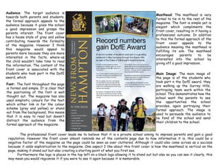
Main Image: The main image of
the page is of the students who
took part n the DofE award, they
are walking up the Surrey Hills,
portraying team work within the
school. This demonstrates how the
school want the parents to see
the opportunities the school
provides, again portraying their
formal approach. The image is
used to persuade the audience to
be fond of the school and send
their children to the school.
The professional front cover leads me to believe that it is a private school aiming to impress parents and gain a good
reputation. However the front cover almost reminds me of the contents page due to how informative it is, this could be a
negative factor of the magazine as the page could be seen as over cluttered. Although it could also come across as a success
because it adds sophistication to the magazine. One aspect I like about this front cover is how the masthead is vertical on the
page, making it stand out but also creating a starting point of what you first see.
Furthermore the logo is places in the top left on a black logo allowing it to stand out but also so you can see it clearly, this
may mean you would regconise it if you were to see it again because it is memorable.