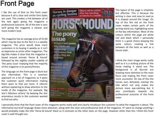
1. I think the main image works really
well as it is a striking picture of the
horse making it stand out. The
background is all blurred out
drawing more attention to the main
focus and making the front cover
more successful. On top of this the
horses ears delicately overlap the
title which not only makes the
picture more eye-catching but it
also contributes towards the
professional outcome of this front
cover.
The layout of the page is simplistic
but effective. This is because the
writing is clear and easy to read as
it is shaped around the image. On
top of this the red on the front
cover makes certain parts of the
writing stand out, highlighting some
of the key information. Most of the
colours within the page are white
red and black which I personally
think is a good choice keeping the
same colours creating a link
between all the texts as well as a
house-style.
I like the use of font on this front cover
because it all is clear and similar font styles
are used. This creates a link between all of
the text again giving the magazine a
professional outcome. All of the text is sans
serif giving the magazine a cleaner and
more modern look.
The magazine has an average price of £2.60
which may be due to the fact it is a weekly
magazine. The price would draw more
customers in to buying it weekly as it isn't
as expensive as some other magazines. The
big title makes it clear that the magazine is
based around animals ‘Horse & hound’
followed by the slightly smaller subtitle of
‘the pony issue’ implying that the majority
of this magazine is on ponies/horses.
The language on the front page is blunt but
also informative. This is a common
approach on a lot of magazines as it gives
the customer quick information making
them want to find out more. It informs
without explaining to draw attention to the
inside of the magazine. For example ‘Big
star’s fabulous victory’ by keeping the star
anomalous results in the customer wanted
to find out who.
I personally think that the front cover of this magazine works really well and clearly introduces the customer to what the magazine is about. The
informative but brief language draws more attention, along with the clear and professional look of the magazine. If I were to change anything I
would probably make the title ‘Horse & hound’ black so it contrasts to the other texts on the page. However other than this I think this front
cover is well thought out.
2. The contents page has a very
simplistic and basic layout which
makes it easy to read allowing the
customer to find what they want
quickly. Again like the front cover,
the text is clear especially on the
actually content information,
linking all of the section down the
right hand side together.
The magazine also uses pictures in
the contents page, which is
commonly used in many magazines.
This gives the page a variety of both
images and texts ensuring the page
isn’t bland. The pictures are also
numbered, these numbers are
surrounded with a border of lime
green, to link it to the text of
information on the bottom length.
This texts further explains what is
shown on the page, resulting in the
contents page being more
informative.
The language on the contents
page is slightly more
informative to give the
magazine more depth. In
addition to this the contents
page also included contact
details providing the customer
with that extra information
which can be useful.
Even though I like this contents
page as it has a clear and precise
layout, I feel like the layout can
come across as quite boring as
due to the common structure
show. This doesn’t make the
magazine stand out from others.
On top of this there are a lot of
colours used on this page, even
though this makes aspects of
the page stand out, it also makes
the page look really busy and
distracts you from the
information. To improve this
aspect I think the page should
have a maximum of 3 colours.
3. The layout of this double page spread is
again quite typical with an picture
overlapping both pages. The pale
colours of the sky allow the simplistic
font of the title stand out and means it
is the first thing you see after looking at
the picture.
There is in even amount of text and
images on the page which is a good
aspect because it balances it out
producing a professional outcome. As
well as this the pictures help to
separate the text out to make the
writing seem like a bearable amount to
read.
All of the images on the double page spread are action shorts of a
horse race. The main image is taking from a low angle to show the
stride of the horses races. This shows the thrilling side of horse races.
Each picture is explained with a small caption to explain when the
race was and who is shown in the picture. None of the pictures have
been edited to show the realistic approach implying that this double
page spread is quite informative.
The fonts on this page is again formal
and simple (Arial). Even though this
makes it easy to read I think that the
title could have a different font to
create that contrast, this would make it
stand out.
The content of these pages is all about
the horse racing imparticularly to do
with Kim Bolger and his horse ‘Trading
leather’. The big picture relates to this
content as it is the main chunk of
information.
However the double page is quite
casual and boring. There is no
effects on the pictures which
doesn’t make the page as eye-
catching. When I do my own I
would like to experiment with the
pictures to create the best impact.