AP Election Survey 2024: TDP-Janasena-BJP Alliance Set To Sweep Victory
Music magazine 2
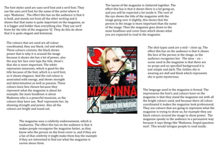
1. The layout of the magazine is cluttered together. The
The font styles used are sans serif font and a serif font. They effect this has is that it shows there is a lot going on,
use the sans serif font for the name of the artist where it and you will be expected a lot inside it. The root of
says ‘Madonna’. The effect this has on the audience is that it the eye shows the title of the magazine with the
is bold, and stands out from all the other writing and it image going over it slightly, this shows that the
shows that that name is quite important on the magazine, as person in the image is more important than the name
it is bigger and bolder than everything else. They use serif of the image. Then the magazine goes down to the
fonts for the title of the magazine ‘Q’. They do this do show main headlines and cover lines which shows what
that it is quite elegant and feminism. you are expected to read in the magazine.
The colours that are used are all colour
coordinated, they use black, red and white. The shot types used are a mid – close up. The
These colours connote, the black shows effect this has on the audience is that it shows
power that is why it is around the image the face of the person in the image, so the
because it shows she has a lot of power, also audience recognizes her. The mise – en –
the way her face over laps the title, show’s scene used in the magazine is that there are
that she is more important. The white no props and no specified background it is
represents innocents, which is good for the just simple and dark. The clothes she is
title because of the font, which is a serif font, wearing are dull and black which represents
so it shows elegance. And the red colour is she is quite mysterious.
associated with energy, and shows strength
and determination as well as passion. These
colours have ben chosen because they
represent what the magazine is about for The language used in the magazine is formal. The
example, the main headlines is about impressions the font’s and colours have on the
Madonna who is a powerful musician, so the magazine is that they stand the magazine out with all
colours they have use, ‘Red’ represents her, by the bright colours used, and because there all colour
showing strength and power. Also all the coordinated it makes the magazine look professional.
colours are bright and stand out. They use colours that are going to represent what the
magazine is trying to show us, for example they use
black colours around the image to show power. The
magazine speaks to the audience in a persuasive way
The magazine uses a celebrity endoresement, which is because it says things like ‘Madonna, Stupid question
madaonna. The effect this has on the audience is that it next’. This would intrigue people to read inside.
makes people recongoise the magazine better, as they
know who the person on the front cover is, and if they are
a fan of that celebrity it might make them buy the example
if they are interested to find out what the magazine is
saying about them.