"I see eyes in my soup": How Delivery Hero implemented the safety system for ...
Q mag
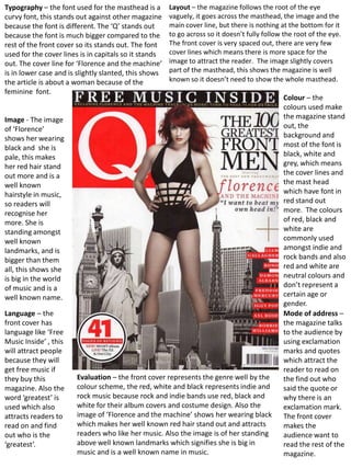
1. Typography – the font used for the masthead is a Layout – the magazine follows the root of the eye
curvy font, this stands out against other magazine vaguely, it goes across the masthead, the image and the
because the font is different. The ‘Q’ stands out main cover line, but there is nothing at the bottom for it
because the font is much bigger compared to the to go across so it doesn’t fully follow the root of the eye.
rest of the front cover so its stands out. The font The front cover is very spaced out, there are very few
used for the cover lines is in capitals so it stands cover lines which means there is more space for the
out. The cover line for ‘Florence and the machine’ image to attract the reader. The image slightly covers
is in lower case and is slightly slanted, this shows part of the masthead, this shows the magazine is well
the article is about a woman because of the known so it doesn’t need to show the whole masthead.
feminine font.
Colour – the
colours used make
Image - The image the magazine stand
of ‘Florence’ out, the
shows her wearing background and
black and she is most of the font is
pale, this makes black, white and
her red hair stand grey, which means
out more and is a the cover lines and
well known the mast head
hairstyle in music, which have font in
so readers will red stand out
recognise her more. The colours
more. She is of red, black and
standing amongst white are
well known commonly used
landmarks, and is amongst indie and
bigger than them rock bands and also
all, this shows she red and white are
is big in the world neutral colours and
of music and is a don’t represent a
well known name. certain age or
gender.
Language – the Mode of address –
front cover has the magazine talks
language like ‘Free to the audience by
Music Inside’ , this using exclamation
will attract people marks and quotes
because they will which attract the
get free music if reader to read on
they buy this Evaluation – the front cover represents the genre well by the the find out who
magazine. Also the colour scheme, the red, white and black represents indie and said the quote or
word ‘greatest’ is rock music because rock and indie bands use red, black and why there is an
used which also white for their album covers and costume design. Also the exclamation mark.
attracts readers to image of ‘Florence and the machine’ shows her wearing black The front cover
read on and find which makes her well known red hair stand out and attracts makes the
out who is the readers who like her music. Also the image is of her standing audience want to
‘greatest’. above well known landmarks which signifies she is big in read the rest of the
music and is a well known name in music. magazine.
2. Typography – the font used for the contents Layout – the contents page follows the root of the eye, it goes
page is the same font used for the front across the ‘Q Contents’, through the main image and across the
cover, the ‘Q’ is in the same curvy font. Also smaller images at the bottom. These are the main features of the
the ‘Q’ is larger than the rest of the writing contents page, because the images represent pages and there
on the contents page because it is the name content. The content in the magazine is down the left hand side
of the magazine and is well known in the and the pictures that relate to certain pages are down the right
musical world. The page definitions are in and at the bottom. This is used because readers usually read from
bold because they are important, the help left to right so they will read the page definitions then glance at
the audience find where the best stories are. the pictures to see if they like the look of the page.
Colour – the main Central Image –
colours used are the image of the
red, black and Muse band
white, these are member isn’t in
used because they the centre but
match the colours stands out by the
used on the front size of the image.
cover of the same He is wearing a
magazine. The shiny silver blazer
white ‘Q’ against which stands out
the red because it is
background is a bright, this is used
well known sign in because this
the musical world. shows the band
Red is used are a indie band
because it is a by the clothing
neutral colour, it worn.
doesn’t represent a
certain age, gender Language – the
or music style, language used in
because ‘Q’ the contents page
magazine is a shows that this
magazine magazine is a well
representing all known magazine.
genres of music. The page titles are
simply band
Mode of address – names and
the contents page famous music
uses words like ‘fab artists e.g. ‘The
four’ to show the Beatles’, this
audience this story shows the
is ‘fab’ and that the magazine is big
band is big. Also Evaluation – the contents shows the magazine is about all because of the big
‘rock nutters’ is genres of music by the colours used, e.g. red is a neutral colour musical names
used to show the which doesn’t represent a certain age, gender or music genre. featured.
band represents a Also the music artists featured on the contents page shows the
variety of genres magazine doesn’t have a certain genre, e.g. ‘Rock Nutters’ ‘The
including rock. Beatles' and ‘Rick Rubin’. The audience can tell the magazine is
well known because of the ‘issue 279’ this shows the magazine
is successful and has been around for a while.
3. Typography – the font used for the title of Layout – the first page on the double page spread is just an image
the double page ‘lady gaga’ changes from of ‘Lady Gaga’, it isn’t a cluttered page and therefore looks better
feminine font for the word ‘lady’ to the than a page full of information. The second page has three columns
word ‘GAGA’ in capitals so it stands out. of writing, but it looks well put together because of the large red ‘L’
This is used to show the word ‘gaga’ is well behind the font. The double page spread follows the root of the
known so when the readers see this word eye, it goes across the face of lady gaga, and across the title ‘lady
they will know exactly who this article is gaga’, then goes through the large red L representing ‘Lady Gaga’.
about. The article begins with the words Colour – The double page spread follows the same colour scheme as
‘Lady Gaga’, the page showing the font has the front cover and contents page of Q by using the red, white and
a large red ‘L’ behind the rest of the font. black. This shows that Lady Gaga’s music isn’t for a specific gender or
This is an example of an extremely large age, because red is a neutral colour. The page is mostly black and
kicker, and relates to the artists name. white and therefore the large red ‘L’ stands out, the L represents
‘Lady Gaga’ this shows the audience who the article is about.
Image - the image is of lady gaga wearing one of her Language and mode of address – the font
iconic unusual outfits. Lady Gaga is known for her used for the main title shows the article is
different style and in this image she is shown with no about a woman artist, and that the article is
clothes on but she has a necklace covering her body, this about a very well known artist. This is shown
attracts male readers and also attracts people who like by the word ‘lady’ which is in a very
lady gaga’s music. feminine font.
Evaluation – this page shows that this article is about a well known artist and that the article isn’t for a
particular age or gender because of the colours used. Red, black and white are neutral colours which
represent all genres, age groups and both genders. The image used attracts people because of the way
lady gaga is dressed, she is known for her elaborate costumes and clothing. The font used for the main
title is very feminine showing the article is about a female artist, also the word ‘GAGA’ is in capitals to
show this word is well known in the music world and will attract readers.