Modular Monolith - a Practical Alternative to Microservices @ Devoxx UK 2024
Contents 2
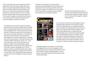
1. The font style used on this contents page is unusual and The layout of this magazine is a cluttered order as
adds a kind of music effect because it goes like a wave everything is squashed together and some things are over
length. It is all quite large and bold and stands out really lapping each other, like some page numbers and stand
easily. The headline stands out from all the other cover firsts over the images. The effect this has on the audience
lines as it is a lot larger than the other texts and bolder. is that it shows there is a lot going on inside, and what The root of the eye, follows the lay out as it
Also the text is a lot clearer where as the rest is almost a you’re expected to read inside the magazine. shows the main headline ‘Contents’ firstly, and
serif font. The effect these fonts have on the audience is then goes down through the images and cover
that it shows the magazine is quite modern and funky as it lines. This shows that the magazine is ordered
is a usual font type. I think these fonts were chosen to and professional.
liven up the magazine and add an extra effect.
The colours that are used in the contents page are colours
like yellow, black and purple. The connotations of these
The images used on the contents page are all images to colours are, yellow represents joy, energy and happiness
represent the cover lines they are going with, For example which are good for this magazine because there is so much
when it says about people being on tour, the picture is of going on, an energetic colour makes the magazine. They
two men together on tour. The shot types used are mainly use the colour black because it is a good colour that
mid shots. The effect these shots have on the audience is contrasts bright colours like yellow. This makes the bright
that it shows the emotion of the person in the picture and colours like the headlines stand out a lot better. Purple
there face, as well as what they are wearing and the also represents things like energy which is also good for
setting they are. In one of the images they use a low angle the magazine. These colours have been chosen because
shot, which shows the people in the photo have power and they add an effect to the magazine and make it more of
it creates an effect of dominance. The mise – en – scene the reason it’s trying to be, which is happy and energetic.
used in the images is that the costumes they are all
wearing are modern and everyday clothes, everyday
people would wear. The props used in the images are that
The magazine speaks to the audience in a positive way.
in one there is a guitar, this signifies that it is a music
The language they use is a informal language, as it’s all
magazine as they are including things that music is about.
quite slang words and shortening words like ‘INFO’ instead
Also in another image there is a large question mark. This
of information, and they say things like gossip. It tries to
is an extra effect as it is talking about the latest gossip and
draw you in by saying things like ‘the latest gossip!’ which
trying to create a sense of imagery and make you wonder
sounds really exciting.
what it is.