1. The layout of the magazine is cluttered, as everything is all squashed
together and you don’t really know where to look, as it’s all
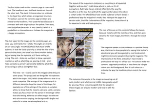
The font styles used on this contents page is a sans serif
everywhere. But it also has an ordered effect to it, the way the
font. The headline is very bold and stands out from all
headline is at the top, then with all the page numbers down the side in
the other text. The stand firsts are colour co- ordinate
a certain order. The effect these have on the audience is that it shows a
to the head line, which shows an organised structure.
professional way the magazine is made, they have put the pages in a
The colours used on the contents page are black and
certain order, then the clutteredness of the magazine, shows there is a
yellow for the headlines. They used the black because it
lot expected in side and loads going on.
contrasts well with bright colours like yellow. Then they
used the yellow because it is very cheerful, which is a
good effect on the audience as it shows the magazine is The root of the eye on this contents follows the layout,
a happy atmosphere. because it starts with the main head line, and then goes
down to the main images, And then a through the stand
firsts.
The shot types for the images on the contents pages are
close ups, and mainly mid – shots. The angles are mainly
an eye view angle. The effects these shots have on the The magazine speaks to the audience in a positive formal
audience is that the close up’s help us show the face of the way, that tries to draw people in by saying little by-line’s
person in the photo, and show’s us there emotion better, about what you will be expected to read inside which
by just seeing how the eyes are, or if there smiling or might interest some people in buying the magazine. The
crying. The mid – shots are used just to show a person’s impressions all the fonts and colours have inside is
reaction as well as what they are wearing. A mid – shot professional the way it is all laid out. The colours make the
helps us realise a person’s personality better by what they contents page really stand out as they have use a bright
are wearing as well as seeing their face. colour on a dull background. And it is all colour co –
ordinate the way the headline colours match the stand
The mise – en – scene used in the images is that they are firsts.
some props. The props used are things like microphones
which the singers hold, which shows reference that it is a The costumes the people in the images are wearing are all
music magazine. The settings of the images are all in quite modern and what normal middle class people would
different places to show the mood of the image, for be wearing. These costumes signify that the people in
example one of the settings of the photos is just plain these images are all quite modern and new in with the
white, to show that the mood is calm and suttle, and also fashion.
makes you focus more on the person in the image rather
than the setting. Whereas on other images like the one
with the musician singing, the background is bright and
colourful to show the atmosphere he is in.