1. Salford City College
Comment on how the design of the magazine cover attracts the target audience:I think this
Eccles Centre
AS Media Studies is mainly for the young adults and women because they always look for the latest trends
Foundation Portfolio which shows in this magazine of Amy Winehouse who is a popular celebrity, to represent a
sexy and rebellious look kind of woman and inspire other people to be like her. Another
Masthead
target audience can be for men as well because of the seductive look the model is doing Colour
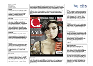
The masthead in this magazine identifies the ‘Q’ at
and we can tell this by the famous artists at the left side mentioned and the majority of The main colour of this magazine seems to be white,
the top left corner with a bold font. This is situated
them artists have a rap, hip hop genre type of music in which men would mostly like to orange and red. The orange colour represents a wild
firmly at the left corner and zoomed very big for
listen to. kind of atmosphere relating this to the artist in the
the reader to recognise the selling line of the
magazine. The white colour is made to support the
magazine as the Q magazine is popular.
orange colour and is used to stand out. The red
colour seems to stand out as well as it’s the main
Main image colour of the brand of the magazine.These main
The main image is instantly recognisable as it’s the colours emphasises the target audiences for women
main focus of the magazine and used a medium and men.
close-up shot on the model and also uses the
Typefaces
direct made address to draw the reader in with the
It suggests that its formal as none of the writings or
image of a seductive and sexy look. The image is
image are curved. This magazine reveals the target
also stereotypical in a provocative way, many
audience: For young adults and above. They only
readers may have different opinions as it shows
use this colour to blend in with the model.
how gorgeous the model is and many people might
feel discouraged or envious after seeing the image.
Photography Lighting
Model credit The lighting is vibrant high key making this a vintage
This relates to the image and people’s opinions look, this contrasts with a bright vibrant red to make
becoming more prominent. The word ‘one year on’ it a seductive and provocative image. Especially the
is used to emphasise to the reader and praise the strap of her clothes falling out of her shoulder which
model. The word ‘tribute’ is more emphasised on stands out a lot. Also the image is edited by
the spreading on each of the letter with a bright removing blemishes and freckles that we can spot
white colour at the top. also her skin is white which implies to gain
popularity for the model and as well as the
magazine.
Coverlines
The cover lines features the contents of the pages
inside and again for readers to buy the magazine Design Principles Used?
there are many other competitors whose target is At the primary optical area it has made the
also for many people to buy their magazines. The masthead to be at the top left of the magazine
Q magazine does this to be on the top selling where also the model of the magazine slightly
points. covers this as she is the main issue of the magazine
and how he model is trying to contact with the
reader or fan to make them feel close to her. At the
Main cover line
terminal area it is made to focus on the cover lines
The main cover line is written in a larger scale
and also the other artists included in the magazine
rather than the rest of the cover lines. Although in
where other fans might be interested in. This front
this magazine it doesn’t isn’t as big as the main House Style cover also uses an informal balance as the left side
focus is the main image of the magazine. ‘One year The magazine has a very formal language of the information on each of the words on the of the front cover seems to have few text but is
on’ shows that this cover line is more important cover. The writings are in capital and stand out constant and bright. The image and text made to be big whereas the right side of the front
than the rest as it a tribute to the past celebrity. creates contrast to stand out of each of the colours we can see which again suggests a cover shows to have smaller text but more cover
formal layout style. lines at the side.