1. Double Page Spread Analysis!
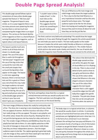
The use of Rihanna as the main image and
This double page spread follows typical “I couldn’t wear a dress celeb image really draws the target audience
conventions of many other double page made of ham”; is the in. This is due to the fact that Rihanna is a
spreads that feature in “We love pop” main title on this very inspirational character and has this very
magazine. The general layout is very double page spread. powerful and unique voice. The target
similar, as it is a pop magazine there is not This suggests that the audience aspire to be like her this draws
too many pictures over powering the text; article has something to them into buying and reading the magazine
but also there is not too much text do with clothing and because they want to know all about her and
overpowering the images there is an equal food. how they can too be just like her.
balance. This carries on the brand identity
of the magazine as there is a shared feature The fonts used are very bold and outstanding! This would draw the target
running throughout the magazine, such as audience in; if you were flicking through the magazine this article would stand
typical colours and layout features. out and make you want to read it. The text really speaks to the reader
because it makes the article seem really friendly as Rihanna is smiling and
The layout is pretty much very seems really cheerful drawing the target audience in. The smaller feature
similar to all of those that are article picture also seems quite cheeky and cheerful, the use of words also
shown in a double page make the magazine more friendly and like they can connect to the article and
spread. The use of the colour things the celebs are saying.
blue is used a lot throughout The colours that dominate the
“we love pops” magazine and double page spread are blue
the use of the big circles that and white; this gives this type
surround the main title and of cloud effect as if it is floating
the small pink shapes that in the sky. There is also a small
surround the big letters that detail of pink used to show tis
appear on the page. The layout very girly and feminine effect.
is a lot more appealing The use of the colour white
because; there is not too much shows that Rihanna is this very
text and this is good as if there elegant and pure character.
was a lot of text this may make The use of the colour blue
the target audience not want suggests this tom boyish
to buy the magazine as they character that is a bit rugged
may find it boring, the use of a around the edges but this soft
big and small picture also helps The fonts and typeface show that this is a typical baby blue suggest this gentle
as the double page spread is article/interview and that you would usually see in the character. The pink also shows
not too in your face and magazine. The font used also runs throughout the that she can be very girly and
doesn’t give you a headache. magazine and carries on this brand identity. feminine when she wants to
be.
The main image of Rihanna shows this really fun and quirky side
of her. The dress she is wearing is very revealing and sexy; shows The body copy is in a typical article form, in columns
this sex appeal of women. And this luxurious red colour of her like would be usually shown in articles. It constantly
hair really brings on this sex appeal. The pose is very playful, and consists of normal Arial front but some of the words
the white colour shows this sense of purity. Showing that she is and phrases are highlighted pink and in blue text. It is
not just this boring person she has many fun sides and traits to in the form of an article but it is an interview
her. The smaller image of Rihanna and NikiMinaj show this very between the writing of we love pop and Rihanna. It is
playful but bad side to them; it is also slightly seductive as Niki just constant chunks of writing so a lot of information
has a bit of cleavage on show and, this sexy pout really shows is shown so we get full details instead of just short
that they are these independent women=, that the target snippets of information. Rihanna is shown as a very
audience aspire to be like. The caption good girls gone bad really fun and quirky character throughout the article as it is
suits the image as they used to be these sweet girls now look at very strange and funny things that are being spoken
them as these seductive powerful celebrities. about such at the main title.
2. “Workout wonders” is the
name of the article on this
double page spread this
suggest that it is about
working out and tricks and
tips that you can use
The fonts and typeface when you are working
show that this is a typical out.
article/interview and
The main image of the wanted shows this hard working It is written in an article
that you would usually
group! It looks as if they are at the gym working out. This form with the use of
see in the magazine. The
would attract a female audience as girl like good-looking columns to make it seem
font used also runs
and healthy men; a lot of females like men that go to the slightly formal. It is an
throughout the magazine
gym and work out so this can help to draw in the interview between the
and carries on this brand
attention of the target audience. Some of the members editors of “We (heart)
identity.
just seem to be lazing about and not doing anything just pop” and the wanted so
The smaller photographs looking pretty for the camera and posing. Whereas other this can draw the target
draw the reader in as members of the band look like they are using weights but audience in as we get an
one if of images has one they make it look easy as if they are not even trying. insight into how they
of the members of the
The wanted are very good looking young men and a lot think and how they feel
band shirtless. This gives
of the female target audience have crushes on them, so on certain subject
the sex appeal and
they appeal to the target audience and make them want matters.
makes you want to read
the article because you to read the article even more because it is about people
Their poses seem to be
want to know what it is they love and people who inspire them.
quite laid back and
about and see what they relaxed as if they are
have to say. He is also a doing easy work; like
very handsome and they are these big
good looking young man macho men. They are all
which would appeal to happy and smiling
the target audience. appealing more to the
target audience drawing
The layout is quite
them in showing the
similar to how you
target audience that
would expect to see it in
they are friendly.
this magazine; the
writing is usually in The use of the sub
columns so inform us. heading “You’re
The colours are also gorgeous too!” makes it
quite typical for a girls sound as this section of
pop magazine as pink is the article is talking
always shown in a girls directly to the audience
pop music magazine. The use of the colours lilac and a light pink show these and the reader of the
The image of the celeb really feminine and girly colours, suiting the fact that it is magazine. Again making
or celebrities always a girl’s magazine but these are not very manly colours it sound friendly and
dominates the page and which is weird to see with an article about working out drawing the reader in
takes up most of the and a male boy band. The colours are also quite soft and making them feel
page and the writing light which make the article seem friendlier and directly special; like the wanted
surrounds it. for us. are calling them