EVALUATION Q2

How effective is the combination of your main
product (video) and ancillary texts (digipak and
advertisement)

Wednesday, 22 January 14
what aspects of your music video link with the digipak
and advertisement?-colour scheme
Here are some screenshots from the music video in which illustrate the direct visual links with the ancillary
work. For example the colours used in the ancillary work link clearly with one of the costume choices in the
music video. The colour Red for is used for a number of things, for example; in the advertisement for the
album name and for the “out now” and “plus” sign, inside the digipak for the cd and the background colour.
And finally it is used on the outside digipak for the tracklist and the information on the spine.
Costume choices

CD

Album name

Background
Tracklist

Red Lipstick

“Plus”

Red dress
“Out now”
Spine

Wednesday, 22 January 14
what other aspects of your music video link with the
digipak and advertisement?-location

Here is a screenshot from
the music video in which
illustrates the direct visual
link with the ancillary
work. This is due to the
location used in the
ancillary work as it is the
same location from the
music video. The location
used in both the music
video and ancillary
products is the canal. This
is obvious due to the same
costume being used.

Wednesday, 22 January 14
How did you plan to use synergy in your
production pieces?
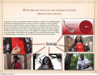
As a group, we came to an agreement that we would use a necklace of a magnifying glass
as the item of synergy. The reason as to why we chose a necklace as a use of synergy is
because it goes well with all the costume changes, it is a simple piece of jewellery and
also easy to remember to incorporate into every part of the video. The way in which the
synergy was used in the music video, is it was used as part of the each costume change.
The way in which the synergy was used in the digipak is by adding it inside the digipak
as the main image. Unfortunately, the synergy was not used in the advertisement which
is a disadvantage as the audience may not understand the link between the three.

Synergy

Wednesday, 22 January 14
How can your audience recognise them as linked products?
The audience may recognise the three
media products as linked products due
to several different reasons. Firstly the
same image of the artist is used on the
front panel of the digipak along with
the advertisement. Secondy the colours
used link all three media products
(music video, digipak and advert) as
there is an obvious Red, Black and
White theme being used. Thirdly the
first location to be shown on the music
video is the location is which I chose to
take a image for the digipak which
therefore means adding onto my advert.
Additionally the artists’ name is clear in
all three media products as the digipak
and advertisement have it clearly placed
at the very top, along with it inside of
the digpak on the cd and also the music
video introduces the name right at the
very beginning. Furthermore the album
name is used on the front panel and the
inside panel, (on the cd) of the digipak
and on the advertisement. And finally
the artists’ website is used on the
advertisement which includes the
artists’ name.
Wednesday, 22 January 14
How successful do you think your main and ancillary texts are?
In my own opinion I think the magazine advertisement is the strongest product out of all three media products and I
think this because I believe it looks professional as it includes significant information however not overloaded with text to
make it look boring. Additionally the album is also added into the advert and this may help to attract the audience due to
the black border placed behind, to help make it stand out more. Moving on to the front panel of my digipak, I believe this
too is quite strong and successful as it is very simple, however follows all the conventions of a real digipak. Unfortunately
the inside of the digipak is not as strong as it looks like the necklace is floating due to gradient being added in. This makes
it look unprofessional. Finally I think the main product is quite successful as it followed most of the conventions of a real
digipak and also the lip syncing made it look more professional as it was a perfect match up with the base tracks.

Wednesday, 22 January 14
do you think your target audience will be attracted
to the ancillary work?
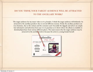
The target audience for my music video is 16-24 females. I think the target audience will definitely be
attracted to the ancillary products due to several different reasons. Firstly the ancillary products are
very feminine, due to the colours and the costumes used. Secondly the digipak and advert are simple
but informative and advertises how easy it is to purchase as it shows where the album is available to
download/purchase from various different places. The main reason why the target audience may be
attracted to the ancillary work is because the artist is a young female herself.

Wednesday, 22 January 14
Compare with existing products
Little Mixs’ ancillary products
influenced my ideas and I believe that I
have followed some of the conventions
they followed. However although there
are similarities between the professional
digipak and advertisement and my
ancillary work, there are also
differences. Starting off with the
advertisement the name of the band
and the name of my artist are both big
and clear to read. However Little Mixs’
digipak does not include a album name,
where as mine does. My advert also
includes magazine reviews and the
album cover where as Little Mixs advert
includes tour dates and a image of the
group. There are more differences than
similarities between these two
advertisements. The professional
digipak and my digipak share many
similarities. Firstly the front panel
includes a image of the artist/band, the
name of the artist/band and the album
name. Secondly the back panel includes
a tracklist, a barcode, copyright
information and record company logos.

Wednesday, 22 January 14
Reflect on audience feedback
When I asked for some feedback on the link between my
ancillary products and music video I hoped to learn how
effective my chosen combination was and learnt that it was in
fact a very simple and effective link.The main thing that made
this combination effective is the synergy used. This is because
the person from the audience mentioned how the necklace
used in the digipak was evident to be the exact necklace that
was used in the music video.

Wednesday, 22 January 14

Evaluation question 2

  • 1.
    EVALUATION Q2 How effectiveis the combination of your main product (video) and ancillary texts (digipak and advertisement) Wednesday, 22 January 14
  • 2.
    what aspects ofyour music video link with the digipak and advertisement?-colour scheme Here are some screenshots from the music video in which illustrate the direct visual links with the ancillary work. For example the colours used in the ancillary work link clearly with one of the costume choices in the music video. The colour Red for is used for a number of things, for example; in the advertisement for the album name and for the “out now” and “plus” sign, inside the digipak for the cd and the background colour. And finally it is used on the outside digipak for the tracklist and the information on the spine. Costume choices CD Album name Background Tracklist Red Lipstick “Plus” Red dress “Out now” Spine Wednesday, 22 January 14
  • 3.
    what other aspectsof your music video link with the digipak and advertisement?-location Here is a screenshot from the music video in which illustrates the direct visual link with the ancillary work. This is due to the location used in the ancillary work as it is the same location from the music video. The location used in both the music video and ancillary products is the canal. This is obvious due to the same costume being used. Wednesday, 22 January 14
  • 4.
    How did youplan to use synergy in your production pieces? As a group, we came to an agreement that we would use a necklace of a magnifying glass as the item of synergy. The reason as to why we chose a necklace as a use of synergy is because it goes well with all the costume changes, it is a simple piece of jewellery and also easy to remember to incorporate into every part of the video. The way in which the synergy was used in the music video, is it was used as part of the each costume change. The way in which the synergy was used in the digipak is by adding it inside the digipak as the main image. Unfortunately, the synergy was not used in the advertisement which is a disadvantage as the audience may not understand the link between the three. Synergy Wednesday, 22 January 14
  • 5.
    How can youraudience recognise them as linked products? The audience may recognise the three media products as linked products due to several different reasons. Firstly the same image of the artist is used on the front panel of the digipak along with the advertisement. Secondy the colours used link all three media products (music video, digipak and advert) as there is an obvious Red, Black and White theme being used. Thirdly the first location to be shown on the music video is the location is which I chose to take a image for the digipak which therefore means adding onto my advert. Additionally the artists’ name is clear in all three media products as the digipak and advertisement have it clearly placed at the very top, along with it inside of the digpak on the cd and also the music video introduces the name right at the very beginning. Furthermore the album name is used on the front panel and the inside panel, (on the cd) of the digipak and on the advertisement. And finally the artists’ website is used on the advertisement which includes the artists’ name. Wednesday, 22 January 14
  • 6.
    How successful doyou think your main and ancillary texts are? In my own opinion I think the magazine advertisement is the strongest product out of all three media products and I think this because I believe it looks professional as it includes significant information however not overloaded with text to make it look boring. Additionally the album is also added into the advert and this may help to attract the audience due to the black border placed behind, to help make it stand out more. Moving on to the front panel of my digipak, I believe this too is quite strong and successful as it is very simple, however follows all the conventions of a real digipak. Unfortunately the inside of the digipak is not as strong as it looks like the necklace is floating due to gradient being added in. This makes it look unprofessional. Finally I think the main product is quite successful as it followed most of the conventions of a real digipak and also the lip syncing made it look more professional as it was a perfect match up with the base tracks. Wednesday, 22 January 14
  • 7.
    do you thinkyour target audience will be attracted to the ancillary work? The target audience for my music video is 16-24 females. I think the target audience will definitely be attracted to the ancillary products due to several different reasons. Firstly the ancillary products are very feminine, due to the colours and the costumes used. Secondly the digipak and advert are simple but informative and advertises how easy it is to purchase as it shows where the album is available to download/purchase from various different places. The main reason why the target audience may be attracted to the ancillary work is because the artist is a young female herself. Wednesday, 22 January 14
  • 8.
    Compare with existingproducts Little Mixs’ ancillary products influenced my ideas and I believe that I have followed some of the conventions they followed. However although there are similarities between the professional digipak and advertisement and my ancillary work, there are also differences. Starting off with the advertisement the name of the band and the name of my artist are both big and clear to read. However Little Mixs’ digipak does not include a album name, where as mine does. My advert also includes magazine reviews and the album cover where as Little Mixs advert includes tour dates and a image of the group. There are more differences than similarities between these two advertisements. The professional digipak and my digipak share many similarities. Firstly the front panel includes a image of the artist/band, the name of the artist/band and the album name. Secondly the back panel includes a tracklist, a barcode, copyright information and record company logos. Wednesday, 22 January 14
  • 9.
    Reflect on audiencefeedback When I asked for some feedback on the link between my ancillary products and music video I hoped to learn how effective my chosen combination was and learnt that it was in fact a very simple and effective link.The main thing that made this combination effective is the synergy used. This is because the person from the audience mentioned how the necklace used in the digipak was evident to be the exact necklace that was used in the music video. Wednesday, 22 January 14