
Recommended
More Related Content
What's hot
What's hot (20)
Viewers also liked
Viewers also liked (20)
Similar to My magazine cover analysis-contents
Similar to My magazine cover analysis-contents (20)
More from NathLaver
Recently uploaded
Recently uploaded (20)
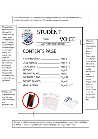
My magazine cover analysis-contents
- 1. Consistencybetweenthe coverandcontentspage shownthroughthe use of the Mast Head, Strapline,logoandtextonthe banner.Thisgivesaprofessional appearance. The page as a whole looksveryblandandbasic,thusnotappealingtothe reader.Thisismainlydue to the lack of colour used,andthe verybleakmasthead(as itis onlya simple font). The mast headisn’t recognisable due to it beenso basic. Therefore it won’tcatch the attention of readers, but alsowill not be recognised, or go noticed. A simple improvement couldbe made by simplygiving it a more unique look that simple text. The textis all alignedtoensure that the page looksconsistent, and proportionate. The page looks extremelybasic. Althoughall informationthe readerwould wantto knowis easilyreadable, due to the plain layoutthe page isextremely boring.To improve the page,the additionof more coloursalong witha more distinctand unique (thus recognisable) layoutwouldbe much preferred by readers.