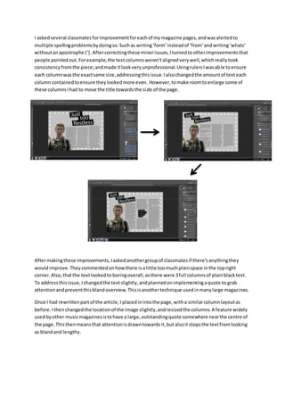
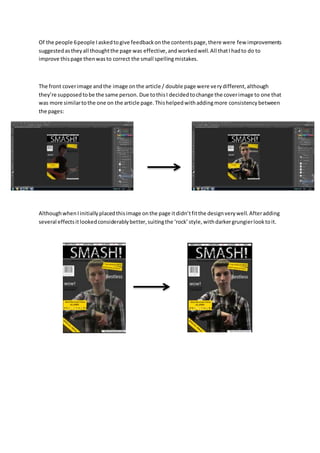
I askedseveral classmatesforimprovementforeachof mymagazine pages,andwasalertedto
multiple spellingproblemsbydoingso.Suchas writing‘form’ insteadof ‘from’ andwriting‘whats’
withoutanapostrophe (‘). Aftercorrectingthese minorissues,Iturnedtootherimprovementsthat
people pointedout.Forexample,the textcolumnsweren’talignedverywell,whichreallytook
consistencyfromthe piece;andmade itlookveryunprofessional.UsingrulersIwasable toensure
each columnwasthe exactsame size,addressingthisissue.Ialsochangedthe amountof texteach
columncontainedtoensure theylookedmore even. However,tomake roomtoenlarge some of
these columnsIhad to move the title towardsthe side of the page.
Aftermakingthese improvements,Iaskedanothergroupof classmatesif there’sanythingthey
wouldimprove.Theycommentedonhow there isalittle toomuchplainspace inthe topright
corner.Also,thatthe textlookedto boringoverall,asthere were 3full columnsof plainblacktext.
To addressthisissue,Ichangedthe textslightly,andplannedonimplementingaquote to grab
attentionandpreventthisblandoverview.Thisisanothertechnique usedinmanylarge magazines.
Once I had rewrittenpartof the article,I placedinintothe page,witha similarcolumnlayoutas
before. Ithenchangedthe locationof the image slightly,andresizedthe columns.A feature widely
usedbyother musicmagazinesistohave a large,outstandingquote somewhere nearthe centre of
the page.Thisthenmeansthat attentionisdrawntowardsit,but alsoit stopsthe textfromlooking
as blandand lengthy.
Of the people 6people Iaskedtogive feedbackonthe contentspage,there were few improvements
suggestedastheyall thoughtthe page was effective,andworkedwell.All thatIhadto do to
improve thispage thenwasto correct the small spellingmistakes.
The front coverimage andthe image onthe article / double page were verydifferent,although
they’re supposedtobe the same person. Due tothisI decidedtochange the coverimage to one that
was more similartothe one on the article page.Thishelpedwithaddingmore consistency between
the pages:
AlthoughwhenIinitiallyplacedthisimage onthe page itdidn’tfitthe designverywell.Afteradding
several effectsitlookedconsiderablybetter,suitingthe ‘rock’style,withdarkergrungierlooktoit.

Improvments made

  • 1.
    I askedseveral classmatesforimprovementforeachofmymagazine pages,andwasalertedto multiple spellingproblemsbydoingso.Suchas writing‘form’ insteadof ‘from’ andwriting‘whats’ withoutanapostrophe (‘). Aftercorrectingthese minorissues,Iturnedtootherimprovementsthat people pointedout.Forexample,the textcolumnsweren’talignedverywell,whichreallytook consistencyfromthe piece;andmade itlookveryunprofessional.UsingrulersIwasable toensure each columnwasthe exactsame size,addressingthisissue.Ialsochangedthe amountof texteach columncontainedtoensure theylookedmore even. However,tomake roomtoenlarge some of these columnsIhad to move the title towardsthe side of the page. Aftermakingthese improvements,Iaskedanothergroupof classmatesif there’sanythingthey wouldimprove.Theycommentedonhow there isalittle toomuchplainspace inthe topright corner.Also,thatthe textlookedto boringoverall,asthere were 3full columnsof plainblacktext. To addressthisissue,Ichangedthe textslightly,andplannedonimplementingaquote to grab attentionandpreventthisblandoverview.Thisisanothertechnique usedinmanylarge magazines. Once I had rewrittenpartof the article,I placedinintothe page,witha similarcolumnlayoutas before. Ithenchangedthe locationof the image slightly,andresizedthe columns.A feature widely usedbyother musicmagazinesistohave a large,outstandingquote somewhere nearthe centre of the page.Thisthenmeansthat attentionisdrawntowardsit,but alsoit stopsthe textfromlooking as blandand lengthy.
  • 2.
    Of the people6people Iaskedtogive feedbackonthe contentspage,there were few improvements suggestedastheyall thoughtthe page was effective,andworkedwell.All thatIhadto do to improve thispage thenwasto correct the small spellingmistakes. The front coverimage andthe image onthe article / double page were verydifferent,although they’re supposedtobe the same person. Due tothisI decidedtochange the coverimage to one that was more similartothe one on the article page.Thishelpedwithaddingmore consistency between the pages: AlthoughwhenIinitiallyplacedthisimage onthe page itdidn’tfitthe designverywell.Afteradding several effectsitlookedconsiderablybetter,suitingthe ‘rock’style,withdarkergrungierlooktoit.