1. Mastheadthe masthead of this magazine is important to gain the Comment on how the design of the magazine cover attracts the target audience:i believe
audience. As it isn’t a well-known magazine as such they need to that when you add all the key components of the magazine together it fits in nicely with the
make sure that it stands out. They do this by having it in big, bold target audience. I believe that the target audience would be trying to reach those that listen
black writing. This is eye catching on this particular magazine as you to music such as r’n’b. I believe this due to how subtle the magazine is, they don’t need a lot
see that there isn’t a lot going on in the front cover, so the mast head of writing to sell the magazine. I think this would attract the target audience as they wouldn’t
Colour: the front cover is filled with the colour black, the
stands out so much as well with the main image. want to be bombarded with information on the front cover, they would rather elt the inside
majority of the writing is black, and then the jacket on the
of the magazine do the talking rather than the front cover. This is essential for the magazine
character on the main image has this thick leather jacket on.
as they then must make sure that the inside of the magazine is essential to keep attracting
This effect is sued to show off 3different aspects. In as you see
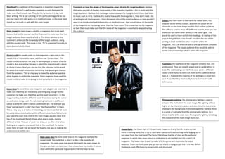
Main imagethe main image is vital for a magazine that is not well the audeicne.
there is in fact some other writing in the colour gold. This
known. And on this you can see that they want to make sure that the
would be used to have sort of mini headings. At the top of the
target audience know exactly who it is. The direct address to the
page in the gold font it has ‘inside’ and then the rest of the
customer’s enhances the knowledge of the target audience, along
writing in black establishes who would be within the
with the model credit. This mode in this, ‘T.I’ is presented formally, in
magazine. This is an effective sue to split up different concepts
a pre planned photo shoot.
of the magazine. The target audience then would be able to
locate and acknowledge what is within the magazine.
Model creditthe model credit on this magazine is right next to the
model. It is of the models name, and then has ‘comes clean’. This
model credit is essential not only for some people to realise who the
model is. But also setting the way in which the magazine will e about. Typefaces: the typefaces of this magazine are very slick, and
As it says ‘comes clean’ you can see that the interview inside would professional. They are straight edged and in capital letters in
be about the model announcing something that would gain interest bold. The sub headings on the front cover are In a different
from the audience. This is a key way to make the audience question colour and in italics to stand out more so the audience would
what is going on within the magazine. Giant magazine have used the look at it. However the majority of the writing is in small font,
model credit to make it intriguing to find out what is in the magazine. so it shows that they don’t really have to bombard it with
information.
Cover linesthe cover lines on a magazine such as giant are essential to
make sure that they are interesting and intriguing enough for the
customers to make sure that they want to read more into it. In this
magazine they make the different cover lines stand out by the colour
co-ordination being used. The sub-heading is almost in a different Photography Lighting: the photography lighting is used to
colour to what the artist’s names underneath are. For example you enhance the cha4cetr in the main image. The lighting reflects
have ‘special report in gold’ then have ‘the Obama effect’ in black. highly on the characters jacket, and also gives the character a
This is a key way as it makes it interesting and stand out that bit more shadow in the background. From looking at this I believe there
by using colour coordination within different cover lines. Not only do is a sense of authority from the photography lighting. As it
you have the cover lines next to the main image, you also have it on shows that he is the main man. Photography lighting is making
top of the masthead. Here it shows what else is inside, naming the character of the main image stand out.
different artists. This use of cover line is key as no after what when
looking at a magazine you would look at the masthead. So having
some form of cover line on top of the heading is a way of making the
House Style: the house style of this particular magazine is very formal. As you can see
audience looks at this also.
there is nothing really that is try to catch your eye as such, and nothing really bulging out at
you apart from the mast head. The formal feel shows that bit of class on this particular
Main cover line:the main cover lines in this magazine issimply the
magazine In which they show colour co-ordination to set the feel that it is a rich r’n’b
model credit. Normally that is what it is like in the majority of
magazine. The house style is used to make it fit the genre and also meet the target
magazines. The main cover line would link in with the main image. In
audience. From the front cover you get the feel that it is trying to get that r’n’b vibe. Which
this you see how the main cover lines shows how the model, TI comes
I believe is used effectively by being subtle and structured.
clean within this particular magazine and the interview he has.