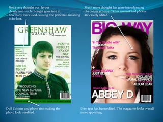
1. Not a very thought out layoutclearly not much thought gone into it.Too many fonts used causing the preferred meaningto be lost. Much more thought has gone into planningthe colour scheme. Tidier content and photosare clearly edited. Dull Colours and photo tint making thephoto look unedited. Even text has been edited. The magazine looks overall more appealing.
2. Clearer communication using descriptionsand a preview of what’s to come using images. Not much thought has gone into themaking of this page. Looks very plain and not like a contents page at all. No website or page numbers inserted,Same font used making the magazine page very dull. Background inserted making the pagemuch more appealing and also a very though out layout.