
Recommended
More Related Content
What's hot
What's hot (16)
Viewers also liked
Viewers also liked (20)
Similar to Analysis of TV GUIDE
Similar to Analysis of TV GUIDE (20)
Recently uploaded
Recently uploaded (20)
Analysis of TV GUIDE
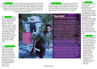
- 1. The MAIN IMAGE takes up the whole A3 page with only ½ of it being in focus. The right hand side of the image is faded behind the coloured text box, which contains the article. The image captured is a medium- long shot of the two actors playing in character. This will allow the audience to identify the characters and potentially guess what will happen in the new episodes. The MAST HEADING is larger than the rest of the text on the page. This will enable its audience to quickly identify what the article is featured on. The font is also different to the other text on the page again making it stand out from everything else. The SIDE QUOTE gives a bit of inside gossip into what is going to happen in the forthcoming episodes. This will influence fans to want to read this article as they will want to know what is going to happen next and whether it will be worth watching. The side quote also includes the characters names again so the audience can quickly identify them. The STAND FIRST enables its audience to see when the programme is on. It is important to do research as to when air the programme so that nothing similar clashes which could lead to high competition. It hightlight’s which night of the week ‘Teen Wolf’ is on and what time. It also gives its audience the website in which you could find out information from and also social media sites for people to discuss the show. The COLOUR SCHEME used in this double page spread relate quite cleverly to the theme of Halloween, which can be related with wolves. The dark, gloomy colours of grey and purple create a daunting atmosphere. This represents the genre of the programme. The BODY TEXT is the main text on the page. In this instance the writer has used a new story style which just contains contextual information for its readers. The writer is introducing the new series, giving an insight into what could possible happen. This will create suspension resulting in its audience to want to watch the new episodes. Siobhan Ruhan