
Recommended
More Related Content
What's hot
What's hot (20)
Similar to Unit1 pptx
Similar to Unit1 pptx (20)
More from Ldowley
Recently uploaded
Recently uploaded (20)
Unit1 pptx
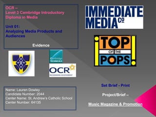
- 1. OCR – Level 3 Cambridge Introductory Diploma in Media Unit 01: Analyzing Media Products and Audiences Evidence Name: Lauren Dowley Candidate Number: 2044 Center Name: St. Andrew’s Catholic School Center Number: 64135 Set Brief - Print Project/Brief – Music Magazine & Promotion
- 2. 4. Focus publisher and product 5. Top of the Pops magazine info 6. LO1 7. Ownership structure 8. Operating model 9. Brand ideology/ ethos 10. Technological convergence 11. Associated products 12. Market position 13. Market position 14. Competitors 15. Magazine competitors 16. Top of the Pops front cover annotations 17. Top of the Pops DPS 18. Top of the Pops contents page annotations 19. Purpose 20. Genre 21. Form and style 22. Production process 23. Production process for Top of the Pops 24. Content 25. LO2 26. Target audience 27. Target audience 28. Spending power 29. Target audience 30. Target audience 31. Psychographics 32. Primary research- survey analysis 33. Primary research- survey analysis 34. Primary research- survey analysis 35. Primary research- survey analysis 36. Primary research- survey analysis 37. Review analysis- secondary research 38. Review analysis- secondary research 39. Review analysis- secondary research 40. LO3 41. Product advertising and marketing
- 3. 42. Product advertising and marketing 43. Retail outlets 44. Online 45. LO4 46. Legal and ethical issues 47. Legal and ethical issues 48. Legal and ethical issues 49. Accuracy- IPSO 50. Discrimination- IPSO 51. Watermark 52. IP- trademark costs 53. IP- trademark processIP- trademark process 54. IP- trademark process 55. IP- trademark process 56. IP- trademark process 57. IP- trademark process 58. IP- trademark process 59. IP- trademark process 60. IP- trademark process 61. IP- trademark process 62. IP- trademark process 63. IP- trademark process 64. IP- trademark process 65. IP- trademark process 66. IP- trademark process 67. IP- trademark process 68. IP- trademark process 69. IP- trademark process 70. IP- trademark process 71. IP- trademark process 72. IP- trademark process 73. IP- trademark process 74. IPSO 75. Stereotypes 76. Impact on the target audience 77. TOTP’s front cover 78. TOTP’s contents page 79. My complaint 80. My complaint 81. My complaint 82. My complaint
- 5. It is published by Immediate Media Company but the predecessor for the Top Of The Pops magazine is the BBC. The number of copies sold are ‘47 million copies over the last 249 issues’ (http://www.licensing.biz/news/read/bbc-top-of-the-pops-magazine-celebrates-250th- issue/040132) Its sister magazine was ‘It’s Hot’ sold its last issue on 19 July 2007.
- 7. The magazine launched in March 1995. the company was founded 1 November 2011. Immediate media is a local company in London and Bristol. Their sister company was called ‘It’s Hot’ but was cancelled and sold their last issue on 19 July 2007. The company plan to acquire future publishing's of sport and crafts.
- 8. Stephen Alexander Chairman Executive team Senior Management http://www.immediate.co.uk/ourpeople/
- 9. The slogan for ‘Immediate Media .Co’ is ‘CONTENT. PASSION. ENGAGEMENT.’. This connotes that the company want their customers to be content with their magazines, passionate about their writing and company and be engaged with their magazines and company . The banner for the website is mainly grey with a white font. The grey represents sadness but also compromise, as it is neither black or white. Grey also represents elegance and formality. The word ‘immediate’ connotes speed which suggests that the company’s media is instant and fast and therefore reliable. They are a local Publishing company in London and Bristol. Listed below are only a couple of the magazines that the company have published. As you can see all of the magazines have a special interest in magazines, but they are all very different. It was formed on 1 November 2011 and is owned by Exponent Private Equity. (http://en.wikipedia.org/wiki/Immediate_Media_Company)
- 10. http://www.youtube.com/channel/UC5q7oJeRhgUn0DPJYY_MVsQ - Immediate’s you tube account. https://twitter.com/Immediate_Media - their twitter page. https://www.facebook.com/immediatemedia - their Facebook page. https://www.linkedin.com/company/immediate-media-co- - their linkedin account. Immediate media company don’t publish their magazines online but they do allow you to look inside at a few of the pages of the magazine.
- 11. Immediate media don’t publish just pop magazines, they publish many other different types of magazines of all different types of genres. They genres include cooking, gardening, science and technology, music, history, children’s TV shows magazines and many more. The net worth of immediate media company is £4,265, 444.
- 12. http://www.hypebot.com/hypebot/2015/01/n ielson-study-reveals-rock-prevails-as-most- popular-genre-in-the-us-.html •Rock - 29% •R&B/ Hip Hop - 17.2% •Pop - 14.9% •Country - 11.2% •Dance/EDM - 3.4% •Christian/Gospel - 3.1% •Holiday/Seasonal - 2.6% •Latin - 2.6% •Jazz - 1.4% •Classical - 1.4% •Children - 1% As you can see, Pop is the third most popular genre that people listen to, which connotes that even though it isn't the most popular, the genre is still popular.
- 13. • Leading publications within the genre (Pop) • Circulation Figures – HOW do the 2 leading Pop magazines compare? WHO publishes them? NRS website and see links Mr. Crafts sent – RESEARCH!!! Leading Publishers in the UK: (Circulation figure; percentage change year on year) Bauer Consumer Media : 2,409,804 ; -10.7% Conde Nast Publications Ltd : 1,448,477 ; - 3.7% D C Thomson & Co Ltd : 493,388 ; 9.1% Dennis Publishing Limited : 473,471 ; -3.8% Egmont Magazines UK : 520,005 ; 20.8% H Bauer Publishing : 2,854,452 ; -4.0% Haymarket Consumer Media : 368,617 ; -0.5% Hearst Magazines UK : 3,513,131 ; -9.0% Immediate Media Company : 3,041,105 ; - 2.4% IPC Media Ltd : 5,427,741 ; -6.1% Circulation: 115,000
- 14. There are five major publishers: Immediate media, Dennis Publishing, Hearst Media, Bauer and Vice Media. Dennis Publishing was founded in 1975 and is owned by Felix Dennis who passed away 22nd June 2014. His net worth was over £750 million. (Wikipedia) Hearst Media was founded in 1887 by William Randolph Heart. The company's net worth is £9.8 billion. (http://www.forbes.com/sites/kerryadolan/2011/09/21/richest- families-on-the-forbes-400/ ) Bauer media was founded in 1875, by Yvonne Bauer. I couldn't find the net worth for the company.(Wikipedia) Vice media was founded in 1994 by Suroosh Alvi, Shane Smaith and Gavin Mclnnes. Their net worth is £1.4 billion. (http://www.forbes.com/sites/jeffbercovici/2013/09/18/shane- smith-vices-400-million-man-is-new-yorks-newest-media-mogul/ )
- 15. The main competitor with ‘Top of the Pops’ magazine is ‘We Love Pop’. This is also a monthly magazine, first published in July 2011 by ‘Egmont’. https://www.egmont.co.uk http://www.mediaweek.co.uk/article/108049 3/egmont-launches-new-teen-magazine- we-love-pop http://www.welovepopmag .co.uk/about
- 16. Masthead = simple font, which won’t be too complicated for young children as it won’t make a difference to them, hot pink, which is quit a girly and happy color for girls and definitely not suitable for boys, it has stars around the edge which makes it more pretty and again more girly. The white font connotes purity which makes the magazine more clean for young females to read. Date, Price and Barcode = ‘9 September 2014, £3.99’ – monthly subscription. Main headline = uses bright colors to appeal to young females and make the circle stand out more and the info inside the circle. The circle shape also stands out as most other things are square. Colloquial or slang language has been used by the word ‘lot’ to appeal to the younger target audience, as they would most likely use more slang than adults. The magazine cover overall uses a lot of bright, stereotypically girly colors to appeal to the target audience of younger pre-teen or early teen female girls. It also makes the page look more fun and attractive, therefore more enjoyable to read. The colors include: hot pink; yellow; blue and white. These colors connote a very happy, exciting and safe feel to the magazine, therefore making it appeal more to the target audience. Main image = popular people from girls’ favorite boy bands to make the magazine look more fun, interesting and enjoyable. Each of the boys in the main image is star appeals from popular bands. The reader can then see that the magazine knows who is most popular and that they know what they’re talking about so therefore it would be a good magazine. ‘Pops’ the sub-genre is pop music. Anchorage text= understand the headline in the main image. Buzz word= ‘Bonus’ it is also outlined by a puff.
- 17. The title has used a pun in the title to appeal to the target audience as puns are never serious, portraying that the magazine and the interview isn’t very serious. This makes it more light hearted for the audience, which makes them want to read the article more. This bold heading of the interview takes up almost half of the page, making it seem like the title is just as important as the actual interview. This suggests that the interview isn’t important. The reader denotes that the interview will be fun, entertaining and casual, which is just what a teen magazine should be. On this page there is a big picture which almost fills up the whole page. The reader sees this and instantly knows what the interview is about and knows that there isn't much reading because the space is filled up with a picture. This attracts the reader to read the article because not all teenagers like reading heavy paragraphs a two or more pages of an interview. This magazine also has images in line with the text as well. This makes the more interesting, there is less to read and more to look at. The font used is pink, which connotes a ‘girly’ outlook, something which could be considered fun and uncomplicated making the reader more interested as apposed to bored.
- 18. Image of front cover with specific section of the page labelled with page number for easy access to everything that is on the page. Personal message for all the readers as an introduction to the magazine. Pictures of celebs dotted around to fill up blank spaces. Have spilt up contents into sections for easier location of article or to pinpoint the specific articles. Pages in order of number. Specific words in bold which the reader could find interesting or important e.g. ‘OMG!’, ‘Your Problems’ ‘Fashion and Make-up’, ‘Gossip’, ‘The Latest’ and stars like: ‘Ella Henderson’, ‘5SOS’, ‘1D’
- 19. The purpose is to entertain young teenage girls by giving them tips, help, advice and many other thing including quizzes, interviews and posters of popular bands. The logo for the magazine ‘Top of the Pops’ connotes that the magazine is about Pop music and that they're at the top, hence the word ‘Top’. The strapline on the cover of the magazine is ‘GOSSIP CRINGES SHOPPING BOYS’. This connotes to the readers what the main subjects in the magazine are. This makes it clear for the reader to see and shows them that because they layout is so clear, its easier to understand as well.
- 20. The denotation of the genre is pop music. The readers can tell this from the verbal code of the masthead ’Top of the ‘Pops’’, which obviously connotes pop music. On the main cover there is always a famous pop star or band, which ‘signifies’ (De Saussure) straight away that it is a pop magazine that helps sell it’s issues based on capturing the attention of a young, passive reader with the use of ‘star appeal’ (Richard Dyer).
- 21. Through out the magazine utopian colours have been used on every page to make the magazine more happy, light hearted and fun which appeals more to younger female teenagers. Also throughout, the magazine uses different fonts for almost everything, as it makes the page seem more fun, interesting and exciting, therefore making it appeal to the target audience more. The height and width of my magazine will be the same as all publications, height= 28.4cm and width= 21cm. Bright yellow & pink Blue & yellow White, blue & pink against the black White & yellow against blue The word ‘Solved’ shows reassurance for the readers who will by the magazine, suggesting they will learn something and get help with stresses so that they will never have to worry about those specific stresses again.
- 22. http://www.missiecindz. com/2013/01/12/the- process-of-creating-a- magazine/ I have tried to contact the magazine editors to find out more about the magazine and its process etc… but this is the only response that I have received:
- 23. First of all the chief editor will have to create a schedule for producing the magazine. This includes: deadlines for when the stories for the magazine have to be submitted by, making sure there is enough time left over for proofreading, the printing deadline and of course distribution deadline also has to be concluded. A content plan then needs to be produced for the editors of the magazine to know what will be going into the magazine, as well as front and back covers. After this is completed the editors can create a detailed plan about each story in the magazine and what will be included. Once the stories have been written they must be proofread and edited if needed. The editors and graphic designers work together to design the entire magazine. A final check is needed to make sure there aren’t any mistakes if they haven’t already been resolved, so that they can be printed and distributed to the shops. http://contentmarketinginstitute.com/2011/08/6-steps-for-producing-a-custom-magazine/
- 24. The content of the magazine has things such as interviews, posters and details of bands in the charts and other stars. It also includes fashion trends and tips, beauty tips and lifestyle tips. The magazine will normally come with a free gift and poster of a band or pop start. There are also articles about the pop stars, quizzes, horoscopes and song lyrics. On the front cover the magazine specifies that the magazine will cover: ‘Gossip, Cringes, Shopping, Boys’. Clearly without having to look inside the mag or read anything else we know what the magazine will be about. The magazine has a quite happy, cheery, innocent and commercialized identity therefore making it a dominant ideology. On this part of the contents page it shows the front cover of the magazine and which shows what page number all of the things on the front cover are on. For example if I wanted to look at what Ariana said and her interview, I could see that its on page 12. This makes it easier for the readers to access what parts of the magazine they want to look at first, which makes the make that magazine easy to read as the layout is clear and understandable. This section shows different parts of the magazine but in categories. For example, if people wanted to read gossip about One Direction as Niall’s face is by the number 11 and under the title of Celeb and Gossip, so they would then know to go to page 11. Again, this makes finding what you want to read easier, so it doesn’t feel like a challenge of having to flick through all the pages until you find what you want to read. As the contents page numbers miss out some numbers (because they have already been showed from another part of the page), it makes it more fun to read and is more exciting because its all mixed up but you can still find what you want easily.
- 26. http://www.nrs.co.uk/downloads/feb-top-liners/general_magazines_201312.pdf Only 3% of the group read the magazine because someone in this group (for example a Doctor) wouldn’t want to read about Justin Beiber and look at pages which are full of pink hearts and yellow stars. 1% of men read this magazine, not surprisingly because it’s aimed at girls. The magazine is most popular with this group, because the minimum age is 15, which is the target audience for Top of the Pops. The magazine is slightly more popular with this group (compared to ‘ABC1’, as this group is of a lower class, so are more likely to read it, but still not as much as the next group (to the right). Of course, only 1% of this group read the magazine because they aged 35 and over and the magazine is aimed at 11-15 year olds.
- 27. Uses and gratifications (Katz) › Either inform and educate or personal relations ship. Inform and educate as the reader may learn something new about pop star or band that they didn’t before by reading the magazine. ‘Personal relationship’ because by reading the magazine, you can build an admiration for a certain star or band. http://www.totpmag.com https://apps.facebook.com/totp_mag/
- 28. Spending power= how much you have left to spend. Young teens will usually receive pocket money that they can spend on magazine and other girly items like makeup and hair accessories. This means that the price of the magazine will have to be affordable for girls to buy. http://www.newsstand.co.uk/193-Pop-Music- Magazines/2018-Subscribe-to-TOP-OF-THE-POPS- Magazine-Subscription.aspx £3.99 http://www.totpmag.com
- 29. Maslow’s hierarchy of needs › If you were to be a ‘social climber’ or a ‘caregiver’, you would buy magazines for social and esteem needs, not for safety or physiological needs. For example, if someone didn’t have easy access to food, water or even struggled to breath, then if they had money they wouldn’t be buying a magazine. Also if someone was homeless, or was at risk or accidents or injury or health then again they wouldn’t spend their money buying a magazine. However if someone felt like they wanted to feel as if they belonged somewhere and be accepted by others like in friendships, family and social or community groups to avoid things like being lonely or unloved, then they would buy a magazine that could maybe help them to avoid those feelings. Building self-esteem by following the latest trends like the friendship groups will do. The magazine app s from their page on Facebook. http://www.totpmag.com https://apps.facebook.com/totp_mag/
- 30. Demographics The audience will be most likely in group E because they will be too young even top get a Saturday job yet as they're still in school. Either ‘social climbers’ or ‘caregivers’. Social climbers because girls will feel that if they know more about certain stars or bands they are more privileged than others who may not know as much. Care givers because girls may feel engaged with and/or sympathetic towards a star or band. The stereotypical language which is used represents the age group of the readers (11-15) as only girls in this age group would say they have a ‘crush’ or say ‘loads of LOLZ’. The ‘We <3 Shopping’ is a button from Top of the Pops’ Facebook page, again connoting what young girls care about. http://www.totpmag.com https://apps.facebook.com/totp_mag/
- 31. The audience for my magazine will be aspirers because young girls are interested in who’s most interested in who’s most popular and who isn’t, image appearance and fashion. This is why I will focus more on utopian colours and puffs to make my magazine appeal more to the target audience and make them want to buy the magazine. To the right are screenshots from the front page of the magazine which I think clearly represents the content young girls would expect to find in pop magazines, for example the fun utopian colours attract the reader, sparking an interest to read the article. http://www.totpmag.com https://apps.facebook.com/totp_mag/
- 32. I asked what gender the audience of my questionnaire were because since my magazine will be for girls, the appropriate audience for my questionnaire will be girls so I would like to know what gender is answering my questions. I wanted to know the age of my audience as the age of my magazine is young teen so if there were certain answers to my questions that I thought would be different it could be because the audience for my questionnaire is older then the intended audience for my magazine.
- 33. The answers of my question are mainly bright bold colours like pink, red, white and blue. This tells me that the audience prefer brighter colours maybe because they stand out more, so it has helped me to choose what colours to use on my front cover and double page spread. This will match the format of my magazine as it is printed in bold and bright colours etc… this will prompt the readers to buy my magazine.
- 34. This question has helped me to decide what are the most important features that the audience will be interested in and what parts I should focus on most, which will be pictures and colours. I would have focused on pictures and colours most anyway because my audience are aspirers, who’re most interested in appearance and image (psychographics).
- 35. If I were to re-do this question, then I would change the options to certain time periods e.g. weekly or monthly. Most of the audience chose the option ‘Slightly often’ which could be the possibility of a monthly subscription and my magazine is also a monthly subscription, so this answer is relevant and helpful for me.
- 36. This question will help me because if the audience chooses rock, then when I asked them about appearance of my magazine they might prefer different colours which may not be as suitable or relevant for a pop magazine. This question doesn't help me as much with my magazine because most of the audience prefer rock, so I will have different or again irrelevant answers which wouldn’t be as helpful.
- 37. The reader’s review states that their favourite part of the magazine is the gossip. This has helped as now I know that the gossip in my magazine will be very important to the readers (http://www.reviewcentre.com/reviews146904.html)
- 38. This review of the magazine helps me because this reader has said that their favourite part is all of the celebrity interviews, so I now know to focus on my double page spread of a popular artist with interesting and useful questions for the reader. The only bad thing that the reader has said about the magazine is that the price is quite high, so I will make sure that my magazine is affordable and a relatively low price (http://www.reviewcentre.com/reviews146904.html).
- 39. (http://www.reviewcentre.com/reviews146904.html) this reader’s review of the magazine tells me that the best parts of the magazine in all of the information on celebrities. This has helped me to again focus on my double page spread to make sure that it will be fun and entertaining for the reader.
- 41. How is the product (Music Magazine) advertised? › In supermarkets or shops which sell magazines (e.g. WHSmiths), train stations, What platforms (E-Media, Print, Broadcast) are utilized to help promote the product? › Magazines sell advertising space and are a good source of promoting a music magazine; Flyers can be placed in shops and adverts can be placed on TV or Radio and on the internet as adverts flash up on PCS and also selling subscriptions for magazines offering better deals financially to induce the buyer to buy the yearly subscription. broadcast
- 42. Marketing –The magazine pays what they can afford in order to get the best position for selling their magazine i.e. next to the CD’s in larger supermarkets. › Viral marketing= marketing through the internet. › Guerrilla marketing= the use of unconventional and low cost marketing strategies to raise awareness of a product. (e.g. viral) Poster= mainly used in shop windows but Top of the Pops doesn’t use this. TV adverts= Top of the Pops doesn’t advertise on TV Radio advert= Top of the Pops are in partnership with BBC Radio1 Leaflets= a small cheaper way to advertise to hand out to people or put on car windows. Top of the Pops does not do this. poster leaflet TV advert Viral marketing Guerrilla marketing
- 43. Top of the Pops magazine can be found in almost every local corner shop, as well as more well-known shops like WH Smiths, the Co-op, Sainsbury’s, Tesco's and many others. To the right is an image of the top of the pops magazine on Sainsbury’s website: www.sainsbury’s.co.uk You can also buy the magazine online (left): uniquemagazines.co.uk/T Monthly frequency
- 44. The top of the pops website doesn’t actually allow anyone to buy a subscription of the magazine or buy the magazine online, however there are a couple of pages which allow girls to ‘look inside’ at the most popular pages, for example double page spread (although half the content is blurred, so you have to buy the magazine to read it all), you can see the free gift that’s included and an exclusive video.
- 46. Copyright= so no-one can copy or re-make your work. All of the photos and content in Top of the Pops magazine is copyrighted. If Top of the Pops magazine were to be sued, this is the process that the complaint would go through: 1. The complaint will go through initial assessment. This means that they will look at if the complaint is actually assessable and that the article (etc…) goes against the code and if not it is sent back to you with reasons why. 2. Referral to the publication- if the article you’re complaining about does go against the code, the complaint will be sent to the editor of the article who will try to fix the problem with you straight away. If it has been over 28 days and nothing has happened to fix it, the IPSO (International Press Standards Organization) will take over. 3. The investigation- if the complaint isn't fixed at all, your complaint will go to the magazine company its self, who will try to ask questions to justify your complaint. You will then get a copy of the reply from the company based on your complaint, and you will be able to be given the chance to comment on their reply. 4. Adjudication by the complaints committee- if it still isn't fixed, then the complaints committee will look to see if the magazine went against the editors’ code, but will only look at the information which has been seen by both sides of the argument. They will then post up their decision on the website. 5. Remedies- if the magazine company had gone against the editors’ code, then they're required to make corrections which will be decided by the complaints committee. 6. Review of the process- this stage allows you to ask to review the committees decision regarding your complaint. Then the committee will decide whether to refer the complaint to the Complaints Reviewer. If the referral is made, the Reviewer will review the process by which the decision was made, and inform the Complaints Committee within 14 days whether it considers that the process was substantially flawed. If the Reviewer does not consider that the process was substantially flawed, the decision will then be issued. If the Reviewer does consider that the process was substantially flawed, the decision will be will be reviewed by the Complaints Committee, taking into account the Complaints Reviewer’s findings. The Committee will then issue its final findings. Complaints which are not pursued- IPSO expects both publications and complainants to cooperate with it in the prompt consideration of complaints. If they don’t get an initial response to correspondence, they will contact you with another request for a reply within a certain time. If you require more time to respond, you have to write to them as soon as possible explaining why you are unable to reply substantively and when you expect to be in a position to reply. They will seek to accommodate reasonable requests. If we do not receive a substantive reply within the specified period, we may close your complaint as not pursued. Alternatively, the Committee may proceed to consideration of the complaint without the benefit of your comments. IPSO will not generally reopen a complaint which has been closed as a consequence of a failure by the complainant to provide a timely response. Complainants who seek to revive complaints that have previously been closed as not pursued will be asked to explain the reasons for the delay in their response. IPSO will only reopen a complaint where, in the view of its Executive (having considered the reasons given and the full circumstances of the complaint), to refuse the request would be unreasonable. https://www.ipso.co.uk/ipso/procedure.html
- 47. Unacceptable behaviour by complaints and vexatious complaints- The staff of IPSO’s Executive will be accessible and courteous to everyone who comes into contact with them. They understand that in some cases complainants will contact them in highly distressing circumstances, and may need significant support and assistance; they will not normally limit the contact which complainants have with the Executive. However, in a small minority of cases, complainants seek to interact with the Executive in an unacceptable way. IPSO’s Regulations make clear that it may reject without further consideration complaints which are vexatious or disproportionate. IPSO interprets this provision to apply both to the nature of the complaint, and to the manner in which it is pursued. IPSO does not expect their staff to tolerate unacceptable behaviour by complainants. Unacceptable behaviour may involve vexatious or disproportionate pursuit of a complaint. It also extends to any other behaviour that, because of its frequency or nature, hinders IPSO’s ability to handle complaints effectively, including: • Using abusive, offensive, aggressive, racist or foul language in conversation or correspondence with staff; • Harassing, verbally abusing or seeking to intimidate staff; • Engaging in unreasonably protracted or repetitive communications with staff; • Attending IPSO’s offices and seeking to speak with a member of staff without an appointment; • Repeatedly refusing requests by staff to follow IPSO’s procedures, despite having been provided with appropriate information about these procedures; • Making persistent and/or unreasonable demands of staff and/or the complaints process. IPSO reserves the right to take appropriate action in cases where complainants are exhibiting unacceptable behaviour, including by restricting the manner in which complainants may communicate with IPSO’s staff or declining to further consider a complaint. https://www.ipso.co.uk/ipso/procedure.html
- 48. Editor’s code of practice: 1. Accuracy 2. Opportunity to reply 3. Privacy 4. Harassment 5. Intrusion into grief or shock 6. Children 7. Children in sex cases 8. Hospitals 9. Reporting of crime 10. Clandestine devices and subterfuge 11. Victims of sexual assault 12. Discrimination 13. Financial journalism 14. Confidential sources 15. Witness payments in criminal trials 16. Payment to criminals 17. https://www.ipso.co.uk/IPSO/cop.html Ethical- not to offend anyone’s race or culture e.g. calling a black rapper ‘n*gga’ or any other similar language which could also offend the readers as well. These legal and ethical issues could impact the magazine, for example if the magazine went against the Legal and Ethical guidelines and the media found out, then the product would gain a bad reputation and not sell as many magazines.
- 49. The information in this magazine would have to be accurate because if your dates or album release dates were being discussed it would need to be the correct date otherwise the fans will complain. The information would also have to be accurate when talking about personal issues, for example if Ariana Grande was talking about her view on something, it could be manipulated to sound different (and the opposite of what she meant) or worded a different way when constructing the double page spread.
- 50. Top of the Pops magazine tend to use the same group of stars who everyone knows are really famous and also appear on the front cover more than once as you can see from my selected images, so could be discriminating against people who are still very famous (and get millions of views) but not as much as Taylor Swift or Justin Beiber (the most famous pop stars!), so don’t get as good an opportunity. Top of the Pops could also be discriminating on the people chosen on the front cover due to their ethnicity or chosen religion, because there tend to be more of a certain type of religion in the pop genre, compared with the rap or R&B genre for example.
- 51. If I were to watermark my images through the official website, there are four different packages that I could choose from. These being: Basic package which is free, Plus package which is £5 per month, Premium package which is £10 per month and the Ultimate package which is £25 per month. The higher the price, the more storage you get, you are allowed to watermark more images at once, have a different variety of templates and fonts and also phone and email support. When choosing the package for my company, I think I would chose the Plus package because there wont be more than 100 images that I would need to edit especially all at once. Then again, you only get 250 MB of data. However, this can be resolved by buying an external hard drive which can be found cheap on website like eBay and Amazon. Here is an example of an image that has been watermarked. You can look at the text on the image and see who has copyrighted it and when, as well as protecting the IP of it online. https://www.watermark.ws/plans This is an example of the front cover of my magazine which has been watermarked. This image is now protected as no one who finds this image of my front cover will be able to use it as their own or change it in any way. Top of the Pops front cover watermark- ed
- 54. • After filling in details of being a new owner, a summary of your details are shown.
- 74. IPSO stands for The Independent Press Standards Organisation. They deal with all complaints about magazines or newspapers, including issues which are online. The IPSO also help soon to be publishers with any concerns they may have, or prevent any contact or hassle with journalists and can be contacted 24 hrs a day.
- 75. Stereotypes= “Stereotype is defined as to attach an idea or image to a person who belong to a particular group.” http://www.yourdictionary.com/stereotype This group of pictures are stereotypical language which are used in pop magazines and also by young female teens. These are all typical images that would be included in a pop magazine; the girls all have a lot of make up on, one of the girls have rainbow hair, and also include stereotypical ‘selfies’ which would attract to my target audience. (“men act, woman appear” – John Berger; “Male Gaze”- Laura Mulvey) Top of the Pops magazine includes utopian colours to attract typically more girls than boys, due to the pinks, purples, yellows and blues displayed in the images below taken from the magazine.
- 76. I researched into reviews on ‘Top of the Pops’ magazine to see if there was any bad feedback and how it impacted the audience: The review above is the only one I could find, but it is clearly positive. However, Since I couldn’t find any other reviews, I look on the comments of their facebook page:
- 77. Masthead = simple font, which won’t be too complicated for young children as it won’t make a difference to them, hot pink, which is quit a girly and happy color for girls and definitely not suitable for boys, it has stars around the edge which makes it more pretty and again more girly. The white font connotes purity which makes the magazine more clean for young females to read. Main headline = uses bright colors to appeal to young females and make the circle stand out more and the info inside the circle. The circle shape also stands out as most other things are square. Colloquial or slang language has been used by the word ‘lot’ to appeal to the younger target audience, as they would most likely use more slang than adults. The magazine cover overall uses a lot of bright, stereotypically girly colors to appeal to the target audience of younger pre-teen or early teen female girls. It also makes the page look more fun and attractive, therefore more enjoyable to read. The colors include: hot pink; yellow; blue and white. These colors connote a very happy, exciting and safe feel to the magazine, therefore making it appeal more to the target audience. Main image = popular people from girls’ favorite boy bands to make the magazine look more fun, interesting and enjoyable. Each of the boys in the main image is star appeals from popular bands. The reader can then see that the magazine knows who is most popular and that they know what they’re talking about so therefore it would be a good magazine. £3.99
- 78. Image of front cover with specific section of the page labelled with page number for easy access to everything that is on the page. Personal message for all the readers as an introduction to the magazine. Pictures of celebs dotted around to fill up blank spaces. Have spilt up contents into sections for easier location of article or to pinpoint the specific articles. Specific words in bold which the reader could find interesting or important e.g. ‘OMG!’, ‘Your Problems’ ‘Fashion and Make-up’, ‘Gossip’, ‘The Latest’ and stars like: ‘Ella Henderson’, ‘5SOS’, ‘1D’
- 81. I did get a quick reply to my complaint and this is the e-mail that I received: