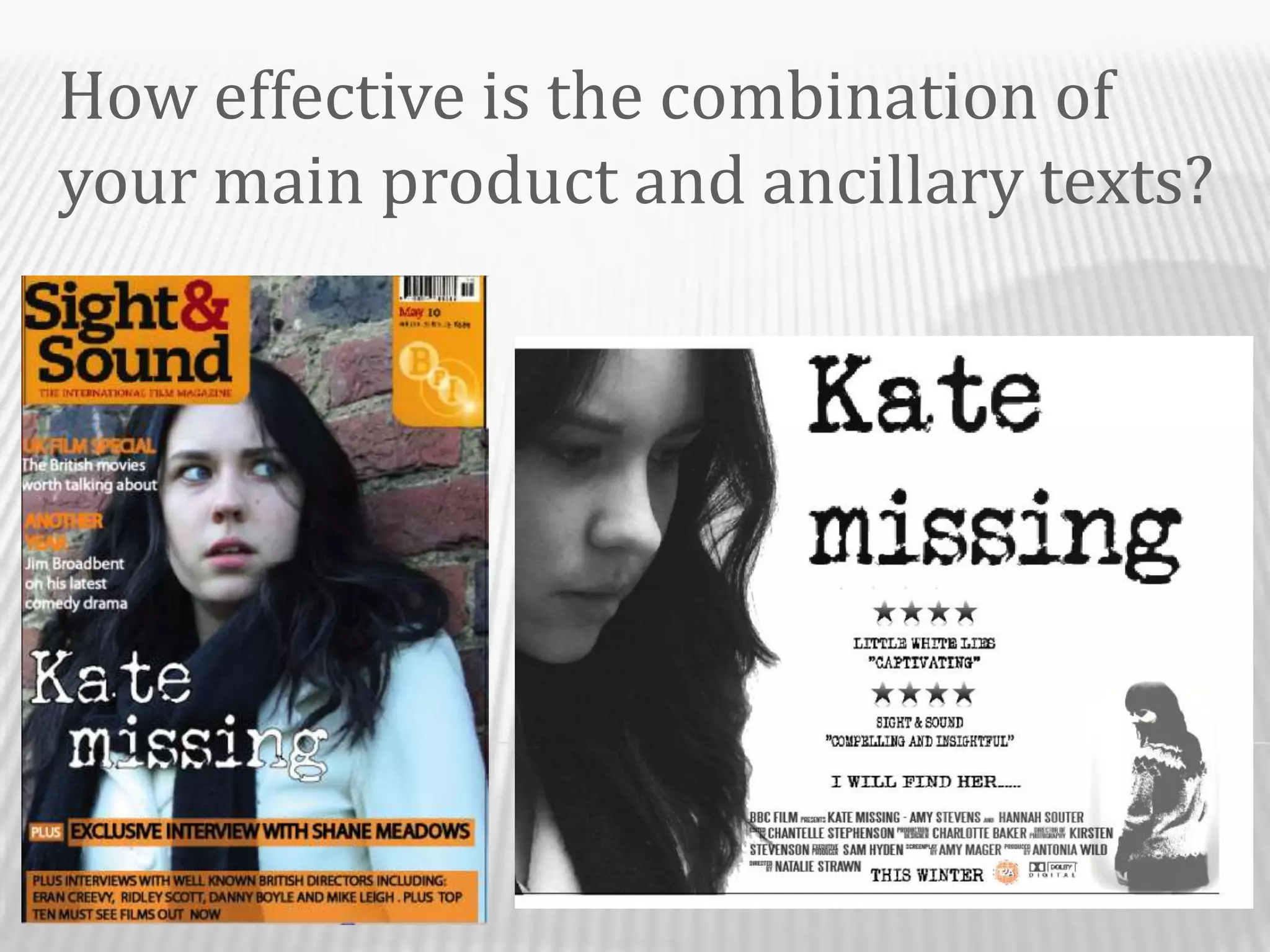
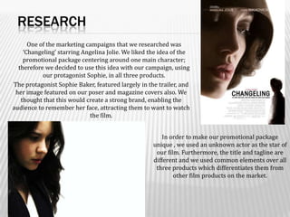
How effective is the combination of your main product and ancillary texts?
ResearchOne of the marketing campaigns that we researched was ‘Changeling’ starring Angelina Jolie. We liked the idea of the promotional package centering around one main character; therefore we decided to use this idea with our campaign, using our protagonist Sophie, in all three products.  The protagonist Sophie Baker, featured largely in the trailer, and her image featured on our poser and magazine covers also. We thought that this would create a strong brand, enabling the audience to remember her face, attracting them to want to watch the film.   In order to make our promotional package unique , we used an unknown actor as the star of our film. Furthermore, the title and tagline are different and we used common elements over all three products which differentiates them from other film products on the market.
PosterWe based our poster on ‘Changeling’ as we liked the strong image of one character, and the overall simplicity of it. We then took our own photos based on this. The close up image that we took shows the characters facial expression clearly, giving the audience an idea of the genre. The text that we used for the poster is the same font style for the magazine cover and trailer, created a strong brand, and making our products link together as one promotional package.  The tagline on the poster of ‘I will find her’, featured as a voiceover of one character in our trailer, and we thought it was a line that clearly summed up the overall narrative of our film, as the protagonists main objective is to find her sister. This makes the combination of these texts more effective as it enhances our USP. Enigma is created with the word “her” as the audience would wonder who the main character is looking for and why. In order to attract the right target audience (18-24 year olds) , we needed to follow the conventions of film posters with the same genre as ours. After a lot of research, we discussed it would be best to keep it simple and have the protagonist featuring largely as the main image. Most posters that we looked at of a similar genre to our own such as ‘the lovely bones’, create a fairly tense atmosphere shown through the facial expressions and body language of the protagonist and other characters. In order to follow this convention, our main character was looking down in sadness to express her feelings and create enigma for the audience. Another convention of film posters in the similar genre often use a dark colour scheme to create suspense and give the audience an impression of the genre. For us to follow this, we made our poster in black and white and used contrasting images to help the all elements of the poster stand out and attract an audience.
Magazine Cover  	As a group we decided that Sight and Sound magazine would be appropriate for our film as it explores films of a variety of genres and high concept films as well as independent. This fits in with our film as it is a relatively low budget film somewhere in-between a low budget and a high concept film. Also we liked the fairly simple layout of this magazine cover and the overall look. The photographs that we took for the magazine cover were taken against a brick wall showing Sophie Baker with a shocked expression on her face. The pictures were taken to link in with a shot in the trailer of Sophie leaning against the brick wall out of breath, giving the impression she is running away from and hiding from someone, creating enigma. This follows the convention of genre because it links in with the main character being frightful or scared about what is going to happen. This also follows the idea of keeping the magazine cover quite simple.  To make our magazine cover realistic and imitate the sight and sound layout, we thought it vital to follow the colour scheme used. In order to do this we used their sight and sound logo and bar code image for the top right hand corner.For us in our to group to link this in and make the combination of this with the other products effective, it was necessary for us to use the same character as the main image on all three products in our promotional package so that it would be obvious to audiences which film it is if they see the magazine cover and have previously seen the film poster. Although the colour schemes of the poster and magazine cover are very different, the film is still recognizable as we have used the same character and the same font and title. Also both images featured have similar facial expressions linking to our genre.

Question 2 powerpoint

  • 1.
    How effective isthe combination of your main product and ancillary texts?
  • 2.
    ResearchOne of themarketing campaigns that we researched was ‘Changeling’ starring Angelina Jolie. We liked the idea of the promotional package centering around one main character; therefore we decided to use this idea with our campaign, using our protagonist Sophie, in all three products.  The protagonist Sophie Baker, featured largely in the trailer, and her image featured on our poser and magazine covers also. We thought that this would create a strong brand, enabling the audience to remember her face, attracting them to want to watch the film.  In order to make our promotional package unique , we used an unknown actor as the star of our film. Furthermore, the title and tagline are different and we used common elements over all three products which differentiates them from other film products on the market.
  • 3.
    PosterWe based ourposter on ‘Changeling’ as we liked the strong image of one character, and the overall simplicity of it. We then took our own photos based on this. The close up image that we took shows the characters facial expression clearly, giving the audience an idea of the genre. The text that we used for the poster is the same font style for the magazine cover and trailer, created a strong brand, and making our products link together as one promotional package.  The tagline on the poster of ‘I will find her’, featured as a voiceover of one character in our trailer, and we thought it was a line that clearly summed up the overall narrative of our film, as the protagonists main objective is to find her sister. This makes the combination of these texts more effective as it enhances our USP. Enigma is created with the word “her” as the audience would wonder who the main character is looking for and why. In order to attract the right target audience (18-24 year olds) , we needed to follow the conventions of film posters with the same genre as ours. After a lot of research, we discussed it would be best to keep it simple and have the protagonist featuring largely as the main image. Most posters that we looked at of a similar genre to our own such as ‘the lovely bones’, create a fairly tense atmosphere shown through the facial expressions and body language of the protagonist and other characters. In order to follow this convention, our main character was looking down in sadness to express her feelings and create enigma for the audience. Another convention of film posters in the similar genre often use a dark colour scheme to create suspense and give the audience an impression of the genre. For us to follow this, we made our poster in black and white and used contrasting images to help the all elements of the poster stand out and attract an audience.
  • 4.
    Magazine Cover   As agroup we decided that Sight and Sound magazine would be appropriate for our film as it explores films of a variety of genres and high concept films as well as independent. This fits in with our film as it is a relatively low budget film somewhere in-between a low budget and a high concept film. Also we liked the fairly simple layout of this magazine cover and the overall look. The photographs that we took for the magazine cover were taken against a brick wall showing Sophie Baker with a shocked expression on her face. The pictures were taken to link in with a shot in the trailer of Sophie leaning against the brick wall out of breath, giving the impression she is running away from and hiding from someone, creating enigma. This follows the convention of genre because it links in with the main character being frightful or scared about what is going to happen. This also follows the idea of keeping the magazine cover quite simple.  To make our magazine cover realistic and imitate the sight and sound layout, we thought it vital to follow the colour scheme used. In order to do this we used their sight and sound logo and bar code image for the top right hand corner.For us in our to group to link this in and make the combination of this with the other products effective, it was necessary for us to use the same character as the main image on all three products in our promotional package so that it would be obvious to audiences which film it is if they see the magazine cover and have previously seen the film poster. Although the colour schemes of the poster and magazine cover are very different, the film is still recognizable as we have used the same character and the same font and title. Also both images featured have similar facial expressions linking to our genre.