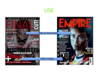
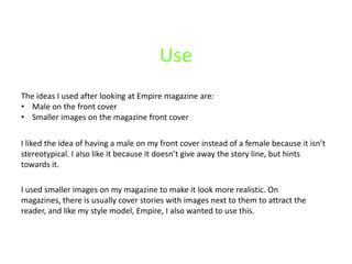
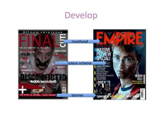
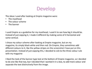
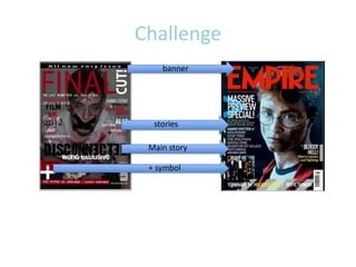
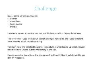
USE, DEVELOP, CHALLENGE
USE


Male on front cover


  Other images
Use
The ideas I used after looking at Empire magazine are:
• Male on the front cover
• Smaller images on the magazine front cover

I liked the idea of having a male on my front cover instead of a female because it isn’t
stereotypical. I also like it because it doesn’t give away the story line, but hints
towards it.

I used smaller images on my magazine to make it look more realistic. On
magazines, there is usually cover stories with images next to them to attract the
reader, and like my style model, Empire, I also wanted to use this.
Develop

  masthead


colour scheme


  banner
Develop
The ideas I used after looking at Empire magazine were:
• The masthead
• The colour scheme
• The banner


I used Empire as a guideline for my masthead, I used it to see how big it should be.
Instead of just copying it, I made it different by making some of it horizontal and
some vertical.

I chose my colour scheme after looking at Empire magazine, but on my
magazine, its simply black white and then red. On Empire, they sometimes add
different colours to it, like the yellow stripes on the screenshot I have put on this
presentation. Instead of just copying this, I decided to sick to the three colour rule
with my magazine

I liked the look of the banner type text at the bottom of Empire magazine, so I decided
to do one like that too, but I decided that I wanted it in a box, to add more colour and
separate the text distinctively from the image.
Challenge
    banner


  stories

 Main story

 + symbol
Challenge
Ideas I come up with on my own:
• Banner
• Cover lines
• Main Stories
• Symbol

I wanted a banner across the top, not just the bottom which Empire didn’t have.

The cover lines I used went down the left and right hand side, and I used different
fonts to make it look more interesting.

The main story line with text I put over the picture, is what I come up with because I
didn’t like how Empire put the Main Story at the side.

Empire magazine doesn’t use the plus symbol, but I really liked it so I decided to use
it in my magazine.
Use


Edited photo


Steel tongue
Use
 Ideas I have used are:
 • Steel Tongues
 • Edited photo


I used steel tongue for my poster, as this is a regular convention of a poster. To do
this I used a steel tongue generator which told me which way I should put the
names.


Both the photos from the two posters are edited. The photo on my poster is
grained and shadowed, and then I’ve added red to the actors eye.
Develop

  opacity


One person
Develop
I have took ideas from other media texts such as:
• Opacity in the picture
• One person on the poster


On the poster for The Uninvited, it looks like one picture, but parts of the opacity have
been turned down. I liked this idea so used the opacity but used it for another picture to
go over the top of my first picture.

I used one person on my poster because I liked how it looked on The Uninvited, but I
changed it because I used a close up where as on The Uninvited, the picture was a
medium close up which was also a shadow.
Challenge

Actors names


  Film name


   logos
Challenge

I have challenged other media texts by using things such as:
• Actor names at the top
• The film name
• Production and distribution company logos


I put the actors names at the top, because I like it when the names are there, for
example, The Boat That Rocked has a poster which has actor names at the top, and although
its not a horror, I liked the actual poster.

The film name is in a different font and position to The Uninvited. My Film posters is
obviously typed, where as The Uninvited poster looks like its written.

I used production and distribution company logos on my work, which The Uninvited didn’t
use.

Use develop challenge

  • 1.
  • 2.
    USE Male on frontcover Other images
  • 3.
    Use The ideas Iused after looking at Empire magazine are: • Male on the front cover • Smaller images on the magazine front cover I liked the idea of having a male on my front cover instead of a female because it isn’t stereotypical. I also like it because it doesn’t give away the story line, but hints towards it. I used smaller images on my magazine to make it look more realistic. On magazines, there is usually cover stories with images next to them to attract the reader, and like my style model, Empire, I also wanted to use this.
  • 4.
  • 5.
    Develop The ideas Iused after looking at Empire magazine were: • The masthead • The colour scheme • The banner I used Empire as a guideline for my masthead, I used it to see how big it should be. Instead of just copying it, I made it different by making some of it horizontal and some vertical. I chose my colour scheme after looking at Empire magazine, but on my magazine, its simply black white and then red. On Empire, they sometimes add different colours to it, like the yellow stripes on the screenshot I have put on this presentation. Instead of just copying this, I decided to sick to the three colour rule with my magazine I liked the look of the banner type text at the bottom of Empire magazine, so I decided to do one like that too, but I decided that I wanted it in a box, to add more colour and separate the text distinctively from the image.
  • 6.
    Challenge banner stories Main story + symbol
  • 7.
    Challenge Ideas I comeup with on my own: • Banner • Cover lines • Main Stories • Symbol I wanted a banner across the top, not just the bottom which Empire didn’t have. The cover lines I used went down the left and right hand side, and I used different fonts to make it look more interesting. The main story line with text I put over the picture, is what I come up with because I didn’t like how Empire put the Main Story at the side. Empire magazine doesn’t use the plus symbol, but I really liked it so I decided to use it in my magazine.
  • 8.
  • 9.
    Use Ideas Ihave used are: • Steel Tongues • Edited photo I used steel tongue for my poster, as this is a regular convention of a poster. To do this I used a steel tongue generator which told me which way I should put the names. Both the photos from the two posters are edited. The photo on my poster is grained and shadowed, and then I’ve added red to the actors eye.
  • 10.
  • 11.
    Develop I have tookideas from other media texts such as: • Opacity in the picture • One person on the poster On the poster for The Uninvited, it looks like one picture, but parts of the opacity have been turned down. I liked this idea so used the opacity but used it for another picture to go over the top of my first picture. I used one person on my poster because I liked how it looked on The Uninvited, but I changed it because I used a close up where as on The Uninvited, the picture was a medium close up which was also a shadow.
  • 12.
    Challenge Actors names Film name logos
  • 13.
    Challenge I have challengedother media texts by using things such as: • Actor names at the top • The film name • Production and distribution company logos I put the actors names at the top, because I like it when the names are there, for example, The Boat That Rocked has a poster which has actor names at the top, and although its not a horror, I liked the actual poster. The film name is in a different font and position to The Uninvited. My Film posters is obviously typed, where as The Uninvited poster looks like its written. I used production and distribution company logos on my work, which The Uninvited didn’t use.