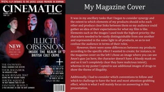
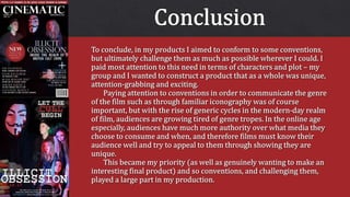
It was in my ancillary tasks that I began to consider synergy and
the extent to which elements of my products should echo each
other and produce clear links between them so my audience could
gather an idea of their expectations for what my film is like.
Elements such as the images I used took the highest priority; the
characters needed to be easily distinguishable from one another
and represented in the same light in all products, so as to not
confuse the audience in terms of their roles.
However, there were some differences between my products
according to the specific effect I wanted to create; for instance, in
the magazine cover on the left I chose an image where you can see
Anon’s gun (as here, the character doesn’t have a bloody mask on
and so it isn’t completely clear they have malicious intent),
whereas in my poster I opted to use additional images of drugs to
show the theme of illegality.
Additionally, I had to consider which conventions to follow and
which to challenge to have the best and most attention-grabbing
effect, which is what I will mainly focus on answering in this
presentation.
My masthead remained fairly typical of most film magazines; I named my
magazine ‘Cinematic’ as the adjective is clearly associated with the world of
film and cinema, meaning the audience can easily discern the genre of my
magazine. In terms of design and appearance, I chose a bold, not particularly
stylized, but sophisticated font, like Empire does in this example. I chose the
colour white as it was neutral and therefore didn’t interfere with the red and
blue colour scheme I wanted for the rest of the magazine.
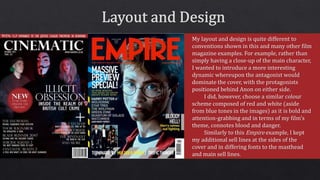
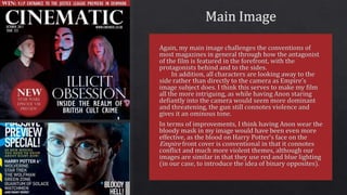
My layout and design is quite different to
conventions shown in this and many other film
magazine examples. For example, rather than
simply having a close-up of the main character,
I wanted to introduce a more interesting
dynamic whereupon the antagonist would
dominate the cover, with the protagonists
positioned behind Anon on either side.
I did, however, choose a similar colour
scheme composed of red and white (aside
from blue tones in the images) as it is bold and
attention-grabbing and in terms of my film’s
theme, connotes blood and danger.
Similarly to this Empire example, I kept
my additional sell lines at the sides of the
cover and in differing fonts to the masthead
and main sell lines.
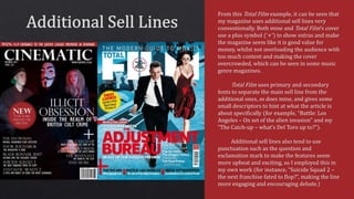
From this Total Film example, it can be seen that
my magazine uses additional sell lines very
conventionally. Both mine and Total Film’s cover
use a plus symbol (‘+’) to show extras and make
the magazine seem like it is good value for
money, whilst not overloading the audience with
too much content and making the cover
overcrowded, which can be seen in some music
genre magazines.
Total Film uses primary and secondary
fonts to separate the main sell line from the
additional ones, as does mine, and gives some
small descriptors to hint at what the article is
about specifically (for example, “Battle: Los
Angeles – On set of the alien invasion” and my
“The Catch-up – what’s Del Toro up to?”).
Additional sell lines also tend to use
punctuation such as the question and
exclamation mark to make the features seem
more upbeat and exciting, so I employed this in
my own work (for instance, “Suicide Squad 2 –
the next franchise fated to flop?”, making the line
more engaging and encouraging debate.)
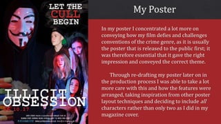
In my poster I concentrated a lot more on
conveying how my film defies and challenges
conventions of the crime genre, as it is usually
the poster that is released to the public first; it
was therefore essential that it gave the right
impression and conveyed the correct theme.
Through re-drafting my poster later on in
the production process I was able to take a lot
more care with this and how the features were
arranged, taking inspiration from other poster
layout techniques and deciding to include all
characters rather than only two as I did in my
magazine cover.
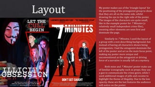
My poster makes use of the ‘triangle layout’ for
the positioning of the protagonist group to show
that they are all on the same side, whilst
drawing the eye to the right side of the poster.
The images of the characters are quite small,
like in the example poster for 7 Minutes (a
relatively small independent crime film),
meaning other elements are seen first and
dominate the page.
Similarly to 7 Minutes, I used the layout of
a group with a non-describing background, but
instead of having all characters shown being
protagonists, I had the antagonist dominate the
left of the poster and act as the main focus point,
making my poster more unique and
unconventional as the antagonist or driving
force of a narrative is usually left as a mystery.
Both mine and 7 Minutes’ poster make use
of familiar iconography such as props; they use
a gun to communicate the crime genre, while I
used additional images of pills and cocaine to
highlight the theme of illegality. Due to the low
opacity, these are the last features the audience
will notice on the poster.
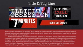
My title and tag line is similar to 7 Minutes’ in that in both, the fonts used are the same for both pieces of text, making the
poster design consistent. It also introduces further synergy to my product, as the font used for my title here is the same as
that used for the title card in my trailer.
Both posters use simple declarative or imperative sentences for the tag line in order to hint at the film’s theme while
remaining mysterious and making use of enigma; both phrases connote crime. However, mine adds to this convention by
having the verb ‘cull’ in red font, making it more striking and adding to the connotation the word has of violence and
bloodshed. Again, this serves to introduce enigma and is therefore engaging. This could have been further improved by
making it a rhetorical question, but it may not have fitted very well in terms of the structure of the phrase and thereby
reduced its coherency. Overall, I mostly stuck to conventional choices with this element of the poster.
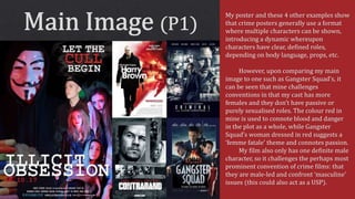
My poster and these 4 other examples show
that crime posters generally use a format
where multiple characters can be shown,
introducing a dynamic whereupon
characters have clear, defined roles,
depending on body language, props, etc.
However, upon comparing my main
image to one such as Gangster Squad’s, it
can be seen that mine challenges
conventions in that my cast has more
females and they don’t have passive or
purely sexualised roles. The colour red in
mine is used to connote blood and danger
in the plot as a whole, while Gangster
Squad’s woman dressed in red suggests a
‘femme fatale’ theme and connotes passion.
My film also only has one definite male
character, so it challenges the perhaps most
prominent convention of crime films: that
they are male-led and confront ‘masculine’
issues (this could also act as a USP).
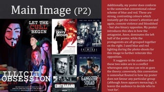
Additionally, my poster does conform
to the somewhat conventional colour
scheme of blue and red. These are
strong, contrasting colours which
instantly get the viewer’s attention and
again, connote violence and bloodshed
– but also binary opposites. My poster
introduces this idea in how the
antagonist, Anon, dominates the left
half of the poster, while the
protagonists are all grouped together
on the right. I used blue and red
lighting during the photo-shoots for
this image to further reiterate this
opposition.
It suggests to the audience that
these two sides are in a conflict
whereupon only one can win as goes
the theory; conversely, this convention
is somewhat flouted in how my poster
does not favour any particular group
(although Anon appears menacing), it
leaves the audience to decide who to
‘root for’.
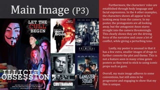
Furthermore, the characters’ roles are
established through body language and
facial expressions. In the 4 other examples,
the characters shown all appear to be
looking away from the camera. In my
poster, the protagonists are all looking
away, but the antagonist Anon stares
straight into the camera threateningly.
This clearly shows they are the driving
force of the narrative and cause a lot of
conflict, while giving a perturbing tone.
Lastly, my poster is unusual in that it
has a few extra, smaller images of drugs to
further connote the plot and theme. This is
not a feature seen in many crime genre
posters as they tend to stick to using iconic
props such as guns.
Overall, my main image adheres to some
conventions, but still aims to be
progressive and engaging to show that my
film is unique.
Evaluation Question 1 (Ancillary Tasks)

Evaluation Question 1 (Ancillary Tasks)

  • 2.
    It was inmy ancillary tasks that I began to consider synergy and the extent to which elements of my products should echo each other and produce clear links between them so my audience could gather an idea of their expectations for what my film is like. Elements such as the images I used took the highest priority; the characters needed to be easily distinguishable from one another and represented in the same light in all products, so as to not confuse the audience in terms of their roles. However, there were some differences between my products according to the specific effect I wanted to create; for instance, in the magazine cover on the left I chose an image where you can see Anon’s gun (as here, the character doesn’t have a bloody mask on and so it isn’t completely clear they have malicious intent), whereas in my poster I opted to use additional images of drugs to show the theme of illegality. Additionally, I had to consider which conventions to follow and which to challenge to have the best and most attention-grabbing effect, which is what I will mainly focus on answering in this presentation.
  • 3.
    My masthead remainedfairly typical of most film magazines; I named my magazine ‘Cinematic’ as the adjective is clearly associated with the world of film and cinema, meaning the audience can easily discern the genre of my magazine. In terms of design and appearance, I chose a bold, not particularly stylized, but sophisticated font, like Empire does in this example. I chose the colour white as it was neutral and therefore didn’t interfere with the red and blue colour scheme I wanted for the rest of the magazine.
  • 4.
    My layout anddesign is quite different to conventions shown in this and many other film magazine examples. For example, rather than simply having a close-up of the main character, I wanted to introduce a more interesting dynamic whereupon the antagonist would dominate the cover, with the protagonists positioned behind Anon on either side. I did, however, choose a similar colour scheme composed of red and white (aside from blue tones in the images) as it is bold and attention-grabbing and in terms of my film’s theme, connotes blood and danger. Similarly to this Empire example, I kept my additional sell lines at the sides of the cover and in differing fonts to the masthead and main sell lines.
  • 6.
    From this TotalFilm example, it can be seen that my magazine uses additional sell lines very conventionally. Both mine and Total Film’s cover use a plus symbol (‘+’) to show extras and make the magazine seem like it is good value for money, whilst not overloading the audience with too much content and making the cover overcrowded, which can be seen in some music genre magazines. Total Film uses primary and secondary fonts to separate the main sell line from the additional ones, as does mine, and gives some small descriptors to hint at what the article is about specifically (for example, “Battle: Los Angeles – On set of the alien invasion” and my “The Catch-up – what’s Del Toro up to?”). Additional sell lines also tend to use punctuation such as the question and exclamation mark to make the features seem more upbeat and exciting, so I employed this in my own work (for instance, “Suicide Squad 2 – the next franchise fated to flop?”, making the line more engaging and encouraging debate.)
  • 7.
    In my posterI concentrated a lot more on conveying how my film defies and challenges conventions of the crime genre, as it is usually the poster that is released to the public first; it was therefore essential that it gave the right impression and conveyed the correct theme. Through re-drafting my poster later on in the production process I was able to take a lot more care with this and how the features were arranged, taking inspiration from other poster layout techniques and deciding to include all characters rather than only two as I did in my magazine cover.
  • 8.
    My poster makesuse of the ‘triangle layout’ for the positioning of the protagonist group to show that they are all on the same side, whilst drawing the eye to the right side of the poster. The images of the characters are quite small, like in the example poster for 7 Minutes (a relatively small independent crime film), meaning other elements are seen first and dominate the page. Similarly to 7 Minutes, I used the layout of a group with a non-describing background, but instead of having all characters shown being protagonists, I had the antagonist dominate the left of the poster and act as the main focus point, making my poster more unique and unconventional as the antagonist or driving force of a narrative is usually left as a mystery. Both mine and 7 Minutes’ poster make use of familiar iconography such as props; they use a gun to communicate the crime genre, while I used additional images of pills and cocaine to highlight the theme of illegality. Due to the low opacity, these are the last features the audience will notice on the poster.
  • 9.
    My title andtag line is similar to 7 Minutes’ in that in both, the fonts used are the same for both pieces of text, making the poster design consistent. It also introduces further synergy to my product, as the font used for my title here is the same as that used for the title card in my trailer. Both posters use simple declarative or imperative sentences for the tag line in order to hint at the film’s theme while remaining mysterious and making use of enigma; both phrases connote crime. However, mine adds to this convention by having the verb ‘cull’ in red font, making it more striking and adding to the connotation the word has of violence and bloodshed. Again, this serves to introduce enigma and is therefore engaging. This could have been further improved by making it a rhetorical question, but it may not have fitted very well in terms of the structure of the phrase and thereby reduced its coherency. Overall, I mostly stuck to conventional choices with this element of the poster.
  • 10.
    My poster andthese 4 other examples show that crime posters generally use a format where multiple characters can be shown, introducing a dynamic whereupon characters have clear, defined roles, depending on body language, props, etc. However, upon comparing my main image to one such as Gangster Squad’s, it can be seen that mine challenges conventions in that my cast has more females and they don’t have passive or purely sexualised roles. The colour red in mine is used to connote blood and danger in the plot as a whole, while Gangster Squad’s woman dressed in red suggests a ‘femme fatale’ theme and connotes passion. My film also only has one definite male character, so it challenges the perhaps most prominent convention of crime films: that they are male-led and confront ‘masculine’ issues (this could also act as a USP).
  • 11.
    Additionally, my posterdoes conform to the somewhat conventional colour scheme of blue and red. These are strong, contrasting colours which instantly get the viewer’s attention and again, connote violence and bloodshed – but also binary opposites. My poster introduces this idea in how the antagonist, Anon, dominates the left half of the poster, while the protagonists are all grouped together on the right. I used blue and red lighting during the photo-shoots for this image to further reiterate this opposition. It suggests to the audience that these two sides are in a conflict whereupon only one can win as goes the theory; conversely, this convention is somewhat flouted in how my poster does not favour any particular group (although Anon appears menacing), it leaves the audience to decide who to ‘root for’.
  • 12.
    Furthermore, the characters’roles are established through body language and facial expressions. In the 4 other examples, the characters shown all appear to be looking away from the camera. In my poster, the protagonists are all looking away, but the antagonist Anon stares straight into the camera threateningly. This clearly shows they are the driving force of the narrative and cause a lot of conflict, while giving a perturbing tone. Lastly, my poster is unusual in that it has a few extra, smaller images of drugs to further connote the plot and theme. This is not a feature seen in many crime genre posters as they tend to stick to using iconic props such as guns. Overall, my main image adheres to some conventions, but still aims to be progressive and engaging to show that my film is unique.