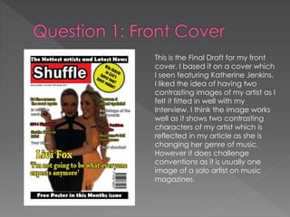
This is the Final Draft for my front
cover. I based it on a cover which
I seen featuring Katherine Jenkins.
I liked the idea of having two
contrasting images of my artist as I
felt it fitted in well with my
Interview. I think the image works
well as it shows two contrasting
characters of my artist which is
reflected in my article as she is
changing her genre of music.
However it does challenge
conventions as it is usually one
image of a solo artist on music
magazines.
This is the magazine which gave me the inspiration for my Front Cover
image. I didn’t follow the design of this Front cover however as I wanted to
include sell lines and a pug. I felt that my cover would be too bland without
them.
I followed some of Billboard designs for my front cover. I tried to create a
similar design whilst using Q’s colour patterns
Overall I feel my Front Cover has
fitted in with the conventional
magazines already on the market. I
feel it has a conventional layout as
well as conventional colours.
However, it does slightly challenge
conventional magazines as it has
two pictures of the same artist rather
than just one. But overall I feel it
works well with the interview I
created for my article.

Evaluationq1

  • 2.
    This is theFinal Draft for my front cover. I based it on a cover which I seen featuring Katherine Jenkins. I liked the idea of having two contrasting images of my artist as I felt it fitted in well with my Interview. I think the image works well as it shows two contrasting characters of my artist which is reflected in my article as she is changing her genre of music. However it does challenge conventions as it is usually one image of a solo artist on music magazines.
  • 3.
    This is themagazine which gave me the inspiration for my Front Cover image. I didn’t follow the design of this Front cover however as I wanted to include sell lines and a pug. I felt that my cover would be too bland without them.
  • 4.
    I followed someof Billboard designs for my front cover. I tried to create a similar design whilst using Q’s colour patterns
  • 5.
    Overall I feelmy Front Cover has fitted in with the conventional magazines already on the market. I feel it has a conventional layout as well as conventional colours. However, it does slightly challenge conventional magazines as it has two pictures of the same artist rather than just one. But overall I feel it works well with the interview I created for my article.