Analysis of Magazine Articles 
Jessica. Jones
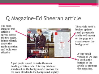
Q Magazine-Ed Sheeran article 
The main 
image of this 
article is 
spread across 
the two pages. 
It immediately 
draws the 
reads attention 
and looks very 
effective 
A pull quote is used to make the main 
heading of this article. It is very bold and 
stands out on the background. However the 
red does blend in to the background slightly. 
The article itself is 
broken up into 
small paragraphs 
and is well set out 
on the page as it 
stands out on the 
background. 
A very small 
version of Q’s logo 
is used at the 
bottom of the 
article to promote 
the magazine.
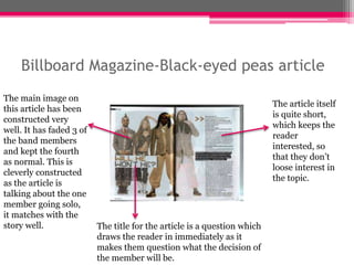
Billboard Magazine-Black-eyed peas article 
The main image on 
this article has been 
constructed very 
well. It has faded 3 of 
the band members 
and kept the fourth 
as normal. This is 
cleverly constructed 
as the article is 
talking about the one 
member going solo, 
it matches with the 
story well. The title for the article is a question which 
draws the reader in immediately as it 
makes them question what the decision of 
the member will be. 
The article itself 
is quite short, 
which keeps the 
reader 
interested, so 
that they don’t 
loose interest in 
the topic.
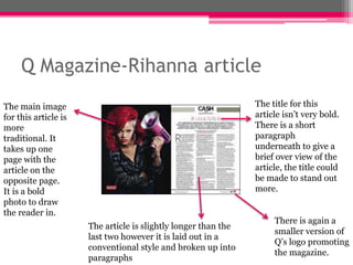
Q Magazine-Rihanna article 
The main image 
for this article is 
more 
traditional. It 
takes up one 
page with the 
article on the 
opposite page. 
It is a bold 
photo to draw 
the reader in. 
The article is slightly longer than the 
last two however it is laid out in a 
conventional style and broken up into 
paragraphs 
The title for this 
article isn’t very bold. 
There is a short 
paragraph 
underneath to give a 
brief over view of the 
article, the title could 
be made to stand out 
more. 
There is again a 
smaller version of 
Q’s logo promoting 
the magazine.

Analysis of magazine articles

  • 1.
    Analysis of MagazineArticles Jessica. Jones
  • 2.
    Q Magazine-Ed Sheeranarticle The main image of this article is spread across the two pages. It immediately draws the reads attention and looks very effective A pull quote is used to make the main heading of this article. It is very bold and stands out on the background. However the red does blend in to the background slightly. The article itself is broken up into small paragraphs and is well set out on the page as it stands out on the background. A very small version of Q’s logo is used at the bottom of the article to promote the magazine.
  • 3.
    Billboard Magazine-Black-eyed peasarticle The main image on this article has been constructed very well. It has faded 3 of the band members and kept the fourth as normal. This is cleverly constructed as the article is talking about the one member going solo, it matches with the story well. The title for the article is a question which draws the reader in immediately as it makes them question what the decision of the member will be. The article itself is quite short, which keeps the reader interested, so that they don’t loose interest in the topic.
  • 4.
    Q Magazine-Rihanna article The main image for this article is more traditional. It takes up one page with the article on the opposite page. It is a bold photo to draw the reader in. The article is slightly longer than the last two however it is laid out in a conventional style and broken up into paragraphs The title for this article isn’t very bold. There is a short paragraph underneath to give a brief over view of the article, the title could be made to stand out more. There is again a smaller version of Q’s logo promoting the magazine.