Brand experience Peoria City Soccer Presentation.pdf
Captain america poster
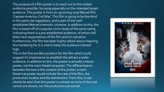
1. The purpose of a film poster is to reach out to the widest
audience possible, focusing especially on the intended target
audience.This poster is from an upcoming 2016 Marvel film
‘CaptainAmerica: CivilWar’.This film is going to be the third
is this particular saga/story, and is part of the well-
established Marvel cinematic universe. In addition to this, the
film is based off of a popular comic book of the same name,
indicating there is a pre-established audience, of whom will
likely have expectations of the film and it’s narrative.
Furthermore, the film has been highly talked-about meaning
the marketing for it is vital to keep the audience interest
high.
This is the first ancillary product for the film which could
suggest it’s importance to establish the attract a wider
audience. In addition to this, the poster is actually a teaser
poster, not the main theatrical poster.The differentiation
between the two is the content of the poster; a main
theatrical poster would include the cast of the film, the
production studios and the distributors. From this, it can
clearly be seen that this poster is a teaser as none of the cast
names are shown, nor the production personnel.
2. Colour:
There are few colours actually used in this movie
poster. The red and blue are the iconic colours of
the two characters shown in the poster, meaning
the audience can easily and quickly establish
them. In addition to this, the colours help to
establish the narrative as the two characters are at
war. Furthermore the remainder of the poster is in
black and white, helping to focus on the red and
blue sides of the poster. However the skin tone of
the characters is shown which could be a way of
making them clear to the audience and there facial
features/expressions, which could have been lost
under red or blue filters.
Background:
The background of the poster is fairly plain, with a
silver or white background. However there are some
marks or what appears like scratches which looks like
the shield of Captain America, helping to relate to the
narrative of the film, and hinting at the ‘mark of war’
between the characters. The use of the plain
background in the centre of the poster is effective as it
helps to prevent the poster from becoming ‘over-
crowded’ and too busy for the audience to process if
they glanced at the poster, causing it to become less-
effective in advertising and promoting the film.
Text/ Typography:
There is little text on this movie poster, of which
could be due to the fact the poster is a teaser poster,
rather than a full theatrical poster which would
usually have much more text. There is a tagline for
the film, being ‘Divided we fall’, hinting at the
narrative of the film fairly clearly. The typography is
bold and fairly large, helping to make an impact on
the audience and attract them or interest them to the
film; being the aim of the poster. In addition to this,
the tagline hints at the narrative, yet doesn’t ‘give the
storyline away’ so is effective in attracting and
intriguing an audience, without spoiling the
upcoming film.
Layout:
The layout of the poster also helps to hint at the
narrative, and certainly creates intrigue for the potential
audience. The two main characters are the only two
featured on the poster, helping to pre-establish their
importance in the narrative. They are facing opposite
each other, with strong, angered expressions, indicating
their anger at one another. This heavily hints to the
narrative and also helps to indicate the narrative being
these two characters are on opposing sides in a civil
war. Furthermore the use of the shield template outside
of the character’s faces helps to establish the film as part
of the ‘Captain America’ saga, thus attracting a certain
audience, of which could be pre-established audience.