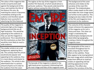
1. The colour of the magazine title
stands out particularly well
against the background of this
issue, and matches the title of
the feature film also. By
matching the colours it becomes
immediately striking to the
audience and therefore would
likely be more successful in
advertising the films featured.
The quality of the magazine is
extremely high as the images,
background and title are all
high-resolution. This would be
appealing to the audience as
they can see the magazine is
professional. This is beneficial to
the film institutions as their film
would be more likely to reach a
wide audience.
The smaller article is on a red
background, appearing like a
tab. This conveys that this article
would also be popular and
appealing to the audience, thus
it is more vibrant and clearer to
the audience. This article is also
advertised to be in a various
amount of parts so it’s clear to
the audience from the cover.
The tagline at the top of the magazine is from
another film featured, of which would attract a
particular audience. They would understand the
tagline without seeing the title of the film.
The background of the cover
enhances and relates to the
narrative of the main film
featured. The shattered glass
effect creates depth to the cover
and makes the main image stand
out further to the audience. This
background also makes the title
of the film and magazine more
prominent to the audience.
The costume of the character
shown enhances the appearance
of the magazine as his suit is
sharp and clean. This clean cut
image is matched by the
shattered glass background and
block lettering typography,
creating a theme throughout the
magazine cover.
The typography of the cover is
consistent throughout but it’s
made unique by the ‘vortex’
effect on the subtitles. These
titles appear to be moving behind
the main image which could have
made them difficult to read but
creates an appealing and eye
catching appearance to the
audience. This effect also
matches the narrative of the film.
The barcode of the magazine is placed in the
right hand corner to prevent it distracting from
the main image and titles of the magazine cover.