
Recommended
More Related Content
What's hot
What's hot (18)
Similar to Saw ii poster analysis
Similar to Saw ii poster analysis (20)
Recently uploaded
Recently uploaded (20)
Saw ii poster analysis
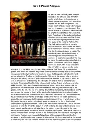
- 1. Saw II Poster Analysis As we can see, the background image is located on the left-hand side of the film poster which allows for the audience to clearly see the image as it stands out from the text and the dark background. This image clearly shows a figure with red eyes and blood appearing from his mouth. The character’s facial expression is emphasised by a ‘light’ in which shows the whole of its face. This allows for the audience to clearly identify a possible character of the film as well as recognising the genre of this film. The layout of the poster is Portrait. This The dark background (black) helps to emphasis the dark atmosphere and allows for more text to be included within it tension that this film poster is trying to create. The dark background also without having to make images smaller or allows for the audience to clearly recognise that this may be horror film as the reducing the font size of text. colour black symbolises tragedy, horror and death. This image shows the title of the film as we can see the main character of of the poster being located near the centre ‘Saw’ films. For fans of the film poster. This allows the first film, they will be for the audience to clearly able to easily identify recognise and identify the character located in movie that this poster is the top left-hand corner advertising. The font of the of this poster. This iconic title seems to be of ‘scratch image allows gaining the marks’ which symbolises the attention of the theme of horror as well as an audience and informing describing the film and its them of a second ‘Saw’ contents. The image of two film to be released. dirty looking fingers which are covered in blood and dirt. The power of this emphasise to the audience character seems to be the genre of the film and very high as it is located shows what may featurette the top of the poster. within the film. The red eyes looking down of this character symbolises blood and As we can see, the subtext of death, whilst also the film is located directly emphasising the underneath the film title. These characters power that it means that it is clearly visible may have over others in as the title is very bold and the film. there is not bright, contrasting against the dark background of the poster certificate rating on there in which allows for the film poster, the target audience to clearly notice, audience of this film in drawing their attention to it.my opinion would be The sub-text also informs the over 18’s. This is because audience of what this film of the colours in which contains. It is also written in a have been used, as well non-formal way, allowing for as the subject in which Located at the lower centre of the film poster is the more realistic response from implies ‘There will be production name, company name and logo as well as the audience with possible blood’ allowing for the distributors. This isn’t very important of advertising a film persuasion to watch the film audience to be informed poster; however, it is located on this film poster to allow the when it is released of the possible contents audience to make their own opinion of the film based on
- 2. Saw II Poster Analysis the of the film. distributors and the production company’s reputation within the film industry. There is also a date in which informs the audience of release date of this film.