
Recommended
More Related Content
What's hot
What's hot (20)
Viewers also liked
Viewers also liked (19)
Similar to Cd cover analysis
Similar to Cd cover analysis (20)
Recently uploaded
Recently uploaded (20)
Cd cover analysis
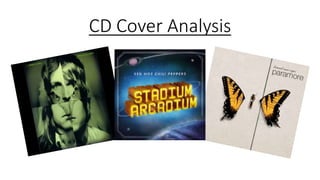
- 2. The font of the album name and the band name are the same style and size. The style of the font is usually associated with the special forces when they go on missions which could suggest that the band is on a mission to create the best music possible. Although it could also imply that the music is top secret and you have to buy the album to be able to hear it. The image shows the 4 members of the band mashed up to create one face. This could suggest togetherness within the band (they’re all related) and lead the fan to believe that they can unite together with this band if they buy the album. Features of an eagle are incorporated into the image which is used to display their genre of music. You normally associate eagles with Western America which is renowned for its country/rock music which would apply to audiences who love the alternative rock genre. The colour and layout of the album is trying to replicate the view you would get if you looked at the image through night vision goggles. This is done as it links with the name of the album ‘Only by the Night’. It also shows they can only be found during the night which suggest their music is about quite dark/serious matters. The font is quite small compared to the image which could be done to give the band’s fans a sense of belonging as they would recognise who the album was by through the image of the band on the front. The fact that an eagle is incorporated into their faces could be comparing themselves to eagles. Eagles are high flying and dominant eagles which could be done to suggest that this band are soaring around the world through their music. Eye contact with the consumer intrigues them to buy the album as it creates a personal connection with them and the band.
- 3. Font on the back is same as on the front to keep the special forces ‘mission’ theme running throughout. The writing has been flipped to add a twist to the cd cover which could suggest that their music is slightly different and unique to other artists. From the design, it looks like we are viewing the eagle through a scope of a gun. This displays their album as a target which could imply that it should be a target for audiences to buy it. The name of the producers are included at the bottom so that the audience can acknowledge the work that the producers did The front of the eagle features the face of an eagle so they continue the image on the back by using the back of an eagle head.
- 4. There is no picture of the band, suggesting that they aren’t bothered about personal image but just want people to appreciate the music of the album. Arcadium isn’t actually a word in the dictionary but it could’ve been generated from the word Arcadia which can mean any real or imaginary place offering peace and simplicity. This suggests to the audience that the genre of the music is quite chilled, relaxing and don’t cover serious/important matters. It could also be a reason for the artwork of the cover, as everyone imagines about going to space and it is a very simple and peaceful place. The font is big and fills a fair bit of the album cover. It is also made to look bright and has a thin white ring around it. This could be done to replicate a planet as the cover artwork is of space. Planets are big and light up space as they’re very bright and Saturn in particular has a ring around it. This is just like how the font is made to look. The colours towards the centre of the album are quite bright and vibrant to suggest their music is quite positive. The font of the band name is smaller than the album name to suggest that people will be able to identify the album by the album name rather than the band name. The fact that that the album artwork is of space could be implying to the audience that their music is so good that it is ‘out of this world’.
- 5. The album features two CDs and the CD names are ‘Jupiter’ and ‘Mars’ which fits into the space theme on the front cover as they are the name of planets. There is a contrast to the front cover as not only are the band displayed on the back but the colours are a lot darker. This could suggest that the music isn’t as positive as first thought and their songs all have a dark, serious side. Black, white and red are often colours you would associate with rock which suggests the genre of the album. Eye contact with the consumer intrigues them to buy the album as it creates a personal connection with them and the band.
- 6. The album is called ‘Brand New Eyes’ buy Paramore. The font for the band name is quite simple which suggests to the audience that the band are just trying to be simple and not try anything unusual to attract the audiences. The background and colours are also quite simple to reinforce their desire to be simple and not try anything unusual. The name of the album is above the name of the band, it is a small font and is implying to the audience that they are more interested in them being interested in their name of the band instead of the name of the album. The Butterfly could be used to represent the band as the background is mainly black and white with the butterfly standing out as it is orange. This could suggest that they stand out from other bands.