1. In what way does my
Digipack use, develop or
challenge conventions?
2. In creating my Digipack it was first necessary to
research similar artists and genres in order to
understand the conventions. In this way I would
be able to choose useful elements of convention
that allows the viewer to recognise where my artist
sits. With this knowledge I was able to decide
which parts would be interesting or useful to
subvert in order to enhance the uniqueness of my
artist.
……I chose to look at:
Troye Sivan, Dan Croll and James Blake
3. I opted to work with a conventional CD
Digipack format as I did not want overly
complex or elaborate packaging as it was not
intended to be a ‘concept album’ in the way
that for instance Pink Floyd have established
their genre with an overtly intellectual
approach.
Pink Floyd have
produced numerous
concept albums
with intricate
booklets and other
inserts to enhance
the listeners
experience.
My digipack is intended to be
enjoyed with a degree of
immediacy, requiring the
audience to simply listen whilst
very quickly understanding
from the artwork what the artist
is about.
4. In order to present our artist as alternative and organic to our
target audience. It was essential to dress our artist for the photo-
shoot in simple clothing where he appears relatable and fans feel
they can align themselves with our artist’s genuine persona.
The front cover reveals the artist’s ambiguous emotions which
were replicated during the music video. Whereas in the inside
cover a less intense pose of the artist smiling appears.
Metaphorically speaking we deliberate chose this for when fans
open up the album they are revealed to our artist opening up
himself resulting in fans being able to connect with ‘Forrest Blake’
in a more personalised way.
Overall our star image is consistent throughout the Digipack in
order to match and conform to conventions of artists similar to
ours. This would be a significant factor in correctly marketing and
branding our artist in not only our Digipack but other services
such as our website.
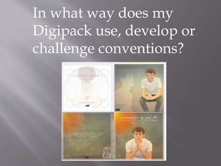
5. Dan Croll, James Blake and Troye
Sivan.
Troye Sivan, Dan Croll and James Blake are all references for my Digipack.
My front cover carries a simple of image of the artist in a conventional
‘moody young man’ pose and can be seen in context here.
6. All of these artists are positioned centrally in the composition with the hierarchy of
text either above or in front of the artist suggesting the name is more important than
the image. The Dan Croll album – Sweet Disarray has particularly clear typography
and I decided to use this style for my piece. I also felt the gradient background of this
album allowed greater prominence of the artist.
However, the Troye Sivan cover has detail in the background
which implies an interesting narrative which is lacking in
Dan Crolls cover. For this reason I decided to add the sunset
to my artwork relating it to my title ‘lovely day’ and the
ambient colours that appear in the opening sequence of my
music video.
These familiar conventions make it easier for the target
audience to identify with the artist.
7. In order to conform to conventions of back
cover designs. The style and themes of the
front needed to be consistent/replicated on the
back. This was notified the artists similar to
mine.
8. In order to create my star image as alternative, my inside cover
displays two juxtaposing image of the artist star image. This
displays two persona’s recognised in the music video. This design
challenges conventions as we have created a innovative and
artistic design in which would satisfy our target audiences
perceptions. We further did this by selecting a different
gradient/texture and manipulated the opacity of both images to
emphasis the contrast.
However, the hierarchy of text matches typical conventions of
album art work in order to keep a systematic layout. Moreover,
we included our record label (compulsory specification on album
criteria) to maximise a professional standard.
Moreover, the CD design we kept simplistic and convectional, as
this would be a tangible product which has more value than the
design itself. Nevertheless I incorporated the logo to maintain
brand awareness for users who may share the disc to others.
9. As our target audience are creative and artistic
people, it was important to create a design
which was both aesthetically pleasing and have
an organic and earthy texture. Moreover, the
Digipack is available on an online format
which allows our target audience (social
sharers) to spread awareness of this album art
work and promote out artist debut album.
10. However, I decided to subvert this with the introduction of a logo.
Although a very uncommon element within music videos it is an
essential ingredient within product and brand development. I first set
about creating my ‘wind blown’ tree logo by considering a tenuous link
to the artist’s name (Forrest) and the albums name (Lovely Day). This
logo seemed to connect both elements well and could easily be integrated
into the album artwork. In this way even when the artist or the albums
name was missing the branding would still be consistent.