
Recommended
More Related Content
What's hot
What's hot (16)
Similar to Media Conventions in Music Videos
Similar to Media Conventions in Music Videos (20)
More from Zheltov2000
Recently uploaded
Recently uploaded (20)
Media Conventions in Music Videos
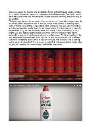
- 1. Conventions are the familiar and predictable forms and techniques used by media to communicate certain ideas or to convey a desired impression. Conventions can be used to guarantee that the audience understands the meaning which is trying to be created. We have used the Jax Jones music video on the songs House Work to get ideas for our music video. As you can see in the Jax Jones video there is a washing liquid bottle with the name of the song and the artist. We found this idea very interesting and decided to add a similar touch to our music video. The dog food cans have the name of our song and are also completed in a similar colour finish which is very bright. Our idea about creating these cans links very well with our video as the name of the song is Great Dane which is a breed of a dog. We have developed the Jax Jones idea and added our artist into the back of the shot which has made our shot more interesting as our artist is actually involved with the cans. He is picking up the cans from the shelf. This provides a better link of the cans to the music video rather than having a simple white background like Jax Jones.
- 2. With this shot we have took an idea from the actual artist who wrote the Great Dane song where there is a shot of a person performing an action with some papers which have writing on them. We have thought about about the idea and we wanted to include some kind of writing into our video. We have developed the idea by making the writing out of scrabble pieces and the action which our artists are performing is actually more interesting and pleasant to the eye. The girls which are involved in this shot are writing the name of our song with the scrabble pieces and this creates shot creates a massive link to the song and our campaign once again. Having in mind the convention of Cosmo Pyke’s music video made us think of a brilliant idea od how we could challenge his music video.
- 3. We have also used a convention from the trailer of Moonrise Kingdom. In that shot there is an effect added to the video which makes us think that somebody is looking at the boy in the field through a pair of binoculars. That idea is very interesting and it works very well as the meaning is understood easily. We have developed and challenged that shot. We decided to use a physical pipe to look through instead of adding an effect later on which gives the music video a more of an organic feel. As our artist is organic this is very important that we have managed to create this mood all the way throughout the music video and the campaign. We have also have done the opposite of what was done in Moonrise Kingdom. We created the effect that the girl that we see is looking at us through the pipe instead of us looking at her. This was another massive development which we have performed and it has worked as the meaning is conveyed clearly.
- 4. With this shot we wanted to support the mood of our music video and create an organic element in it. This shot gives the audience the feel of piece, being away from all of the problems which arise in the world under the duvet and creating this individual atmosphere. The shot below which we have developed creates a similar effect and in that shot there is a young girl which straight away gives us thoughts of innocence. We wanted to create the same feel, but with our artist. It was much harder to convey the same meaning as our artist is not a child who would give such thoughts straight away. Both our artist and the girl in the shot are reading something which provides the effect of interesting thoughts and an individual feel to the characters. This allows our artist to be special from all of the other artists and highlights him in the industry.
- 5. In this shot you are able to see the similarities between our music video and the video Nick Cave & The Bad Seeds - Henry Lee. In both video we see the artist and there is a girl who is touching the artist and showing some attraction/connection between them. However in our video our artist is ignoring the girls and in the Henry Lee video the artist is also concentrated on doing his own thing. We have developed the idea by adding more girls which allows us to have a more complex meaning behind our music video. Both video represent very well who is at the centre of attention and this is a very important convention to follow in a music video in order to promote the artist.
- 6. The similarities between these two shots are that we see each of the artists lip sync in an empty room and we see emptiness. However we have used completely different colours compared to the Arctic Monkeys music video and we have placed our artist into a different atmosphere. Our artist is in a basement and this conveys the meaning much better in my opinion compared to the Arctic Monkeys video where we see the performer in front of a white wall. Our shot has more meaning in it. This shot supports the personality of our artist very well and goes very well with the atmosphere which we have in our whole campaign. The dark location of our shot also supports the Indie genre.
- 7. Kanye took Vincent Desiderio's "Sleep" & brought it to life with a modern twist. This was a genius music video by Kanye West and we have also wanted to take the idea and create a meaning that all of the members in our music video are in the same boat - the same bed. We have challenged Kanye West’s Famous by changing the shot angle which we have used and we created action between the performance instead of them just sleeping. The meaning which we created is understood much better by audiences and suits our music video, while there was a lot of uncertainty about the meaning Kanye tries to create. In our shot we managed to contain the mood of our music video and the organic feel. Our shot represent a very pleasant atmosphere which satisfies the audience as it is very calm. This is the opposite of what Kanye has done.
- 8. OurCDDigipak
- 9. A Digipak is a modern approach to CD packaging which allows to include more information about the band/artist. It is about adding value to the music we are purchasing which is the original good which we demand. By adding value the firms are able to sell the music at a higher price to us and this allows them to boost profits. Moving away from the financial side, the digipak also has visual images which strengthen the image which is being created. This makes the start image and the campaign stronger whilst triggering more buttons in our heads which make us memorise this particular CD/music as a link is created in our minds between all of the content produced. By doing this the record labels and the artist are more likely to succeed with their product which they are trying to push forward into the music market. A Digipak should feature the name of the artist and the name of the album in large font at the front cover. This is done so we are able to recognise who has produced this content. Usually a large image or some sort of design is added to the front cover alongside the name of the artist and the name of the album. The back cover usually has the name and logo of the record company. It also has a full list of the contents of the CD which you are purchasing. You will see each of the song names in the middle of the back cover and these song names will be the main focus of attention. The CD Digipak has 3-4 colours max and there is this limit in place in order to support the brand image and not confuse the audience by adding unnecessary elements to the product. There is the same rule about the font, however it is even more strict and a max of two fonts should be used in order to keep the Digipak looking appropriate and professional. The same fonts should be used on the website and throughout the whole campaign in order to create the right image in the audiences heads. Consistency is a key to success as audiences will be more likely to remember something if they see the same thing over and over again. These are all conventions of the Digipak and how a standard Digipak should be made. We are used to the CD Digipak looking like this and that is why audiences will usually be more attracted to this format of the Digipak, if it looked otherwise some simply would not understand where to find the information they are looking for which would decrease customer satisfaction and a large proportion of the sales revenue could be lost. With our CD Digipak we have included the name of the artist and the name of the album at the front cover as most CD Digipaks do. You can see examples of CD DIgipaks below which we have used to inspire our design of the CD Digipak. We have made a collage of photos with our artist August. Such bands as the Rolling Stones have previously created a similar collage at the front of their digipak. The photos reflect the mood of the songs and help us target our audience as the consumers will be able to understand the genre and mood of the music by looking at the front cover. The fact that our artist is featured at the front of the digipak supports the artists star image and helps the audience visualise the music which they hear. At the back cover we included a painted artwork with the name of the record label and the full list of the songs which the album contains. We have followed this convention which most cd digipaks have. The colours which we used
- 10. suit our artist star image and the image which we are trying to create throughout the campaign. There is a clear link between the mood and the colours of the digipak and the music video which we have created. This is also done in most real media products. The collage and the artwork in the digipak contains our creativity and inside the digipak we have included a photo of our artist. This will promote our artist as audiences will get familiar with his looks and recognise him. This is going to allow the artist to become closer to his audience and become more famous which will set his career on the right footpath. Many similarities can be found between our digipak and the one below. This evidence suggests that we have followed many media conventions.
- 11. WEBSITE
- 13. A website is a set of data and information about a particular subject which is available on the Internet. Our home page on the website contains of the artist name and our music video which starts playing in the background when you open the website. The font is the same that we used on our CD Digipak and this is very important in order to create the correct picture in the audiences minds and support the brand image which is being created. The colours of our website are the same as of the digipak once again. We are being very consistent and organised with everything we produce. Our website contains 6 tabs which you can go onto to view such content as August’s biography, his music and his tour dates. Our website is very simple and looks very organic. This is going to support the star image of our artist and make the campaign as a whole more capable of being successful. It is very important to use large images on a website and keep it easy to use for audiences. We have done that and at the same time managed to keep the website looking interesting which is going to make audiences more involved and want to discover more about the artist. Nearly everything that I have listen above is the usual norm for a website and below you will be able to see screenshots of websites which were made for real artists. There can be many similarities found between our and a real website. I chose these website to compare to ours because they also use very calm colours and many of the artists are organic. As you can see all of them use large images on the website, together with large font. Some of our web pages are similar to the website of Florian Tessloff who is a composer. The colours look similar as both websites have a lot of black and blue. Another website which looks similar to some pages of our website is the Remi Jousselme website where we see a simple white background and a simple font is used everywhere on the website, however afterwards coloured photos are added to the website in order to keep the website looking interesting and this creates a nice touch to the website. In conclusion I would definitely say that we have followed all of the rules which are required to make an appropriate and successful media product. We have used many conventions which are used in real media products in order to convey meaning to our audience which we are trying to create. At the same time we have developed many ideas which were created by other people before and we have came up with brand new ideas and challenged real media products with our work. It could be portrayed hard to challenge a real media product at our level, however with our combined work and creativity which has flown into this campaign, I believe that we are up for the challenge.