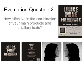
1. Evaluation Question 2
How effective is the combination
of your main products and
ancillary texts?
2. There are many similarities and
differences between our music
video and our digipak. It is both
of these things together that
make the combination of the two
ancillary texts so effective.
Some of these similarities and
differences I will discuss of the
following slides.
3. Similarity
When looking closely at the albums front cover it can be seen that the
text has been cut from a photograph of Manchester City Centre’s
landscape, this links to the music video as a large portion of the video
is set in the city, an example of this is in the screen shot below. This
link between the two is very subtle, which was our aim because we
didn’t want to be obvious we wanted to make our target audience think
so that they became more engaged in our music video and digipak.
Album Cover
Music Video
4. Similarity
Music Video Inside Panels
This link between our digipak and the music video is much more apparent
than the previous one, an almost identical shot from our music video is used
on both the inside panels of our digipak. We have chosen to do this so that
the audience can make a direct link between the video and digipak,
especially if they missed the link of the city landscape I highlighted on the
previous slide.
This image helps the audience to establish a relationship with the performer
as we get to see an image of her, although the fact she is looking to one side
leaves an element of mystery, similarly to how Lorde is often portrayed ad a
mysterious character.
5. Difference
The image used to fill the text on the front and back covers of the
digipak is not used in the music video, it is a separate photograph that
we took when out filming. The reason we didn't use a screen shot from
the music video was partially because the image quality would not
have been as good, and partly because we wanted the theme to be
the link between the two, not the image, so that it took slightly more
thought and therefore created added interest as the audience would
have to look slightly harder to spot this link.
Music Video
Album Cover
6. Similarity
Another similarity between our music video and our digipak is the
use of a strong, bold contrast when using black and white. By using
this strong contrast the image, or footage, really stands out and
grabs the audiences attention. Also it fits in well with Lorde’s already
established image, as she has quite a simple yet powerful look. The
digipak she has already released for the album ‘Pure Heroine’ has
the colour scheme of black and white so we wanted to incorporate
this into our new digipak so that it was evident we had researched
our artist and learnt to keep a close link to her.
Music Video
Inside Panel
7. Difference
In our music video there is no text
used, whereas on the digipak
there is a fair amount, so when it
came to choosing a font it proved
difficult as we wanted to choose
something that not only reflected
our music video but Lorde as a
person also. In the end we went
for a strong bold sans-serif font
as we felt this represented
Lorde’s personality. When
choosing this font we kept in
mind that we would use this font
on our magazine advert in order
to keep the continuity.