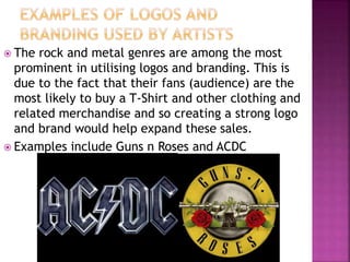
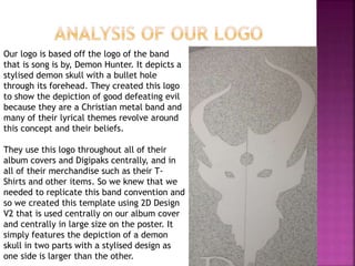
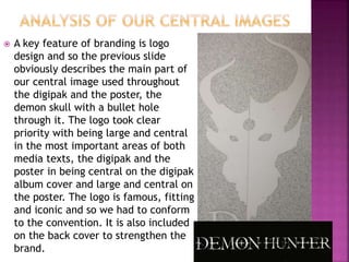
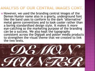
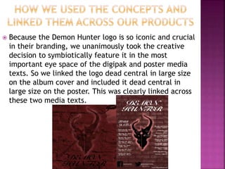
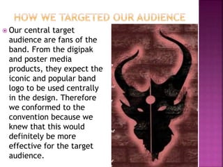
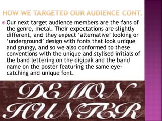
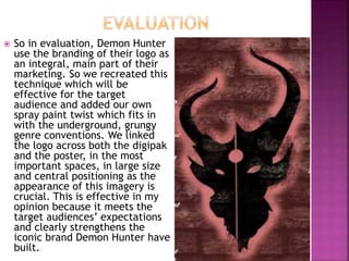
By Michael Scotney
 A logo is a small design or a symbol used by
an organisation to identify its
products/services, employee uniform,
vehicles etc.
 Branding is a marketing practice of creating
a name, symbol or design that differentiates
the product/service from its competitors.
 The rock and metal genres are among the most
prominent in utilising logos and branding. This is
due to the fact that their fans (audience) are the
most likely to buy a T-Shirt and other clothing and
related merchandise and so creating a strong logo
and brand would help expand these sales.
 Examples include Guns n Roses and ACDC
Our logo is based off the logo of the band
that is song is by, Demon Hunter. It depicts a
stylised demon skull with a bullet hole
through its forehead. They created this logo
to show the depiction of good defeating evil
because they are a Christian metal band and
many of their lyrical themes revolve around
this concept and their beliefs.
They use this logo throughout all of their
album covers and Digipaks centrally, and in
all of their merchandise such as their T-
Shirts and other items. So we knew that we
needed to replicate this band convention and
so we created this template using 2D Design
V2 that is used centrally on our album cover
and centrally in large size on the poster. It
simply features the depiction of a demon
skull in two parts with a stylised design as
one side is larger than the other.
 A key feature of branding is logo
design and so the previous slide
obviously describes the main part of
our central image used throughout
the digipak and the poster, the
demon skull with a bullet hole
through it. The logo took clear
priority with being large and central
in the most important areas of both
media texts, the digipak and the
poster in being central on the digipak
album cover and large and central on
the poster. The logo is famous, fitting
and iconic and so we had to conform
to the convention. It is also included
on the back cover to strengthen the
brand.
 However, we used the branding central images of the
Demon Hunter name also in a gnarly, underground font
like the band uses to conform to the dark ‘alternative’
metal genre conventions and to look cooler rather than
a boring standardised design style. It makes it more
eye-catching so the marketing purpose of the branding
can be a success. We also kept the typography
consistent across the Digipak and poster media products
to strengthen the visual theme that we created to link
the two texts.
 Because the Demon Hunter logo is so iconic and crucial
in their branding, we unanimously took the creative
decision to symbiotically feature it in the most
important eye space of the digipak and poster media
texts. So we linked the logo dead central in large size
on the album cover and included it dead central in
large size on the poster. This was clearly linked across
these two media texts.
 Our central target
audience are fans of the
band. From the digipak
and poster media
products, they expect the
iconic and popular band
logo to be used centrally
in the design. Therefore
we conformed to the
convention because we
knew that this would
definitely be more
effective for the target
audience.
 Our next target audience members are the fans of
the genre, metal. Their expectations are slightly
different, and they expect ‘alternative’ looking or
‘underground’ design with fonts that look unique
and grungy, and so we also conformed to these
conventions with the unique and stylised initials of
the band lettering on the digipak and the band
name on the poster featuring the same eye-
catching and unique font.
 So in evaluation, Demon Hunter
use the branding of their logo as
an integral, main part of their
marketing. So we recreated this
technique which will be
effective for the target
audience and added our own
spray paint twist which fits in
with the underground, grungy
genre conventions. We linked
the logo across both the digipak
and the poster, in the most
important spaces, in large size
and central positioning as the
appearance of this imagery is
crucial. This is effective in my
opinion because it meets the
target audiences’ expectations
and clearly strengthens the
iconic brand Demon Hunter have
built.
 However, we made the creative decision to not
link the initials and the band name branding on
the media texts. This is effective in my opinion
because they are not central in the branding
and also the name is needed on the poster to
inform new potential customers of who the
band is and not on the back of the digipak
where the name is not needed.

A2 Media - Logos and Branding

  • 1.
  • 2.
     A logois a small design or a symbol used by an organisation to identify its products/services, employee uniform, vehicles etc.  Branding is a marketing practice of creating a name, symbol or design that differentiates the product/service from its competitors.
  • 3.
     The rockand metal genres are among the most prominent in utilising logos and branding. This is due to the fact that their fans (audience) are the most likely to buy a T-Shirt and other clothing and related merchandise and so creating a strong logo and brand would help expand these sales.  Examples include Guns n Roses and ACDC
  • 4.
    Our logo isbased off the logo of the band that is song is by, Demon Hunter. It depicts a stylised demon skull with a bullet hole through its forehead. They created this logo to show the depiction of good defeating evil because they are a Christian metal band and many of their lyrical themes revolve around this concept and their beliefs. They use this logo throughout all of their album covers and Digipaks centrally, and in all of their merchandise such as their T- Shirts and other items. So we knew that we needed to replicate this band convention and so we created this template using 2D Design V2 that is used centrally on our album cover and centrally in large size on the poster. It simply features the depiction of a demon skull in two parts with a stylised design as one side is larger than the other.
  • 5.
     A keyfeature of branding is logo design and so the previous slide obviously describes the main part of our central image used throughout the digipak and the poster, the demon skull with a bullet hole through it. The logo took clear priority with being large and central in the most important areas of both media texts, the digipak and the poster in being central on the digipak album cover and large and central on the poster. The logo is famous, fitting and iconic and so we had to conform to the convention. It is also included on the back cover to strengthen the brand.
  • 6.
     However, weused the branding central images of the Demon Hunter name also in a gnarly, underground font like the band uses to conform to the dark ‘alternative’ metal genre conventions and to look cooler rather than a boring standardised design style. It makes it more eye-catching so the marketing purpose of the branding can be a success. We also kept the typography consistent across the Digipak and poster media products to strengthen the visual theme that we created to link the two texts.
  • 7.
     Because theDemon Hunter logo is so iconic and crucial in their branding, we unanimously took the creative decision to symbiotically feature it in the most important eye space of the digipak and poster media texts. So we linked the logo dead central in large size on the album cover and included it dead central in large size on the poster. This was clearly linked across these two media texts.
  • 8.
     Our centraltarget audience are fans of the band. From the digipak and poster media products, they expect the iconic and popular band logo to be used centrally in the design. Therefore we conformed to the convention because we knew that this would definitely be more effective for the target audience.
  • 9.
     Our nexttarget audience members are the fans of the genre, metal. Their expectations are slightly different, and they expect ‘alternative’ looking or ‘underground’ design with fonts that look unique and grungy, and so we also conformed to these conventions with the unique and stylised initials of the band lettering on the digipak and the band name on the poster featuring the same eye- catching and unique font.
  • 10.
     So inevaluation, Demon Hunter use the branding of their logo as an integral, main part of their marketing. So we recreated this technique which will be effective for the target audience and added our own spray paint twist which fits in with the underground, grungy genre conventions. We linked the logo across both the digipak and the poster, in the most important spaces, in large size and central positioning as the appearance of this imagery is crucial. This is effective in my opinion because it meets the target audiences’ expectations and clearly strengthens the iconic brand Demon Hunter have built.
  • 11.
     However, wemade the creative decision to not link the initials and the band name branding on the media texts. This is effective in my opinion because they are not central in the branding and also the name is needed on the poster to inform new potential customers of who the band is and not on the back of the digipak where the name is not needed.