2. Ancillary Products play a huge part in the promotional package
of an Artist. We decided to create synergy in our products so
the band’s look was recognisable. To create synergy we took
the colours from the band’s look in the music video to create
our ancillary products and digipak. This made the colours and
the look of the band recognisable to our target audience. To
make a link between our ancillary products and our music
video, we decided to use some stills from the video on our
digipak which also makes our audience instantly aware that it
is our band.
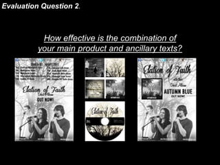
3. The Digipak
We created a digipak for our band as part of our
promotional package. We used stills from our music
video as part of our promotional package so that
our audience would instantly recognise the band.
Our music video and digipak feature the same
people (Becky, Will and Ethan), however there is a
still for the front cover which has been taken from
our video which Ethan isn’t featured in so we have
included all 3 band members on the inside cover
instead. We used the band on our digipak as this is
a promotional task and the band are being sold to
our target audience. We used the same filters on
adobe elements 11 to make the digipak colours
similar to the video. We created several drafts of the
digipak to make sure we got the right look for the
band. The font of the band’s logo is called ‘Coneria
Script’ and this font is used throughout our ancillary
products for whenever the band’s name is shown.
We used the same font to establish synergy and
recognition for our target audience.
4. Front of Digipak
We took a still image from our music video for
the front cover of our digipak as we thought that
this image really reflected the band as an artist.
We wanted our band to be easily recognised by
our target audience therefore we used a still
from video. We also chose this shot as there is a
lot space around the two members of the band,
where by we could add the band and album
name and icons of the brands identity, feathers.
We edited this photo by taking the colour out the
picture and adding a black and white tint. We
also cropped the edges of the photo off as they
weren’t needed. We both like this shot as we
think it created a certain atmosphere in both the
video and our digipak front cover and represents
the bands soft genre well. We used a
handwriting like font for the band name as we
wanted the text to look personal and as if a
member of the band had written it. (This has also
been done by existing artists on some albums,
as we found out through our similar product
research.)
5. Back of Digipak
The back of our digipak is made up of an
image that Becka photographed at Scawby
Ponds at the beginning of this task. We used
this image as we think it suits the emotions
and mood of our music video and also
creates an atmosphere. Again, we took the
colour out of the shot and added a black and
white tint to match the front of our digipak to
create recognisable synergy. Like
conventional music videos, we added the list
of songs on the back and puffs like
barcodes, websites, social media etc.. The
font used on the back page is called ‘Futura’,
we both agreed that this is a clear, bold font
and easy to read, therefore our audience
would have no issues reading it. We also
used the same colours from the front of our
digipak for the writing on the back.
6. The Inside Covers
For the inside covers we have taken designs from the
outside of our digipak and manipulated them to
incorporate a similar designs. The inside left is the lyrics
for our debut single ‘Don’t You Worry Child’ and
individual pictures of each band member. We decided to
have lyrics because we found from our similar product
research that it is a well known convention for an artist
to include a lyric book or lyrics for a certain song,
typically their debut single. The individual pictures are
stills from our music video, we liked the fact that their
facial expressions are a mixture of them smiling and
singing which makes them more appealing to our target
audience. For the inside right cover we simply used one
of our photos from our initial location shoots and
changed the colour to black and white and higherd
brightness and contrast. The photo is from the same
location where we filmed our music video so it does
create synergy. After designing our digipak, we decided
to also use the photo for our CD so when the CD is in
the case, It merges with the cover.
7. The Album and The Tour Adverts
We created synergy in both of our adverts by
using a black and white theme like in our
music video and digipak. The photographs of
the band that we have used for our adverts
are stills from our music video which have
been merged together to create a group shot.
We chose to use this method so that we
could get the best expressions from each
band member because we found that with
some of the group shots, one person would
be singing and the other would not. We have
used the same fonts for our adverts that we
used on our digipak as well as trying to keep
to the black and white theme because it
creates synergy and band identity for the
audience.